Author: admin

  • Game On! 12-16-2006: More Games Than Should Be Legal

    gameon.jpg

    Yeah, ok. I know in my last column I said “See you in Seven”. I didn’t INTENTIONALLY lie. I fully planned on doing a column last week, but I’ve just been so burnt out from work that it just didn’t happen. I’m sorry. Don’t look at me that way, I still love you”¦ I just needed some time away. But I’m back now, and I’m bringing you lots of gifts”¦ namely reviews and comparisons of more of the latest titles. Feel better? Good, let’s get this over with”¦

    I GOT RHYTHM, I GOT MUSIC

    DDR vs GUITAR HERO II

    First up this week, it’s the battle of the rhythm games. Long time champ DANCE DANCE REVOLUTION has two contenders entering the fray, with DDR SUPERNOVA out on PS2 and DDR ULTRAMIX 4 bowing as one of the last titles for the original Xbox. Both titles sport a huge array of songs, moves, and difficulty levels, as well as a few new features to keep old fans coming back, and bring in the noobs as well.

    DDRsupernova.jpgSUPERNOVA, for one, has an all-new “Battle” mode, where two players actually “fight” each other based on how well you dance, and yes, it’s just about as ridiculous as it sounds. There’s also a training mode for beginners, and an all new Stellar Master Mode, which is as close to a campaign mode that DDR will ever get. In it, players dance through various “joints” (planet locations on a map of sorts) and complete dance-centric tasks to move on. There are dance showdowns, basically boss battles, to complete as well, to move down to the next series of joints and so on. It’s the first freshest addition in a long time to a series that has only seen marginal “updates” to most of it’s modes.

    DDRultramix4_1.jpgULTRAMIX 4, however, seems to be more of the same. Still, it does offer a few nice things, such as the ability to utilize any of the download song packs from the previous entries, as well as sporting a good variety of songs for non-J-pop fans. In fact, both ULTRAMIX 4 and SUPERNOVA feature actual AMERICAN artists such as David Bowie, Fallout Boy and Oingo Boingo across their soundtracks. This makes finding a decent tune to dance to a bit more bearable once you find a name that you can actually recognize without having to be a 14-year-old Japanese girl first.

    GUITAR HERO II on the other hand is leaps and bounds above its previous iteration. Featuring the same style of rhythm based madness as the previous year’s entry and amping up the variety with over 55 songs to choose from already streaks this one ahead of the last. However, add to the mix a fantastic new multiplayer mode and a good variety of unlockables and you’re only just scratching the surface.

    guitarheroII.jpgWhat makes GUITAR HERO II so enjoyable is its simplicity. Using the guitar controller, press the proper colored fret and strum as the notes pass by. There’s (thankfully) a practice mode to those who never picked up the first game, where you can now not only choose sections of songs to practice, but you can even slow them down to make sure you nail that solo. The main game features the same four difficulty levels as last time (easy, medium, hard and expert) but for some reason even the lower levels seem tougher on some songs. The roster of songs is also much expanded (obviously) with a huge amount of unlockable songs able to be bought down the line.

    What makes this game shine, however, is the multiplayer. Adding to last year’s Face Off mode (where two players play the same song with alternating notes to see who scores the highest) is the new Co-op mode. Here, one player plays lead guitar, with the other taking up either bass or rhythm guitar. It adds a whole new spin to certain songs, and an increased difficulty for songs you may be familiar with on guitar, but not on bass. Also new is the Pro Face Off, where both players play the same song, but they must be on the same difficulty level, and play the same notes.

    guitarheroII2.jpg

    While this year’s game has a huge amount of songs to choose from, not all of them sound as good as the originals, or even last year’s spot on remakes. This time around, most of the singers are doing a horrible job, with vocals for most songs sound just very, very off, or at least just very bad impressions of the original vocalists. Still, everything’s at least in key, and you’re not playing the game for the vocals, just the guitar licks, and the game recreates all the sqeedlies and meadlies well. In fact, there are even a few original recordings in the game. Both Primus (“John The Fisherman”) and Jane’s Addiction (“˜Stop”) contributed their master recordings to the game, as well as all the unlockable tunes (including Strong Bad from HomeStarRunner.com singing “Trogdor” and [adult swim] cartoon band Deathklok (from Metalocalypse) performing “Thunderhorse”).

    Konami may finally have some competition in the rhythm based game genre, but it seems they’re not standing idly by, after recently copyrighting the name “Guitar Revolution” to go along with their other brands. One day, I fear that all the rhythm games will combine and breed a new race of super human pop stars who can sing, dance and play guitar. Then the “Revolution” will really take place. Until then, we’re just playing one game at a time.

    DDR: SUPERNOVA:
    righton.jpg

    DDR ULTRAMIX 4:
    ok.jpg

    GUITAR HERO II:
    kickass.jpg

    ROUND ONE: FIGHT!

    POWERSTONE COLLECTION vs MORTAL KOMBAT: UNCHAINED

    Usually, fighting games don’t do very well on the portable systems. There’s either not enough buttons, or the angles don’t work well, or you just can’t pull off that 22 hit combo the way you could in the arcade or at home. Well, the arcade is just about dead, and handhelds are becoming mode and more like the home consoles, so two new fighting games have hit the PSP, and the results aren’t as horrible as one would expect.

    powerstone.jpgPOWERSTONE COLLECTION, for example, takes the two entries in the series (both released on the Dreamcast) and puts them together for the first time, as well as including some odd mini games from the ill-fated system’s VMU memory card. Both games are glorious representations of the original game, where fighters do battle on a multi-tiered field, with plenty of objects to pick up and chuck at your foe and power-ups to collect. The game works well on the PSP’s screen, with bright vibrant colors highlighting the action and simple commands used to execute punishing moves.

    The first is the better of the two, but both games feature a good variety of diverse fighters and moves, as well as different power ups and collectibles. The VMU games are a weird distraction, including an odd flying game starring one of the fighters. Still, its inclusion is fairly cool, and certainly keeps the entire series intact in one collection.

    mkpsp.jpgMORTAL KOMBAT: UNCHAINED, however, is merely a port of last year’s DECEPTION, just with a few new additional fighters. As well as including MOTARO and SHAO KHAN (from the Gamecube version of the game), we get Blaze, Frost Kitana, and Jax. All of the unlockable fighters from the home version are there, but they’re already unlocked, making the Konquest mode’s inclusion rather unnecessary (because, really, who played that mode for the story?).

    Puzzle Kombat and Chess Kombat return as well and work just as they do on console. The main game, however, suffers from one “fatal” flaw: load times. Between matches, between fights, for just about every instance you can think of, there’s a 20 to 30 second loading screen. At least the actual fights are smooth, and the transitions from different tiers in the multilevel fights goes off without a hitch. Plus, the fighting (once it’s loaded) all works just as well as it’s console big brother”¦though the d-pad still isn’t as responsive as it should be (though that’s more the fault of the system rather than the game). Graphically, the game looks almost as sharp as the original from a distance, but when the camera gets in close (like at the end of a match) the system shows it’s limitations.

    All in all, however, it’s a successful port for both. Maintaining all the modes from the feature rich home version of DECEPTION is no small task, and the little handheld does it (mostly) admirably. It’s not perfect, but what works, works very well.

    POWERSTONE COLLECTION:
    righton.jpg

    MORTAL KOMBAT: UNCHAINED:
    righton.jpg

    SUPERHERO SMACKDOWN VOL 2.

    SPIDER-MAN: FIGHT FOR NEW YORK vs SUPERMAN RETURNS

    Once again, the two biggest titans of comicdom face off. Not since the 70s (or maybe it was the early 80s) have these two clashed so tirelessly. Well, now they do it again, but in digital form. I speak of course of the two new games for the two most popular and recognizable comic heroes. However, this match up, like all the ones before it, is not as evenly balanced as one might imagine.

    SpidBFNY.jpgFirstly, my favorite hero gets a brand new game in the form of SPIDER-MAN: BATTLE FOR NEW YORK, out now on GBA and DS (reviewed). Built off the same engine for the previous handheld versions of ULTIMATE SPIDER-MAN, this title again takes its cue from the Ultimate Universe. In fact, it seems to stem from some of the early issues of the book, where Peter first fought Norman Osbourne, otherwise known as the Green Goblin. In the Ultimate U, ol’ GG is a giant demon looking beast created by the Super Solider Serum gone wrong, and in the game, you play as both Spidey and his nemesis.

    Gameplay is practically an exact duplicate of the previous DS adventure, with many of the same sprites used in the graphics. Spidey can swing, pick up civilians to rescue them, and perform a variety of moves and combos against the ne’er do wells of the city. Likewise, Double G can smash, destroy and generally harm those in his way with wicked attacks and fire bombs. Much like Venom in the previous game, GG story runs parallel to Spidey’s and they both come to a head midway through the game.

    SpidBFNY2.jpg

    Unfortunately, while the title is fun to play and offers up a good video game version of the comics, it’s a bit like “been there, done that”. Because the sprites have been reused, many moves have been too, and everything feels very same-y. That’s not entirely a bad thing if you enjoyed the previous handheld adventure (which, I of course did) but those looking for a fully fresh game might be disappointed.

    Sadly, the same can be said for SUPERMAN RETURNS, out now on Xbox 360 (reviewed), PS2, Xbox, with slight variations on GBA and DS. Taking the familiar open world format of the SPIDER-MAN 2 game and applying it to a different set of red and blue tights is one thing, but making it boring is a crime within itself altogether.

    supesret.jpgThe premise is ok by itself. A game based on the film of the same name, fleshed out a bit with side missions and non-movie story modes to continue the game well past the film. Sure, they all do that. But here, it doesn’t quite flow the way that they intended. Maybe it’s the fact that you only really fight two kinds of enemies in this game (drones and boss characters). Maybe it’s the fact that between events, you just sort of hover above the city, waiting for something to happen. Or maybe it’s just because Superman is TOO POWERFUL to make a good game about. Sure, they finally have all his powers, and he’s quite formidable. But, he’s so powerful, that they don’t even give him a health bar. No, instead what we’re treated to is a meter which registers “Metropolis Health”, the life bar of the city itself. If the city becomes too damaged in a fracas, it’s game over for the big caped guy. Lame.

    What’s worse is, that while his powers do work well, sometimes they work TOO well. Fighting while flying is ok, but sometimes you’re just moving too fast to keep a good lock on your target. The same can be said for running at high speeds while trying to take down one of the games many super speedy foes. And transitioning from ground to air sometimes isn’t nearly as smooth as you’d want it to be. Still, heat vision, freeze breath, super strength, they all work admirably, and experience points build up new moves.

    It’s sad to say that the most fun you’ll have with the game is in a mini game, where you actually destroy the city as Bizarro. But these interjections are too few and far between, and don’t last nearly long enough.

    If imitation is the sincerest form of flattery, both these games’ predecessors should be blushing to beat the band. There’s something to be said for originality however”¦and it should be directed at these two games, because frankly, they don’t seem to grasp the concept.

    SPIDER-MAN: BATTLE FOR NEW YORK:
    ok.jpg

    SUPERMAN RETURNS:
    eh.jpg

    THE (VIOLENT) SPORTS AUTHORITY

    BLITZ: THE LEAGUE vs WWE SMACKDOWN VS RAW 2007

    I’m not a sports guy. Most of my regular readers know that. Still, every so often, I have to review a sports title, just so I don’t alienate that particular demographic that buys those types of games. I still do it my way, though, which I why I tend to shy away from the mainstream with the few sports titles I do review. This time is no exception.

    blitztl.jpgAs most of you know, of all the sports I don’t like, I like football the least. Which is why I was so surprised that I enjoyed BLITZ: THE LEAGUE as much as I did. When I reviewed it for the original Xbox, I found that, while the main game had its hiccups, it was still a fun diversion from a normal gridiron game and still had a lot to appeal to football fans as well as arcade players.

    Now that it’s been released for Xbox 360, I still feel the same way”¦but sadly it’s nothing new. The same game that was released last year has been repackaged, shined up a bit and released as a “next gen” title. And sadly, it doesn’t even look that much different from the original Xbox title. The graphics are still fairly sharp (in places, some models still don’t quite look right in certain cut scenes), the running game is still a bit unbalanced (sometimes you’ll get sacked no matter what, sometimes you’re catch a fumble and get a turnover to a 90 yard touchdown) and the story mode is practically the same. So why then didn’t they just make the original backwards compatible? Achievements?

    blitztl2.jpg

    Granted, yes, the achievements are new, but the online seems to be better integrated here as well. Beyond that, however, it’s still very much the same game. That’s fine if you didn’t play the other one and are looking for a weird MADDEN alternative. But if you bought it once already, why would you plop down another $50 for a gussied up remake?

    wwesvr07_1.jpgFor our other title, some would argue that its subject matter doesn’t officially count as a “sport” (despite the in game announcers claiming that it contains the worlds best “athletes”). Still, now that it’s become a yearly franchise, WWE SMACKDOWN VS RAW 2007 (on PS2, PSP and for the first time Xbox 360) has continued to grow into the world’s best wrestling title”¦though currently there’s not much competition.

    The game has continued to expand it’s already diverse move set and stylized control, with this year’s entry relying heavily on the analog sticks for more complete control over your combatants moves. Different directions deliver grapples, submissions, lifts and slams. You can even click the stick in for further control, holding your opponent in the air and choosing when and how to slam them to the mat. It’s a certain level of control that, now that you have it, you don’t know how you ever played with out it.

    Because of this, control for all the other match types has greatly improved. Ladder matches are now more intuitive as far as reaching that belt (though I often still only climb the ladder when I often only wish to grab it). The Diva matches still seem slightly wonky, but over all, everything has a new coat of style and substance that makes this the richest and deepest wrestler yet.

    With the typically immersive create-a-superstar mode, the level of detail you bring to your grappler is unending, with features for move set customization, and entrances so completely directed you can even choose each camera angle and when to set off pyrotechnics. However, if you want your created star to have a chance in the squared circle against the real wrestlers, you’re going to have to play a t a lower difficulty level. Since you begin with your character at such a low power level in his stats, and the other wrestlers are already established, it makes for some rather one sided fights. Still, it’s all gravy, with the aforementioned sweet new control scheme,

    It’s strange, but as I’ve stated before, while I hate wrestling itself, I love wrestling video games. Once again, I have immersed myself in a grapple-tastic title and come out with the championship belt. And once again, I’ve loved every sweaty hairy minute of it. There’s something kind of wrong about that, but oh well.

    BLITZ: THE LEAGUE:
    ok.jpg

    WWE SVR 2007:
    kickass.jpg

    And thus we end another week. Are we satisfied yet? What’s that? Where’s my stuff about the Wii and the PS3? Well, ZELDA is so long I still haven’t quite finished it yet, so that’s delayed yet again, and I’m not even bothering to try to find a PS3 (I’m not made of money you know). But hopefully, you’re at least statiated this week. Now, I’ll be back (probably in another two weeks”¦ I have to go biweekly during the Holidays due to so many games and so much over-workage elsewhere) eventually. See you then.

    THE GAME ON! RATING SYSTEM


    gameonratingscomplete.jpg

    Kick-Ass, Right On, Okay, Eh, and Stinker (or Craptacular)

  • Comics in Context #158: Jolly Holiday

    comicsincontext4.jpg

    cic2006-12-15.jpgWith the approach of the holiday season, I found appropriate entertainment by going to see the Walt Disney Company and producer Cameron Mackintosh’s new Mary Poppins stage musical, which opened in London in 2004, and which arrived on Broadway at the New Amsterdam Theatre this fall. Based on both P. L. Travers original Mary Poppins books and the 1964 Disney movie, the stage musical is another retelling of the tale of the proper but mysterious nanny with supernatural powers who takes charge of the children Jane and Michael Banks.

    As I did with Disney’s Tarzan Broadway musical (see “Comics in Context” #133), I used the occasion of attending the Mary Poppins musical to finally read P. L. Travers’ first Mary Poppins book, originally published in 1934. I expect that by now far more people know Mary Poppins from the Disney movie, which I’ve seen several times, most recently the ABC Family Channel telecasts on December 11, than from Travers’ six books about the character.

    But I have long been aware of the recurring complaint about the Disney film: that Walt Disney, actress Julie Andrews, and their collaborators, turned Travers’ severe and rather forbidding Mary Poppins cheerful and sugary sweet. Cultural critic Edward Rothstein reiterates the point in his article in The New York Times (Nov. 20, 2006), pointing out that Travers’ Mary Poppins “often had a look of “˜fury,’ who “˜snaps,’ and “˜sniffs’ and “˜retorts.’ That Mary Poppins “˜never wasted time being nice.’” In her article about Travers in the December 19, 2005 issue of The New Yorker, Caitlin Flanagan writes that Mary Poppins “is, in fact, very often “˜angry,’ “˜threatening,’ “˜scornful,’ and “˜frightening.’” On the other hand, Disney’s Mary Poppins announces early on on the film that she is “never cross.”

    So I watched the Family Channel telecast with this in mind. For most of the film Andrews’ Poppins is haughty and strict, as the character is in the book. Disney’s Poppins does not behave quite as unpleasantly as Travers’ can. The book states that Mary Poppins is “frightening” (Odyssey Classics paperback, p. 12), and at one point Mary Poppins “regarded” her young charge Michael “with something like disgust” (p. 116). But, for example, consider the scene in the movie in which Mary Poppins visits her Uncle Albert, who levitates to the ceiling when he laughs. Mary Poppins’ friend Bert and the two children she is nannying, Jane and Michael Banks, find his laughter contagious, join in, and are soon levitating upwards as well, while a severe Mary Poppins seethes with disapproval at this supposedly improper behavior. This scene is adapted reasonably faithfully from the first book, and here Disney’s and Travers’ versions of Mary Poppins exactly coincide. (This scene, and its memorable song, “I Love to Laugh” are not in the Broadway musical, perhaps because it would require five people in flight harnesses at once, or perhaps because it would dilute the theatrical impact of Mary Poppins’ flying at the end of each act.)

    The reputation of Disney’s kinder, gentler Mary Poppins seems to me to be founded on three key sequences, which are all so memorable that it’s not surprising that they eclipse the scenes in which Andrews performs more in Travers mode. First, there’s the song “A Spoonful of Sugar,” which, as the lyrics say, helps the medicine go down. This too turns out to be based on an incident in the first book, in which Mary Poppins administers medicine to Jane and Michael, which turns out to taste delicious. But whereas in the book Mary Poppins wears a “stern” expression and gives Jane “a warning, terrible glance” (p. 12), in the movie Andrews’ Poppins is smiling and beaming with happiness as she sings. Her manner fits the point of the song, and, actually, there seems to me to be a contradiction in the book between Travers’ sweet-tasting medicine and the sour temperament of her Mary Poppins. If medicine should have an appealing taste, then why shouldn’t a nanny have a pleasant disposition? By the same logic, wouldn’t that make the children more willing to obey her? Or is Travers making a more complicated point with the medicine? Is she saying that just as something necessary but unpleasant, like medicine, should paradoxically taste good, then Mary Poppins, who takes the children on wonderful adventures, should have an unpleasant manner in order to create a kind of balance?

    Rothstein insightfully pointed out that Travers’ Mary Poppins “is a caricature of the most authoritarian form of adulthood” and that “In part this reveals how children perceive adulthood.” He explains that children must obey their parents, and yet the children recognize that with adulthood comes a “realm of magical freedom” they do not yet have. I compare this to the theme of maturation in the superhero genre: for example, the boy Peter Parker, who is dutiful to his aunt and must obey his tyrannical boss, becomes Spider-Man, with superhuman abilities that give him a freedom to rise above society’s restrictions.

    Rothstein argues that “Discipline is required for the magical realms to be revealed; it is what makes freedom possible. Without the one, there is meaningless fantasy; without the other, there is heartless rigidity.” Here too there is a similarity to the superhero genre, in which, traditionally, the protagonist has both a “civilian identity,” in which he is a part of society and accepts its restrictions on his behavior, and a superheroic one, in which he has abilities and freedom exceeding those of ordinary people, but nonetheless devotes them to the service of society. The most famous of the superheroes is both Superman and Clark Kent. To be only Clark Kent would doom him to a life of “rigidity” he could not transcend; to be only Superman would mean leading a “meaningless fantasy” life without grounding in everyday humanity. Mary Poppins has extraordinary magical powers, and yet she works as a nanny, using them in caring for children. Similarly, her friend Bert, as we shall see, may have magical powers of his own, but instead devotes himself to art (in the book, movie and musical) or to serving society as a chimney sweep (in the movie and musical).

    Although Cameron Mackintosh promised P. L. Travers before her death that his stage version of Mary Poppins would be truer to her character, if you have a singing, dancing Mary Poppins, then the battle to make her consistently stern and authoritarian has already been lost. The other two sequences in the movie that present a sunny, cheerful Mary Poppins are the adventure in the world within Bert’s sidewalk painting, full of singing and dancing (with the songs “It’s a Jolly Holiday with Mary” and “Supercalifragilisticexpialidocious”) and the “Step in Time” song and dance number with Bert and his fellow chimney sweeps on the rooftops of London.

    The “Jolly Holiday” sequence is surprisingly faithful to a chapter of the book, in which Mary Poppins and Bert do indeed enter a world within his painting, find themselves dressed in fancy clothes, and are served tea in the woods by a waiter (but not by penguins, which Walt Disney contributed to the film). Moreover, in Travers’ book Bert is clearly Mary Poppins’ boyfriend, and their adventure in this alternate world is just as clearly a date. My biggest surprise is that in this chapter, which is only the second in the book, Travers has Mary Poppins’ stern persona entirely melt away. She speaks “softly” (p. 18) and “brightly” (p. 19); she is described as “pleased” (p. 23). Even the book’s insistence that Mary Poppins is rather plain (and therefore does not look like Julie Andrews) is undercut in this chapter by Bert’s awestruck reaction to her in her new finery: “Then he gulped and said: “˜Golly!’” (p. 22).

    There has been some controversy in the New York City media about the end of Act I of the musical, in which toys come to life and menace Jane and Michael, who have been naughty. I don’t know how I would react to seeing this if I were a small child, but from my adult perspective it didn’t seem at all disturbing. What I found strange was the musical’s treatment of “Jolly Holiday.” Mary Poppins, Bert and the children do not enter Bert’s painting, presumably because that would be a hard thing to stage. Instead the park transforms into a more colorful setting, Mary Poppins and Bert reenter in handsome new costumes, and statues in the classical style, including one of the god Neleus, come to life and join in the dancing. (Neleus’s statue is from one of Travers’ later Poppins books.) The strange thing is that Neleus and the other statues are virtually nude. (They’re actually in skin-tight costumes and body paint, and naughty bits remain covered, but the effect is still that of semi-nudity.)

    Perhaps this wouldn’t bother Travers. In the first Mary Poppins book a star named Maia appears on Earth as a human child, and Travers emphasizes that “the child had practically no clothes on, only a light wispy strip of blue stuff that looked as though she had torn it from the sky to wrap round her naked body” (p. 183). Mary Poppins is started by the sight, but Maia is unconcerned by her near-nudity, and perhaps Travers means us to be unconcerned as well.

    It seems weird and perhaps a little disturbing to watch performers in Edwardian costumes cavorting with semi-nude figures in front of an audience full of families with small children. But, as I said, Mary Poppins and Bert are obviously on a date of sorts, so I suppose that Neleus and the semi-nude female statues provide a libidinous subtext.

    My initial reaction to reading this chapter was that it gave Walt Disney all the justification he needed to presenting the merry, beautiful, singing and dancing Mary Poppins of the “Jolly Holiday” sequence. Since this is how she behaves around her boyfriend Bert, then it would also make sense that his presence would induce her to join in the merriment in “Step in Time.” Watching the movie again, I noticed that after engaging in dancing in “Step in Time,” Andrews’ Mary Poppins abruptly and amusingly reverts to her usual staid persona, holding up her hands and turning her face in exaggerated disdain when the other chimney sweeps offer to keep dancing with her.

    My second reaction was to realize what the difference is between Travers’ and Disney’s versions of the “Jolly Holiday” sequence: in Travers’ version the kids aren’t there. Travers makes the point that this happens on Mary Poppins’ day off, so she has dropped the staid, stern persona she otherwise uses in her dealings with the Banks family and virtually everyone else.

    So why did Travers do this as early as Chapter Two? Presumably it was to alert the reader that there was more to Mary Poppins’ personality than the strict disciplinarian in the rest of the book. To build upon Rothstein’s reasoning, this chapter speaks to children’s partial awareness that adults have a side to their lives apart from dealing with kids. To continue my analogies with the superhero genre, it shows that Mary Poppins has a “secret identity” of sorts. Actually, she has a multi-leveled identity. Mr. and Mrs. Banks, and the world at large, think of her as an ordinary woman, with a proud, severe manner. She allows the children to see that she has magical powers, but, in the book, does not allow them to see more than the strict authority figure side of her personality. Bert gets to see a softer side of her personality, and notice that Mary Poppins’ other self comes complete with a fancy costume. And then there are suggestions, as we shall see, that Mary Poppins is something other than human.

    This reminds me of one of my favorite characters in Charles Dickens’ novels, though one who I think is generally overlooked: Mr. Wemmick from Great Expectations. At the office Mr. Wemmick has a grim, severe, emotionless manner, and characteristically keeps his jaw locked in an unpleasant expression. At one point Mr. Wemmick brings Pip, the protagonist, to his home, and Pip notices that with every step they take away from the office, Mr. Wemmick’s jaw loosens by another degree, and his demeanor and facial expression become more relaxed and sunnier: he transforms into a different, happier, more outgoing self. His home looks like a miniature castle, and it’s like a playhouse where he lives with his Aged Parent. Staying with the Wemmicks is like one big party, but when Pip and Mr. Wemmick head back to the office, Pip observes that with every step Mr. Wemmick’s face and demeanor settles back into the rigid persona he uses in the business world.

    Rothstein asserts that Jane and Michael “learn that “˜Appearances are Deceptive.’ They learn, that is, that there is a split between the inner life and outward appearance, between the magic of Mary Poppins and her thoroughly adult facade.” As Rothstein points out, after they have one of their encounters with the supernatural, Mary Poppins continually insists to the children that no such thing happened. This happens in the book, the movie, and the musical. The children are puzzled by Mary Poppins’ denials, but perhaps the point that she is trying to make is that they should not tell the adults what happened. It’s like the way that in her Harry Potter books, J. K. Rowling’s wizards hide the existence of the supernatural from the ordinary people, the “muggles” (see “Comics in Context” #148).

    Like the secret identity motif in the superhero genre, this “split,” as Rothstein calls it, reflects the truth that an individual can have a public side and a private side to his personality. Justifying such a split, as Rothstein does, can have negative effects. It could provide a rationale for people who belong to one ethnic minority to try to “pass” as members of the majority, or for gays to remain in the closet, or for anyone to refrain from challenging the opinions of the majority. When Stan Lee wrote The X-Men, being mutants was the title characters’ secret “inner life”; they posed as ordinary humans in their “outward appearance,” their everyday identities. When Grant Morrison took over X-Men, he “outed” Professor Xavier and the others as mutants; the new idea was that mutants should no longer hide what they were, but be proud of their “inner” selves. (See “Comics in Context” #28.)

    I find Travers’ attitude towards the “split” somewhat disturbing. She seems to be not only defending the stereotypical British emotional reserve, but taking it to an extreme. Why shouldn’t Mary Poppins express affection for the children in her care, or even smile at them? It’s as if Travers was justifying adults’ emotional withdrawal from their children, as long as they can tell themselves that their “inner selves” actually care about them.

    In her New Yorker article Caitlin Flanagan describes Travers’ “formidable maiden great-aunt, Helen Morehead. Aunt Ellie, as she was called, bossed everyone around, but her fierceness disguised a kindness she would have been embarrassed to admit.” Aunt Ellie is an obvious model for Mary Poppins, but the original book never suggests that Mary Poppins feels embarrassed about admitting kind feelings towards the children; only at the book’s end, when she leaves presents for them before flying off, does Travers imply that Mary Poppins feels any fondness for the children. Notice that Flanagan also notes about Travers’ story meetings for the film with songwriters Richard M. and Robert B. Sherman, “Travers, whose youthful self-confidence had gathered over the years into an oppressive self-righteousness, interrupted, corrected, bullied, and shamed them.” Sound like anyone we know?

    On the other hand, there are other ways in which a “split” between one’s public and private personas is natural, harmless, and even good. A lawyer or a doctor might well be, say, an amateur rock musician or even a comics collector in his or her spare time. A husband and wife have to be proper and respectable when they are working in the office, but may well have a passionate sex life at home that is no one’s business but their own. So Mary Poppins insists that the children behave in a proper manner in their everyday life, but also enables them to experience an “extraordinary adventure,” as Travers calls it (p. 187) from time to time.

    In various classic children’s stories there is a threshold that one must cross to travel from the real world from the fantasy world. Hence Alice tumbles down the rabbit hole or passes through the looking glass; Dorothy is swept up by a tornado that deposits her in Oz; Wendy joins Peter Pan in flying from London to Neverland; the Pevensie children enter the wardrobe and exit into Narnia. Some more recent examples of fantasy tales don’t draw such a sharp boundary between the real world and the fantasy world. Neil Gaiman’s Neverwhere (see “Comics in Context” #18) exists within London; even so, most of it seems to be out of sight underground, notably in London Underground stations. In J. K. Rowling’s Harry Potter series wizards and witches are an unsuspected part of the general population, and the supernatural can manifest itself in the everyday world. (Take, for example, the magical night bus at the beginning of Harry Potter and the Prisoner of Azkaban.) Even so, Rowling also follows the convention of separating the real and fantasy worlds. Hence, in the first book (and film) Harry Potter and the Sorcerer’s Stone, Harry and Hagrid pass through a secret entrance into Diagon Alley, a shopping and banking area for wizards that the non-magical people, the “muggles,” know nothing about. Similarly, in a train station Harry has to run straight at–and into–a post to emerge on the platform for the train to the wizards’ school, Hogwarts, a platform that seems to lie in some other dimension. Of course, the Rowling books mostly take place at the isolated location of Hogwarts, and although there are various means by which wizards can get there (the train, a flying car, etc.), as yet there is no indication that it is accessible to any muggles. The teleportational “portkey” in Harry Potter and the Goblet of Fire serves as another means of transcending the boundary between the real and the fantastic.

    Mary Poppins–the original book, the movie, and the musical–also makes use of the magical threshold device in the form of Bert’s sidewalk painting, through which Mary and Bert magically travel into the world it pictures. But this is an exception. Otherwise Poppins makes the point that there is no division between the real and the magical, and that most people are simply unaware of the marvels around them. Mary Poppins acts as the children’s guide to these wonders. She brings them to visit her Uncle Albert (in the book and movie), who levitates himself when he laughs, and (in the book and musical) to visit Mrs. Corry, who is apparently thousands of years old, both of whom live right in London. (In the book, however, Mrs. Corry’s shop disappears as soon as the children leave it, suggesting that they had crossed some sort of magical threshold without knowing it.) Statues in the park come to life (in a later book and in the musical). Animals, such as the dog Andrew (in the book and movie) speak their own language, which Mary Poppins understands; in the local zoo (in the book) the animals can even speak English (but don’t do so in front of people other than Miss Poppins and her charges). As noted, in Chapter 11 a star, Maia, one of the Pleiades, appears in the form of a human child and goes Christmas shopping in London. The title of a new song in the musical, “Anything Can Happen,” is entirely appropriate.

    The world within Bert’s painting, in the book and movie, challenges conventional notions of reality. Here is a world imagined and portrayed by an artist, which Mary, Bert and, in the movie, Jane and Michael, can physically enter; it is literally an alternate reality. Presumably Bert’s other paintings are also portals into different fantasy worlds. The “real” world, therefore, is only one of many.

    Moreover, an artist can create one of these alternative realities. Bert thus represents P. L. Travers, or for that matter Walt Disney, or any writer of fiction, or any artist. On the literal level of the Mary Poppins story, I wonder if Bert is meant to have magical powers, just as the title character does. In the movie Bert attempts to transport himself and the children into his painting but fails; exasperated, Mary Poppins then transports all four of them into the alternate world. This suggests that Mary Poppins is the only one with magical powers. At another point in the film, Mary Poppins magically manipulates things in the children’s room to tidy it up, and Jane finds herself similarly able to levitate objects by snapping her fingers. So it seems Mary Poppins can enable other people in her presence to perform magical feats. On the other hand, the movie’s Mary Poppins scolds Bert for failing to enter the painting, thereby implying that he could do so but somehow did it wrong. In the book Bert transports himself and Mary Poppins into the world of the painting, and she is repeatedly surprised by what she finds there. This makes Bert a magician too. The musical endows him with magical powers too, enabling him to dance up the wall of the proscenium and, upside down, along its top during “Step in Time,” thereby reenacting onstage what Fred Astaire did (thanks to a set within a turning wheel) in the movie musical Royal Wedding (1951).

    Watching the Poppins movie recently set me wondering. Leaving the “Jolly Holiday” sequence within Bert’s painting aside, it all clearly takes place not in the real London, or even on a backlot area designed to look like London, but very clearly on studio sets. When I first saw the movie, I probably just accepted these sets as reality; nowadays the artificiality of Disney’s Poppins world is all too obvious to me. How do most people who see the movie react? Do they notice the difference between these stage settings and reality? Are we supposed to? Are the settings of the Mary Poppins movie meant to look so theatrical, thereby providing a postmodern reminder to the viewer that this story is an artificial construct, a kind of modern fairy tale? As with all musicals, the fact that characters will segue from ordinary speaking to singing and dancing reminds us of the artifice. Moreover, in the movie (and again in the play) Bert acts as narrator, directly addressing the viewers with variations on his “Chim Chim Cheree” song. So there’s not really so wide a gap between Mary Poppins the movie and Mary Poppins the stage musical.

    Something that fascinated me on viewing the movie again was the “Jolly Holiday” sequence, in which Mary, Bert and the children interact with animated characters. It’s always clear who’s real and who’s animated. But look at the settings in this sequence. Often I was not certain what was part of the set where the actors were performing and what was part of a painted background that the animation department inserted into the footage. The melding of the real and the unreal is surprisingly seamless; in fact the painted backgrounds here look more real to me than the stage sets in the pure live action portions of the movie.

    The week before I had watched the Turner Classic Movies interview with Stanley Donen, director and/or choreographer for many classic movie musicals (including Royal Wedding), who, among other things, talked about asking Walt Disney to help create a sequence for Anchors Aweigh (1945) in which Mickey Mouse danced with Gene Kelly; Disney refused, so MGM’s William Hanna and Joe Barbera did the sequence with Jerry (from the Tom and Jerry cartoons) instead. Famous as that sequence is, I thought Dick Van Dyke’s dance with the animated penguins in the Poppins film topped it, and I wondered if Disney had consciously intended to outdo the Anchors Aweigh sequence. Then I realized that in having real people interact with animated characters in a “cartoon” world in Poppins, Disney had returned to the premise of his pre-Mickey silent series Alice in Cartoonland. With the “Jolly Holiday” sequence, Disney had come full circle in his career in animation.

    So the segment of the book and film that takes place within Bert’s painting provides an alternate, fantasy world that is equally as “real” as the everyday world. But the book goes far further than the movie or the musical by suggesting that not only is there no division between the real and the fantastic, but that reality, as most people perceive it, is an illusion. It is the fantasy world that is the real one.

    Chapter 9 of the book is “John and Barbara’s Story,” about Jane and Michael’s infant siblings. As in Sheldon Mayer’s Sugar and Spike, babies can communicate with each other in their own language, which seems to be meaningless gurgling to adults. Travers went further than Mayer: the babies can also talk with a starling, with the wind, and even with sunlight. Travers’ world is an animist one, in which it seems that everything is alive and sentient. This chapter makes the point that infants quickly lose the ability to understand the language of animals, the wind and the light, and even each other. The youngest babies are still attuned to the voices of the natural world; adults are separate from it. Mary Poppins, of course, can still communicate with the non-human world; she is, as the book puts it, “the Great Exception.” This “fantasy” world, in which everything is alive and talks, is the real one in Travers’ book; it is simply that adults, with that one Exception, can no longer perceive it.

    One might say that the book’s Mrs. Corry (who also turns up in the musical) is the world’s oldest woman, since she claims to remember when Columbus discovered America and to have encountered William the Conqueror. However, she claims to be “˜”quite a chicken compared to my Grandmother.” Even so, Mrs. Corry says, “I remember the time when they were making this world, anyway, and I was well out of my teens then” (p. 122). In Little Orphan Annie Harold Gray created a similarly long-lived character, Mr. Am, who with his long beard resembles Santa Claus and, perhaps, may actually be God. Maybe Mrs. Corry is divine, too. At her shop Jane and Michael obtain “slabs” of gingerbread, each with “a gilt paper star.” That night they watch as Mrs. Corry, her two daughters, and Mary Poppins glue gilt paper stars onto the sky. “What I want to know,” Jane wonders, “is this: are the stars gold paper or is the gold paper stars?”

    Now this seems to contradict the Christmas chapter, in which Maia the star appears on Earth as a young girl. The idea of stars taking human form also turns up elsewhere. For example, in the 1980s Peter Gillis co-created Cloud, a now forgotten character for Marvel’s Defenders, who was actually a nebula who could take the form of either a teenage girl or a teenage boy. (As you can see, Cloud was a pioneering character for gender issues in mainstream comics.) So stars can be children as well as gold paper. But it seems that in the Mary Poppins book they are not what science tells us they are: massive balls of superheated gas many light years away. In our world science is real and magic is illusion; in the Poppins book it’s the other way around. The sky isn’t even that far above our heads: Mrs. Corry and Mary Poppins can reach the firmament by climbing a ladder!

    And if Mrs. Corry and Mary Poppins can hang stars in the sky, does that make them goddesses? Does Mrs, Corry recall when “this world” was made because she helped make it? And her phrase “this world” implies that there are others. Perhaps Bert, who can create alternate realities, is a god of sorts. (In both the book and the movie, the world Bert creates is apparently destroyed when the rain washes away his painting. Is this like Noah’s Flood?) But goddess-like characters predominate in the book; Maia, Mrs. Corry, and especially Mary Poppins.

    For those who know Mary Poppins from the movie, the strangest vision of her in the book comes in the chapter set at the zoo, when her birthday falls on the night of a full moon and the animals, who speak English, all leave their cages. (There’s a penguin in this chapter, although it seems from Neal Gabler’s biography that Walt Disney got the idea to put penguins in the movie because they reminded him of waiters.) Jane and Michael enter the “Snake House,” where “All the cages were open and the snakes were out–some curled lazily into great scaly knots, others slipping gently about the floor. And in the middle of the snakes, on a log that had evidently been brought from one of the cages, sat Mary Poppins” (p. 166). The largest of the snakes, a Hamadryad cobra, seems ancient, with a face “more wizened than anything they had ever seen,” is acknowledged as the king of the beasts (not the lion, significantly), and calls Mary Poppins his “cousin.” The Hamadryad slithers towards Mary Poppins, “And when he reached her, he raised the front half of his long, golden body, and thrusting upwards his scaly golden hood, daintily kissed her, first on one cheek and then the other” (p. 167). Now consider that snakes have a phallic shape, go back and reread that part about “thrusting,” and this scenario becomes even more bizarre.

    The Disney movie may hint that Mary Poppins might be a kind of angel: she first appears seated on a cloud. But in the book’s zoo sequence, she seems more like a pagan nature goddess, surrounded by the beasts of the wild and consorting with serpents. The chapter is named after the full moon, suggesting a link between Mary Poppins and lunar goddesses like Diana or Hecate. Is the zoo after hours a latter-day Eden, with Mary Poppins as an Eve who chose the serpent as her companion? The Hamadryad’s references to her as his “cousin” may imply that she is somehow a serpent herself, or perhaps that she is a shapeshifter who can appear as a woman or as a serpent. In her New Yorker profile of Travers, Caitlin Flanagan pointed out that Mary Poppins first appears in the original book “as a shape hurled against the front door in the midst of a gale, [which] assumes the form of a woman.”

    FOR MYSELF
    As usual, “Comics in Context” takes a two week break for the holidays, and will return on the first Friday of January 2007. I will not only be writing more about Mary Poppins but also about “Cartoon America” at the Library of Congress. In the interim, if you want to read more about “Cartoon America,” check out my report for Publishers Weekly’s Comics Week (http://www.publishersweekly.com/article/CA6399160.html?nid=2789).
    Copyright 2006 Peter Sanderson

  • Trailer Park: Finish the Year With a Drink From a FOUNTAIN

    By Christopher Stipp

    Archives? Right Here…

    I was recently watching Arrested Development re-runs that my TiVo (All hail at the feet of this technological wonder….Aaaaa-uuuummmm…) picks up on a daily basis and came across an episode that simply bursts with inside-joke goodness, Good Grief!, and was reminded of how this show could be amusing, tragic and razor smart. One of the other things that I picked up on was the nice, mellow sounds of the “Christmas Time is Here” jingle that plays in the background of one scene and it got me thinking: “Shit, self, I need to give away some swag…”

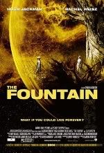
    I know I hinted at it a few weeks ago but I am here today that the entry gates are now open for a new contest (There are some of you who are Lifers at trying to snag something from this Prize Patrol and I admire your shamelss tenacity to get your mittens on something free. Huzzah, good sirs.) and one that I can’t believe I am offering up. It’s not because of the sheer coolness of the prize but since THE FOUNTAIN is easily in my Top 3 for 2006, it’s damn well in my Top 10 for movies that came out post-2000, I am amazed that I am able to give a couple of you out there the chance to own a hand-signed Darren Aronofsky poster for THE FOUNTAIN.

    I can attest honestly that if I was on the other side of this giveaway I would be stewing in my Jockeys in anxious anticipation to get one but I want to pass along the love to one of you out there who have seen the movie and loved it enough to send in an entry.

    Now, you’ve to work for this win.

    It was damn hard to get these in my possession and I don’t want any of these to go somewhere where they’re not going to be treated with a little love and reverence. I would get too maudlin if I explained why I think that Richard Roeper from the Sun-Times (Thanks for responding so swiftly to my email, Dick.) or A.O. Scott from the New York Times (How witty to be called by a truncated version of your nombre. Do your peeps call you up and say, “Hey, A.O., want to grab a beer with the rest of the crew down at Applebees?” If I was close enough to call you “friend” A.O. would be the last thing on my list to call you and you could be assured I would bust your balls relentlessly of you perpetrating this ruse on others.) are both completely wrong regarding what they thought THE FOUNTAIN was, or was not, in their eyes. They are certainly entitled to their opinion but they’re wrong on this one.

    Give me an Etch-A-Sketch, a Texas Instruments TI-81 graphing calculator, 10 minutes on Ebert and Roeper to make my case, a fruit smoothie just to keep me hydrated and I can break this movie down to a compelling enough defense as to why A.O. and Roep just missed the mark with their jaunty rip-fest into this deep movie.

    Look, I won’t get into why I love this film as much as I do and why I weep for those reviewers who think that Aronofsky is anything less than genuine and earnest but I feel completely stable in my assertions regarding how important this film is to anyone who wants a second opinion about what death, life and love are all about in a way that accessible. All I know is that I’ve got a couple of posters to give out that Darren graciously signed when he was out here in God’s country, Arizona, and I want to give them to you.

    All you need to do is tell me one scene that you enjoyed, just one, and make sure it isn’t anything you could pick up simply by watching the trailer. If in doubt, check here or here and be sure to check your work.

    Just tell me a scene and give a little context. If the film meant anything to you, you’ll write something that justifies why you’re angling to slap this on your wall. This contest is open to the world so come one, come all.

    A.O. and Roeper can suck it.

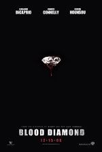
    BLOOD DIAMOND (2006)

    Director: Ed Zwick
    Cast:
    Leonardo DiCaprio, Djimon Hounsou, Jennifer Connelly, Arnold Vosloo, Michael Sheen, Stephen Collins
    Release: Now Playing
    Synopsis:
    Set against the backdrop of civil war and chaos in 1990s Sierra Leone, Blood Diamond is the story of Danny Archer (Leonardo DiCaprio), a South African mercenary, and Solomon Vandy (Djimon Hounsou), a Mende fisherman. Both men are African, but their histories as different as any can be, until their fates become joined in a common quest to recover a rare pink diamond that can transform their lives. While in prison for smuggling, Archer learns that Solomon – who was taken from his family and forced to work in the diamond fields – has found and hidden the extraordinary rough stone. With the help of Maddy Bowen (Jennifer Connelly), an American journalist whose idealism is tempered by a deepening connection with Archer, the two men embark on a trek through rebel territory – a journey that could save Solomon’s family and give Archer the second chance he thought he would never have.

    View Trailer:
    * Large (QuickTime)

    Prognosis: Negative. Ed Zwick doesn’t have to explain anything but did he really want me to believe that Tom Cruise pulled a move straight from Kevin Costner in DANCES WITH WOLVES and dodged the gauntlet of bullets that rained down straight at his person? It was that move that nearly obliterated any disbelief I was suspending for THE LAST SAMURAI.

    I’m hoping that we don’t get a repeat performance of this moviemaking crutch and, from this trailer, I see the same kind of hopefulness that hooked me into SAMURAI. It’s gorgeous to look at and I think this trailer really exemplifies the kind of selling to a mass market in a way that, while there’s nothing “edgy” or “borderline” about the advertisement at all, does what it is supposed to do: be accessible.

    Now, I get a little pang in the heart as the opening reveals a little JURASSIC PARK goodness as a helicopter weaves itself between a lush green canyon but it’s Djimon (why do I always think of a spicy mustard when I see his name?) who really captures our attention in a moment that just propels the events of the movie forward. His black palm holding a muddy stone and the really “dramatic,” read here: obnoxious, voiceover that tells us that people kill each other for these things.

    I laugh just a little on the inside when the first shots of Leo and Jennifer are in slow-motion, their faces perfectly sharpened in that I’m-trying-to-look-scared/strong-here-people, kind of way but it’s ok. Even though, yes, the precious stone trade in developing nations is stained with the very real blood, sweat and tears of, essentially, serfs who are enslaved by their poverty and that this movie won’t make this situation any better but the imagery here is undeniable.

    And this is about the time when Leo opens his mouth. It’s accented. I wish I could say that I am trying to concentrate on the story but I just can’t get past it. It’s funny, people. Really, it is. I’m already more partial to Djimon’s plotline of having to liberate his family from the clutches of marauders who know he has the gem which they want. I am at a loss to try and see how Jennifer wants to insinuate herself into this movie as Leo gets that she’s using him for some nefarious reason of her own, Leo using Djimon for the obvious reason of wanting the stone, it’s like RAIN MAN all over again, but there’s a real reason why I am so high on this movie.

    Arnold Vosloo.

    “I don’t give a damn who’s down there”¦kill them all.

    A real South African by birth and a bad-ass by trade Arnold really deserves more than he’s given and, thankfully, as he’s precariously perched on the open doorway of a fast moving helicopter with some sweet armament attached to it I feel like this is, really, the true sequel to HARD TARGET. I mean, come on, you’ve got the obligatory romance between a dude and a lady, toss in Djimon as the wild card, while savages are hot their heels to kill them and Arnold is really all you need here to seal the deal. Just disregard all the talk at the end of this trailer about a man on the hunt for his child; this movie should be called HARD TARGET II and this trailer hints about Arnold catching up and, hopefully, finally getting the kill that eluded him so many years ago in that Van Damme entry.
    One can hope.

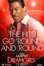
    DREAMGIRLS (2006)

    Director: Bill Condon
    Cast: Beyoncé Knowles, Jamie Foxx, Eddie Murphy, Danny Glover, Jennifer Hudson, Keith Robinson, Hinton Battle, Sharon Leal, Anika Noni Rose
    Release: December 21, 2006
    Synopsis: Set in the turbulent late 1960s and early “˜70s, DREAMGIRLS follows the rise of a trio of women: Effie (Hudson), Deena (Beyoncé) and Lorrell (Anika Noni Rose), who have formed a promising girl group called The Dreamettes. At a talent competition, they are discovered by an ambitious manager named Curtis Taylor, Jr. (Foxx), who offers them the opportunity of a lifetime: to become the back-up singers for headliner James “Thunder” Early (Murphy). Curtis gradually takes control of the girls’ look and sound, eventually giving them their own shot in the spotlight as The Dreams. That spotlight, however, begins to narrow in on Deena, finally pushing the less attractive Effie out altogether. Though the Dreams become a cross-over phenomenon, they soon realize that the cost of fame and fortune may be higher than they ever imagined.

    View Trailer:
    * Large (QuickTime)

    Prognosis: Negative. At first I thought it was a joke.

    I asked the questions: Are they serious? Is this really a movie?

    When I heard some of the singing that Eddie Murphy is supposed to be doing I was reminded, no joke intended, of his James Brown impersonation back when he used to be funny. I wasn’t quite sure, but I thought I was pretty close in assuming it to be so, if I should have been anticipating a comedy when the hubbub started swirling around this movie. I am sorry that I was wrong about the assumptive power of a hokey Eddie Murphy that appears to be completely serious and I apologize when I say in advance that this trailer does a crap job in debunking the lingering thoughts that this film is a comedy.

    The laughs really begin when Beyonce graces us with her screen suckage ability as she treats us to her dizzying capabilities as an actress when she asks the question of how long the girl group to which she belongs, I wonder if her screen mother makes all of her own outfits in this film as well, has been together. I’m a bigger fan of the cowbell that’s clanking in the background, sounding like we’re going to get a rousing version of “Everyone’s Working For The Weekend”, but all we get is a line straight of MY COUSIN VINNY when Jamie Foxx says “If I’m lyin’ I’m dyin’” to Beyonce’s amazement that she’s being given a big break. I really don’t know if I should be containing my laughs or not but this exactly when Eddie screams, “1, 2, HIT ME!” It’s amusing.

    But that’s also the thing that plagues this trailer: Eddie’s singing is the soundtrack of the action that populates its content. I dare any of you not to smile when you see that guy with his pompadour all Jheri curled and that obnoxious smile of his; one really doesn’t know whether this is supposed to be an exaggerated, ironic emblem for men of that era who were the front for bands like this or whether this is supposed to be played straight.

    That said, then, I can tell you that between Beyonce’s plasticine smile, looking like it was shaped by some Geppetto-like doll maker, and Eddie’s prancing and preening on the stage I don’t really care about any of these characters. There simply isn’t any reason why I am emotionally drawn in by whatever story is trying to be constructed around these two titular actors.

    Oh, and this makes me just have a mental meltdown, I forgot to mention one thing about the thrust of this film’s action that we’re let in on about two-thirds of the way through this trailer: Beyonce, who begins the film as a second-banana, ends up as the girl who becomes the real star and gets all the attention much to the chagrin of her other two friends. What a fucking unbelievable change of events right? Beyonce becomes the star of a three person vocal group and somehow has to learn how to deal with her newfound glory. I mean, seriously, how this plot wasn’t ripped from the Behind the Music story of Destiny’s Child’s rise and fall as a crap pop group is beyond me.
    Just skip the rest of this trailer because all we get is a montage of what happens in so many other videos, No Doubt’s “Don’t Speak” come to mind rather fast in this regard, when one person gets more attention than someone else. It’s clichéd, hackneyed and I am sure someone will hail it as this year’s Oscar shoe-in. God help us all.

    ERAGON (2006)

    Director: Stefen Fangmeier
    Cast:
    Jeremy Irons, Robert Carlyle, Djimon Hounsou, Sienna Guillory, Ed Speleers, John Malkovich
    Release: December 15, 2006
    Synopsis: Based on the Christopher Paolini-penned bestselling fantasy novel about a youth whose discovery of a dragon egg leads him to become a knight and battle an evil king. The medieval-set tale revolves around a farm boy who learns he is the last of a breed of benevolent Dragon Riders, whose magical powers derived from their bond with the beasts.

    View Trailer:
    * Large (QuickTime)

    Prognosis: I Liked It More When It Was Called LORD OF THE RINGS. Just stop for one second.

    If you could, please, keep these things in mind before viewing this trailer: 1) THE LORD OF THR RINGS trilogy proved that movies made in 3’s can be enormously profitable 2) Studios love to steal 3) New Line made a shitload, and, yes, in accounting circles it is common parlance to say the word “shitload” when referring to an investment that breaks triple digit percentages when discussing profitability, of money on a franchise that initially only appealed to geeks and those with pale skin and 4) Every child wants what the other kids have; it’s an inevitability that doesn’t stop with the advent of pubes.

    That said, what a rip-off, man.

    Yeah, this seems like a wholly different story than THE LORD OF THE RINGS trilogy but when you see that this flick is being pimped as the first of three, that the photos of this flick show dudes and dames wearing nearly the same leatherwear as their more recognizable doppelgangers you just have to feel that, yes, this movie is going to make some coin.

    I mean, really, when we open the sweeping vistas that we look on, nearly the same as the New Zealand location for Peter Jackson’s hard-fought vision, I stop and wonder how many people will psychologically transfer their happy-happy joy-joy goodness onto this flick simply on looks alone. And, as a lot of you know, many will.

    We get some nice shots of a dragon that dips and dives, I have my breath taken away as I realize this winged beast could replace my favorite winged dragon of all time from THE NEVERENDING STORY, but I digress. I mean, this one doesn’t seem to have any witty or snappy things to say so I think my boy from 1984 has nothing to worry about.

    So, about halfway though this thing I still don’t know what’s going on; we’re shown the replacement for Liv Tyler, we’ve got a stand-in for Saruman, Orlando Bloom is taken care of and we’ve even got the wood and leather strap scaffolding that was indicative of the Fraggle Rock/Orc’s underground operation. Speaking of which, haven’t these people learned how to illuminate a little? I know archetypes demand that bad guys work at night and by fire but can’t any of these people wait until daylight to do their evilness?

    And big ups to Jeremy Irons who obviously didn’t learn a thing from DUNGEONS & DRAGONS as he comes correct once more, he obviously was enamored with the concept, to play the kind of role that Jeremy Irons plays so well again and again.
    If I was the guy who lobbed this to Fox this would have been the 10 second meeting that would’ve secured financing: Mix 1 part LORD OF THE RINGS with 2 parts franchise potential with a splish of REIGN OF FIRE and a splash of SOUND OF MUSIC location. Mix to taste and accent with Jeremy Irons. Boom. Now where’s the financing?

    PERFUME (2006)

    Director: Tom Tykwer
    Cast:
    Dustin Hoffman, Alan Rickman, Rachel Hurd-Wood, Ben Whishaw
    Release: December 27, 2006
    Synopsis: Based on the bestselling novel by Patrick Süskind, PERFUME is a terrifying story of murder and obsession set in 18th-century France. Jean-Baptiste Grenouille has a unique talent for discerning the scents and smells that swirl around him, which he uses to create the world’s finest perfumes. Strangely lacking any scent of his own, he becomes obsessed with capturing the irresistible but elusive aroma of young womanhood. As Grenouille’s obsession turns deadly, twelve young girls are found murdered. Panic breaks out as people rush to protect their daughters, while an unrepentant and unrelenting Grenouille still lacks the final ingredient to complete his quest.

    View Trailer:
    * Large (QuickTime)

    Prognosis: Wonderfully Creepy. We’ve talked about this before.

    I am a huge fan of Marcel Proust’s writings. “Du Côté de chez Swann” is, perhaps, one of those rare novels, like Virginia Woolf’s “Mrs. Dalloway”, where psychology met prose in a wonderful confection of words and experience. One of the key things, then, that links these two authors together with the movie by bad ass Tom Tykwer, dude who slung RUN LOLA RUN into our collective cool film conscious, is that while the two authors proved that you can make a sensory experience translatable through words Tykwer has to prove that a movie about perfume is translatable to film.

    The trailer is promising that he has done it.

    I about shat myself when this trailer opens, the twinkling music very sublime in the background, and we see a little baby on its back. It’s lying there, eyes closed, as some dirty index finger slowly makes its way to the child’s nose. And, before you can figure out what’s happening, the kid grabs the finger and pulls it close to its nose.

    The voiceover here, as well, is calm, soothing and, dare I say it, gentile as we delicately get led down the path of where we are, what is happening and why we should care about the protagonist. Bam, bam, bam, this trailer hits the high points and I am thankful that as we see Tykwer begins showing us how he’s going to translate the sense of smell through visual rendering it is completely enveloping.

    While I am equally pleased to see that the graphic which states this movie is based on a novel weaves its way quickly from recognition to dissolution I am not so sure that showing our main man as a little bit of a freak by his closed eye smelling of the goings-on inside the town square is endearing as it is a little off-putting.

    It’s nice to see Dustin Hoffman as a recognizable face in this production, while the production values seem just as impressive, and the tension that’s created when voiceover guy tells us that it was our protagonist’s work to preserve life within a bottle; it’s poetry, I would posit, in a combination of both sight and sounds.

    This kid’s work, however, takes a turn for the freakish and demonic as he hunts down a woman who seems to embody a lot of what his nose is driving him to capture and big props to the trailer makers for giving us a glimpse of this boy’s turn towards murder when he snaps the neck of some fraulein. Not only that, kids, but he then sticks her in a tank, wrapped up like a tea bag to steep for a while, to try and leech the scent that drove this boy to kill.

    And then, bam, he kills again.
    The kid can’t stop and Hans Gruber himself, Alan Rickman, which details the delicacies of what a serious perfume was capable of in that era, treats us to a delicious voiceover. The visuals that accompany the destructive nature of this boy and his prey, a pale redhead that would drove me to kill a few kittens if you know what I mean. Wink, wink, nudge, nudge. While I know this movie is not for a lot of people it managed to stoke my interest for its visual capabilities and riveting premise.

  • Toy Box: Lost – The Action Figures

    toybox.jpg

    Every year there’s a new fall show that takes the world by storm. Every year there’s always at least one, because God knows we don’t want to talk about work when we’re at work, and heaven forbid should be spend any extra time with our families. Two years ago, that show was Lost.

    Although it’s had its ups and downs over the course of two and a quarter seasons so far, the show remains strong both in the ratings and in its fanbase. Mcfarlane Toys picked up the license last summer with much hoopla to do action figures based on the show, starting with a wave of six this fall. While they were officially released in a big signing party at the Toys R Us in Times Square over a month ago, they’ve just now started to make it out in numbers to stores across the country and online.

    The first wave consists of Jack, Hurley, Locke (all three reviewed here today), Charlie, Shannon and Kate (all three reviewed over at MROTW later today). Each figure includes a diorama style base, a ‘prop replica’ from the show, and a talking feature, allowing you to play several key lines for each character from the first season. These are all very much first season based, although the appearance of the characters hasn’t altered a whole lot during the course of the show.

    If you have any questions or comments, drop me a line at mwc@mwctoys.com. Now buckle in for a long ride – there’s lots to say about this series!

    “Lost – Jack, Locke and Hurley”

    While some of the character choices for this first wave might be questionable (Shannon?!?!?), there’s no doubt that Jack, Hurley and Locke are at the top of everyone’s list.

    Hurley is depicted from the episode in which they played the first “Island Open”, using the golf clubs they recovered to pass the time.

    toybox_121206_1c.jpg

    Jack is straight from the very first episode, walking through the rubble of the plane on the beach, still in shock at what has happened.

    toybox_121206_1b.jpg

    And then there is Locke, from much later in the season, standing over the newly discovered hatch that will play such a critical role both in his character’s life and in the lives of the entire group of survivors.

    toybox_121206_1a.jpg

    You can find these at a number of online stores (links at the end of the review, as usual), or you can find them at your local Toys R Us for around $15 a pop. For the full set, that’s a whopping $90 out of the old budget (not including tax), and that’s about the cheapest you’ll find them.

    Packaging – **
    This packaging could have been four star work, with just a couple minor alterations. Even with my nits, it’s still pretty damn well done.

    toybox_121206_2.jpg

    These figures are boxed instead of carded, a big plus. They’re easy to store for the MOCers, but to open them you will have to destroy the box. The top flap is glued shut, which is too bad because once inside, there’s only a couple twisties and some tape. You could easily put everything back for storage if it weren’t for the taped flap. You can try opening them from the bottom, where the flaps are folded together without tape or glue, but I couldn’t manage to open them without tearing the thin package.

    The graphics and text are great though, and to the right of each figure is a flap that opens up to give you some more details. My big nit with this packaging that pulls it down at least a half star is the lack of any instructions. The dioramas are actually tricky to get together (I have a little visual how to later in the review), and for some, like Jack, it will take a few minutes to figure out how to get everything in the right place. It would have been very easy – and very inexpensive – to give us a small insert that had basic visual instructions on how to get at least the cardboard backer frame together and in place.

    The big drop in the score here is due to the lack of instructions. Without them, I (and many other buyers) had no idea that the voice boxes actually attached to the bases, and wasted time I didn’t need to on assembling the frames.

    Sculpting – Locke ****; Hurley, Jack ***1/2
    Scanning is all the rage these days, and Mcfarlane uses the process quite heavily. However, the key to getting tremendous results out of scanning is to have sculptors that can give the results life. Without that step, scanning produces zombie versions of the characters.

    toybox_121206_3b.jpg

    I’m happy to say there’s no zombies here, and Locke is the clear winner of the entire series. The head sculpt is almost spooky it’s so accurate, and the detail work on the body is up to the very best of Mcfarlane standards. I could pick at it a bit and mention that the neck seems a little thin, making the sculpt not quite dead on, but it’s a very, very minor nit. This final figure turned out very much like the original pre-production two up, which is a very good thing.

    Jack’s up next, and while he doesn’t quite live up to the expectations set by Locke, he’s still a solid effort. Jack’s face doesn’t have quite as much ‘character’ as Locke or Charlie, making it more difficult to capture the character and set him apart from just another guy. The short hair and stubby beard, usually very difficult to do, are nicely depicted, and the details in the dirty suit and flopping tie give the impression of movement without being overdone. I’m not a huge fan of the open mouth expression, and the lower half of the face is a squidge wider and longer than the actor, but it’s certainly close enough to warrant a well above average score. The two up we saw of Jack last summer was much better, but I think this is due in no small part to his front teeth. You see, in the two up they were clearly visible – the scale made that possible. They’re still here of course, but you have to really search for them, and not seeing them makes the open mouthed expression seem a bit odd.

    toybox_121206_3a.jpg

    Likewise, Hurley came out extremely well. From other photos I’ve seen, I was most concerned about how the final Hurley would turn out, but in person he’s great. The expression is perfect, as is the sculpted stance – which is a good thing since you won’t be changing it. The huge puff of hair looks a little weird in plastic form, but it does approximate his hair style as best as you’re going to get in this medium. The small details are perfect, right down to the proper folding and wrinkling of his shirt and jeans.

    toybox_121206_3c.jpg

    One of the things worth noting here is that the proportions are excellent all around. Heads, torsos and limbs are all properly in scale with one another, and even from character to character, scale is great. These are done in a general 6″ scale.

    Paint – Hurley, Jack ****; Locke ***
    Mcfarlane excels at paint application, and this set of three is generally in line with their usual quality. Locke is the only one to have issues, and I’m betting that it’s a hit or miss sort of problem.

    toybox_121206_4a.jpg

    My Locke has a rather odd looking ‘hair line’ across his bald pate. It appears as though they were trying to use a slightly darker paint on his head, but the hair line across the front on mine makes some odd dips and turns, and looks more like a mistaken application. However, other than that, Locke is excellent. The face details are clean and neat, the dirtied up clothing have just the right amount of wash, and clothing details like buckles and zippers, are done with tremendous realism.

    Jack’s outfit doesn’t have the opportunity to show off the detail work quite like Locke’s does, but it still has some amazing work on the tie, and features very realistic dirt on the elbows and knees. In fact, Locke, Charlie and Jack all sport some of the most realistic dirt effects I’ve ever seen in figures this scale. Poor Kate doesn’t fair as well, but more about that in the other review.

    toybox_121206_4b.jpg

    Jack has some nice work on his face as well, where the scratchs are present, and the beard and hairline are extremely clean and neat.

    Hurley has the same excellent work on his hair and beard, and even has some extra itty bitty eyebrow hairs running between the two defined eyebrows. These are such a small detail that they are almost impossible to see with the nekkid eye. Hurley has some dry brushing added to his shirt to imply wear and bring out the details, and it’s not over done or excessive.

    With the one exception of Locke’s weird hair line on my figure, these are all excellent examples of the sculpt being complemented and even improved by the paint application.

    Articulation – Locke, Jack *1/2; Hurley *
    This is one of those categories that will matter quite a bit to some folks – for me, this score will have little effect on the overall. Why? Because with this line, I’m giving it very little weight. It’s important to score it, so that people picking them up understand what they are getting, but once you understand, if the product fulfills you’re expectation, then the lack of articulation won’t effect your personal overall. If you’re looking for lots of articulation though, and expect that in all your figures, then these will do much worse in your final assessment.

    Each of these figures has only the most basic of articulation. Hurley has a cut waist, cut neck (technically, there’s probably a ball down in the torso, but you’re only going to be able to turn the head from side to side, and even then only a little bit due to the hair), and cut right arm at the sleeve. He poses one way, and one way only.

    Jack has more articulation, but what’s here is pretty much worthless. Again he has a cut neck, although the range of movement is a little better since he doesn’t have Hurley’s long hair. He has cut shoulders, but are you ever going to raise the stiff arms? And he has cut wrists, but like the shoulders, they’re here only to get the hands in just the right spot and leave them. Oh, and he has a cut waist too, but it’s restricted by the coat and shirt. Again, he’s a plastic statue that holds one pose extremely well.

    Finally, there’s Locke. Locke sports a ball jointed neck (again, the all probably do, but the others are completely restricted by the clothing, making them really cut joints), and he can move his head forward and back, and tilt side to side. He can’t move his head back far enough though, due to the collar of his shirt, so he’s always going to be looking downward at least somewhat. I really do wish he could look straight forward, but it’s not going to happen. He has cut joints at the elbows, and a cut waist as well.

    Accessories – Locke, Jack ***; Hurley **1/2
    Each of the figures come with an assortment of extras, although most of them fall far short of exciting.

    They all have diorama bases, which are generally the best feature in this category. Locke goes a step further though, and includes a nifty water bottle (with air pocket mid-way in the bottle, just like it would be if it were being carried on an angle!), and one of his trademark knives. Both of these accessories fit nicely in his hands, and are a key part of the overall appearance.

    toybox_121206_6a.jpg

    His base depicts the hatch, or at least the small section of it first uncovered. There’s a cardboard background depicting the jungle, which you may decide to use or not – see below for some photos without. More about the cardboard backgrounds and the assembly of the frames in a minute.

    Jack has a very detailed base, including several extra pieces which you need to assemble. These extra pieces are made from fairly sturdy plastic, so wilt is unlikely, and are designed to fit in certain holes only. Still, those instructions we didn’t get would have been nice. He also suffers from a backdrop that’s shorter than he is, since the base puts him up further in the air than either Locke or Hurley. Jack’s diorama is his only extra, but with the additional pieces, it makes up for any shortcoming compared to Locke.

    toybox_121206_6b.jpg

    Hurley’s base is the least interesting of the set. The bottom is basically sculpted grass, with a hole for the bottom of the flag. The cardboard background shows the mountain and sky, with a lot of open grass. While the flag is well done, it’s not quite the visual “oooo” as either Jack or Locke’s base. On top of that, I was never able to get Hurley’s feet to fit properly into the sculpted footprints and pegs. While every one of the figures took a lot of effort to get on the base, Hurley was the only one that never did match up properly. The legs need to be just a bit further apart, and because his are so thick and made from such solid plastic, bending them out to fit just wasn’t going to happen.

    Before we get to the other accessories (each figure also comes with a “full scale replica” from the show, as proclaimed by the box), let’s talk a bit about the backgrounds. I had to enlist the help of Spidey to get these things together. You’ll find seven parts altogether – the sheet of cardboard, two small pins (which are actually inserted into a cross beam already in the package and have to be removed), two side beams, a top beam and a bottom beam. Let’s use Jack’s background as our example:

    toybox_121206_7a.jpg

    The larger curved cross beam is the bottom, the smaller is the top. While not all the characters have curved beams (Shannon and Charlie’s are straight), they all go together the same way. The peg on each side beam inserts into the top support, and the bottom support has a peg that inserts into each side beam. Once you have the four support pieces together, the frame should look like so:

    toybox_121206_7b.jpg

    Then all you need to do is attach the backer to the frame with the two included pegs. The final product will look like the next photo, and can then be attached to the back of the display base.

    toybox_121206_7c.jpg

    And there you have it! Now, I realize this doesn’t require a degree in engineering to figure out, but I have one and it took me about 10 minutes, and Spider-man’s help. That’s ten minutes I could have saved with just a simple little diagram included in the box. And now I owe Spider-man one, and you know what a pain in the ass he can be.

    There’s another question here – should you even use the cardboard backdrops? Please note that once you’ve snapped the frame on the base, you may have an extremely tough time getting it off, depending on how much paint ended up on the pegs, so it’s a good idea to consider this first. Some folks prefer to go without, and I’ve included the next three photos of the figures without to give you a feel for how they look sans backgrounds.

    One other point to note on the backdrops that you may have noticed in the photos. Unlike the prototypes, that had a frame across the top of the backer, these use two black plastic pins to attach them at the top to the frame in back. That means back drops light in color have two glaring black spots in obvious spots. For a character like Hurley, for example, where the black peg rests squarely in the middle of the sky, it’s a tad annoying.

    toybox_121206_5a.jpg
    toybox_121206_5b.jpg
    toybox_121206_5c.jpg

    Now let’s talk “full scale replicas”. To be honest, this is the first time ever that I have dropped an accessory score because of the INCLUSION of an accessory. Normally, more is always better – not this time.

    On paper, the idea of adding in replicas of key props for each character sounds good. It also makes it sound like the higher than average price for these is warranted. And then you see them. Now, this score is going to be a little better for Kate and Charlie, two characters who actually got decent props. In fact, I’m betting this whole idea started with someone saying “hey, we need to include the airplane for Kate in actual size!”, and everyone agreeing that yes, that sounds cool. Unfortunately, the next person came up with the bad idea “Let’s do that for all of them!”

    The reason this is a bad idea is quite simple – almost none of the characters have actually interesting or useful props to be included. These three are perfect examples. Jack comes with a folded 8 1/2 x 11″ piece of paper that looks like it just came out of the fax, with Kate’s mug shot. Locke and Hurley’s are a little better, since they’re at least two sided and in color – Locke has his ‘walkabout’ brochure, with almost no information on it, and Hurley has the lottery ticket with the numbers on one side, and almost all other text in gibberish and such a tiny font it would be unreadable anyway. These are cheap little pieces of paper, folded up (in the case of Kate’s sheet and the brochure) so that even framing them to display is out of the question. These things don’t cost pennies to include – they cost tenths of pennies, and certainly do not warrant or justify the high prices of the figures. You might keep the lottery ticket around, but the other two are going to get tossed aside by even hardcore fans.

    toybox_121206_10.jpg

    Talking Feature – ***
    To go along with the silly replicas, there’s a silly talking feature. Now, talking features in general aren’t silly, and sometimes – in the case of shows like the Simpsons, Futurama, horror films – they can really add quite a bit to the overall value and fun of action figures. Unfortunately, Lost isn’t one of the licenses where it really makes sense.

    While the dialog on Lost is extremely well written (most of the time), it’s not particularly iconic. There are no lines that are repeated at the water cooler the next day, or even more importantly, three years after they’ve been uttered on the show. But had the feature been implemented well, even this lack of iconic statue wouldn’t have been a huge detraction.

    Nope, it’s the way a feature that’s already not particularly exciting was implemented that kills it. Rather than being integrated with the diorama in any way, it’s been done as a separate black box, about 3.5 inches square. Pop in your own batteries (no, your $15 – $20 a figure doesn’t get you any cheap AAA batteries) and press a button on top, and it runs through three or four lines from the show. EDIT: Guess what? They DO attach to the bases, in a rather unobvious way. There are two small pegs on the back of each frame, and the underside of the boxes have holes that allow you to attach the box there. After finding this out (thanks to a smarter reader than I), I actually upped the score in this category across the board. However, the general idea of having the talking feature with a dramatic show is still weak, especially considering the additional cost.

    toybox_121206_8.jpg

    The lines are:

    Locke:
    “I’ve looked into the eye of this island, and what I saw… was beautiful.”
    “Don’t ever tell me what I can’t do! Ever!”
    “Do you want to know a secret?”

    Jack:
    “If we can’t live together, we’re going to die alone.”
    “Everybody wants me to be a leader, until I make a decision that they don’t like.”
    “There’s something that you need to know… We’re going to have a Locke problem, and I have to know that you’ve got my back.”

    Hurley:
    “Dude… I’m starving… I’m nowhere near that hungry.”
    “Stop! Wait! The numbers are bad!”
    “Welcome, to the first… and hopefully last… Island Open.”
    He was also orginally supposed to say “You got some… Arzt… on you.”, but that line has been dropped. Too bad, since that was my favorite of the bunch.

    The speakers are fairly clear, and most of the lines are intelligible. All of the boxes are identical, so you’ll need batteries in them to tell them apart. All in all, underwhelming is a good word to describe them. The only upside to having the voice boxes as wholly seperate entities is that it makes it all that much easier to drop the idea from future assortments.

    Fun Factor – *1/2
    While they might be called Mcfarlane “Toys”, these are clearly not toys. These are inexpensive pop culture statues, designed for the adult fan to display at home or work. Now, this score is going to have no bearing on my personal overall, because I knew this going in and didn’t expect anything different, but if you’re looking for super poseable action figures, these aren’t you’re thing.

    Value – **
    These are going to cost you at least $16 a piece on the cheap side, and that’s too much for a mass market release, even of something that’s really a specialty market toy. The addition of the talking feature and ‘prop replicas’ clearly gave them the option to drive up the price from the usual $10 – $12, but both of these features are uppercase lame. Since most fans are going to want sets (with perhaps the exception of Shannon), they’re looking at a $100 investment, no small potatos.

    Things to Watch Out For –
    If you’re picking them out at TRU, you should watch the paint application, although I’m betting my problem with Locke is a fluke. Generally, Mcfarlane is quite consistent with the quality of paint work.

    Overall – Locke ***1/2; Hurley, Jack ***
    Had they dropped the talking feature and the props, and therefore dropped the price accordingly, these guys would have rated another half star higher across the board. In fact, had they done that, this line could have easily been in contention for one of the best of the year. Unfortunatley, this was definitely a case of more is less.

    toybox_121206_9.jpg

    Mcfarlane has also just released a boxed set of the Hatch, with mini-figures (about 2″ tall) of Kate, Hurley, Lock and Jack. It runs around $30, and you can see a photo here from my SDCC coverage.

    The next line up as been announced as Sun, Jin, Ecko, Desmond, Sayid, and Sawyer, and is due out next May.

    Scoring Recap:
    Packaging – ***
    Sculpt – Locke ****; Jack, Hurley ***
    Paint – Jack, Hurley ****; Locke ***
    Articulation – Locke, Jack *1/2; Hurley *
    Accessories – Locke **1/2; Hurley, Jack **
    Talking Feature – ***
    Fun Factor – *1/2
    Value – **
    Overall – Locke ***1/2; Hurley, Jack ***

    Where to Buy –
    I’m assuming some other brick and mortar retailers will eventually get these in, but right now Toys R Us is the place to find them locally. Online options include:

    Amazing Toyz has the singles for $15 – $17, but are selling out fast. The full set is $80. They also have preorders up for wave 2.

    CornerStoreComics has the set at $85, and the singles for 415 – $17 as well, along with series 2 pre-orders.

    Alter Ego Comics has them for $16 each.

    Killer Toys has the set of six for $83.

    Clark Toys has the singles for $17, the set for $85, or a case of 12 for $155. They also have preorders already up for series 2.

    Time and Space Toys has the set for $95, plus they carry the cool Lost puzzles.

    Related Links:
    Obviously, you’ll want to check out my review of the other three figures, Shannon, Kate and Charlie, but don’t forget there’s also the very cool Lost puzzles that I reviewed here a few weeks ago.

  • Comics in Context #157: Our Nation’s Cartoons

    comicsincontext4.jpg

    cic2006-12-08.jpgFrom its founding right through the end of the twentieth century, The New York Times would not run comics and did not even employ an editorial cartoonist. Presumably the Times considered comics and cartoons too déclassé for a serious, proper newspaper like itself, in contrast to its tabloid competition. The flagrant exception to the Times‘ rule were Al Hirschfeld’s caricatures of Broadway and Hollywood performers in the Arts and Leisure Section, but Hirschfeld reportedly considered himself an “illustrator,” not a “cartoonist.” In the School of Visual Arts’ current Jules Feiffer retrospective, there is a comics page that Feiffer did for The New York Times Sunday Magazine in 1974 that is satirically presented as the kind of comics the Times would run if it ran comics: titled “Hodgkins of State,” it is an (intentionally) deadly dull policy discussion by two members of the foreign service.

    But now look at this year’s annual Holiday Books issue of The New York Times Book Review (Dec. 3, 2006). On the list of the “100 Notable Books of the Year” is Alison Bechtel’s Fun Home: A Family Tragicomic, which the Times helpfully classifies as a “graphic memoir,” solving the problem of what to call a book in the graphic novel format that deals in nonfictional autobiography. Ivan Brunetti’s An Anthology of Graphic Fiction, Cartoons, and True Stories, including work by Daniel Clowes, Robert Crumb, Art Spiegelman, and Chris Ware, receives a review that takes up two entire pages. (The “Speak: Nine Cartoonists” exhibition in New York City earlier this year served as a preview of this book. See “Comics in Context” #122.) The author of this review, David Hadju, writes that “If anyone really qualifies as the voice of the current literary generation, he or she could well be using the language of cartoons, captions and word balloons.” There is a “Holiday” roundup review headed “comics,” covering Will Eisner’s New York: Life in the Big City, Marjane Satrapi’s Chicken with Plums, and a new volume of George Herriman’s Krazy & Ignatz, among others, written by Douglas Wolk, one of my colleagues at Publishers Weekly’s Comics Week. (It is a pleasure to see the Times assign a comics review to someone who actually has a background in writing about the medium.) Another “Holiday” roundup, on “Drawings,” includes not only a collection of the work of Saul Steinberg, who long ago was welcomed into the precincts of high art, but also caricaturist Drew Friedman’s book Old Jewish Comedians, and a book called The Sweeter Side of R. Crumb, which, by Crumb’s own description, contains “adorable, heartwarming, and lovingly rendered drawings.” This makes me think of the “lovingly rendered” drawings of women I was surprised to find in the Crumb section of the “Masters of American Comics” exhibit (see last week’s column). Scott McCloud classifies Crumb as an Iconoclast, who strives to convey truth about life rather than artistic craft and beauty; perhaps this book shows not just the sweeter but the Classicist side of Crumb. This Holiday Books edition also includes reviews of Neil Gabler’s massive new biography of Walt Disney (about which I will have more to say next week) and Linda H. Davis’s biography of Charles Addams. There’s even a critique of a book called Presidential Doodles: Two Centuries of Scribbles, Scratches, Squiggles and Scrawls from the Oval Office. And meanwhile the Times continues to run a weekly comic by Seth in its Sunday magazine section.

    A decade ago the Times would have run reviews of biographies of Disney and Addams. Regardless of whether or not one admires his work, Disney is recognized as a major figure in American popular culture. Moreover, back in the twentieth century some forms of comics and cartoon art had more cultural respectability than others. One of those categories was the cartoons in The New Yorker, including those by Addams, who donated his artwork to the New York Public Library, which for years has been displaying them in their own gallery (see “Comics in Context” #72). Even when I was a child my local library in a Boston suburb carried book collections of editorial cartoons (including those by Herblock), histories of newspaper comic strips, a 1940 coffee table book about the making of Disney’s Fantasia, and even some collections of comic strips, notably Walt Kelly’s Pogo, whose political satire won it cultural respectability, as Doonesbury would receive later.

    Still, the considerable amount of space that this year’s Holiday Books issue of the Times Book Review devotes to comic and cartoon art is mightily impressive. In his review of Brunetti’s anthology, Hajdu writes that “Among the events that helped establish jazz as a serious art was the concert “˜From Spirituals to Swing,’ staged at Carnegie Hall in 1932,” which “brought together an eclectic array of African-American musicians. . . in the same hall famous for presenting Stokowski, Toscanini, and their high-toned like.” Hajdu believes that Brunetti’s book serve the same purpose for comics. To my mind, Yale University Press’s publication of the Brunetti book is merely one of a number of events in 2006 that mark the comics medium’s transition into cultural respectability. This issue of the Times Book Review is another, and “Masters of American Comics” may be the foremost.

    It’s not just the museums and galleries of New York City that have been celebrating the comics medium this year. The Friday after Thanksgiving I made a day trip down to Washington D. C. to visit the Library of Congress to see its current exhibition “Cartoon America: Highlights from the Art Wood Collection of Cartoon and Caricature,” which runs through January 27, 2007. In connection with the show, Harry N. Abrams has published the book Cartoon America: Comic Art in the Library of Congress, edited by Harry Katz, the former head curator of the Library’s Prints and Photographs division, which includes original cartoon artwork. The Abrams book has a format similar to that of Yale University Press’s Masters of American Comics catalogue; there is a long essay about the history of comics, in this case by Katz, followed by an array of essays, mostly about individual artists, by an extraordinary lineup of contributors. Whereas the Masters book was a catalogue of the show of the same name, the Cartoon America book does not limit itself to examples of the Wood collection on display, but deals with the Library’s entire range of holdings in original cartoon and comics art.

    The book jacket for Cartoon America features a knockout illustration by Richard Williams (not the animator of the same name), showing Mount Rushmore redone with the faces of Charlie Brown, Ignatz, Bill Griffith’s Zippy the Pinhead, and Popeye; the original art is included in the exhibition. It’s a gag kidding the elevation of American comics and cartoons into the realm of serious art, but that elevation is real. The introductory wall text for the exhibit, by its co-curators Sara W. Duke and Martha H. Kennedy, reprinted in its brochure, declares that “The Art Wood Collection of Cartoon and Caricature. . .is a jewel among the Library’s special collections. . . .”

    But, enjoyable as Williams’ redesign of Mount Rushmore is, do Charlie Brown, Ignatz, Zippy and Popeye really convey the full range of American “comic art”? Something seems missing.

    In the foreword to the Cartoon America book, James H. Billington, the Librarian of Congress himself, writes that “Few people realize that the “Library of Congress is home to one of the world’s great collections of original cartoon art.” He explains that “The library began to collect and preserve cartoons and caricatures within decades of its founding in 1800, recognizing their value as vehicles of social and political commentary and as original works of art” (p. 7). This is highly prescient and admirable, although Billington’s description suggests that the Library’s primary interest was in editorial cartooning.

    James Arthur “Art” Wood, Jr. is a longtime editorial cartoonist who was also a major collector of cartoon art, compiling what Billington calls “the most comprehensive private collection of original historical American cartoon art known to exist” (p. 7). In 1995 Wood opened the National Gallery of Caricature and Cartoon Art in Washington, D. C. to exhibit his collection to the public; however, due to lack of funding, it closed merely two years later. (Maybe one of the gallery’s problems was publicity: I had heard about it but was never able to find out where it was.) So, instead, Wood donated his collection to the Library of Congress in 2000, which, according to Katz, “more than doubled the Library’s already outstanding cartoon art holdings. . . “ (p. 13). Billington states that the Library has also recently acquired other “notable collections” in cartoon art besides Wood’s.

    “Cartoon America” is very different from the “Masters of American Comics” exhibition. “Masters” is, as Times critic Holland Cotter put it, a “masterpiece show” (Fri., Nov. 24), dealing solely with fifteen artists whom it presents as the most accomplished practitioners of the medium; the selection of works, the wall texts and, even more so, the catalogue make strong analytic arguments for the visual greatness of the Masters’ works. Though virtually all the works in the “Cartoon America” show merit exhibition, they are not all on such a high level of achievement. For example, the section about comic strips includes an example of Cathy Guisewite’s Cathy, which would be no one’s choice as a miracle of graphic mastery and beauty; its virtues lie elsewhere, in its wit and perceptiveness. (Now here’s a prime example of McCloud’s Iconoclast school.) The curators included an example of Bil Keane’s The Family Circus, which is infamously banal as both writing and art; I could only justify that on historical and sentimental grounds.

    Whereas “Masters” narrowed its focus to little more than a dozen cartoonists, “Cartoon America” seems to aim for a more encyclopedic approach to American cartoon art. Billington writes of Wood, “Over time he compiled an extraordinary collection encompassing virtually every aspect of the genre and every era of our nation’s history” (p. 7). (By “genre” Billington means presumably means “medium,” though his choice of words may be revealing.) In the brochure Duke and Kennedy write that the 102 original artworks in their show reveal “the vitality of an innovative and evolving art form that includes political illustrations, gag cartoons, comic strips, illustrations, animation, and caricature.” Something big still seems to be missing from this encyclopedic survey, though, as we shall see.

    Not having been to Washington D. C. since the last century (i. e., 1999), I was looking out for changes, but found few. Well, there was that colossal new building across the Mall from the East Building of the National Gallery of Art; that turned out to be the new National Museum of the American Indian. Just as surprising were the new traffic lights. When the “walk” signal goes on, a lower screen displays numbers that steadily count down towards zero; then the flashing red signal turns on, and another countdown begins, indicating how many seconds are left till the light turns solidly red and the traffic recommences. This had the effect of making crossing the street seem like an episode of 24: if I didn’t make it across in time, would the street blow up? And the countdowns, in turn, reminded me that this was my first visit to Washington D. C. after the 9/11 attacks. Another reminder was the long, slow security line at the public entrance to the Library of Congress’s Thomas Jefferson Building, complete with metal detector and X-ray machine. So, once I got through security, should I fasten my seat belt and wait for the Jefferson Building to take off? Do they still serve beverages?

    The Jefferson Building is actually a monumental and magnificent Beaux-Arts edifice, whose Great Hall is an astonishing, almost overwhelmingly elaborate visual extravaganza of grand staircases, sculpture, murals of mythological and allegorical figures, and inscriptions about the value of wisdom. The “Cartoon America” show has been given a place of honor, along two opposite sides of the Great Hall.

    I started with the “Animation” section, which not only displays artwork from classic animated films, but also features a video monitor showing corresponding sequences from the actual films.

    Here was a drawing of Winsor McCay’s Gertie the Dinosaur backing away in surprise from a woolly mammoth; Gertie was the first great example of character animation that conveyed personality. This drawing was actually a tracing, made circa 1980, of McCay’s 1914 original.

    Here too was a model sheet for Max and Dave Fleischer’s Betty Boop (see “Comics in Context” #116 and 117), labeled as being from 1932-1934. This looked to me like Betty after the movie industry’s Production Code started being enforced in 1934: her dress, with its high neckline, looked considerably more proper and her trademark garters were gone. Nevertheless, she was still in a minidress: in terms of fashion she was thirty years ahead of her time. Oddly, the video monitor showed the scantily clad pre-code Betty from Boop Oop a Doop (1932), fending off the advances of an obese circus ringmaster.

    A highlight of this section was a “preparatory drawing” from the Fleischers’ Popeye cartoon Females Is Fickle (1940), showing Popeye, like a more combative Jonah, trapped inside a gigantic, semi-transparent jellyfish and punching his way out: this single drawing captured the dynamism of the full animated sequence, shown on the video monitor.

    Here too were cels and watercolors for Disney’s Snow White and the Seven Dwarfs (1937) (pgs. 15, 25), The Sorcerer’s Apprentice from Fantasia (1940) (p. 194), and Dumbo (1940). The most impressive Disney piece was a remarkable pastel for Bambi (1942) done by Tyrus Wong as a concept sketch, showing Bambi’s father, the godlike stag known as the Great Prince, standing between barren trees, atop a rocky crag (p. 191). The trees are in silhouette, the sky is gray, and the enormous rock is cast into deep shadow, but the godlike stag is lit by an aura of light, and seems almost to blend into it, and to glow.

    The only other animation studio represented is MGM’s, through 1940 model sheets for William Hanna and Joseph Barbera’s Tom and Jerry (p. 197). But what about Tex Avery’s great MGM animated shorts, and, for that matter, Warner Brothers’ Looney Tunes and Merrie Melodies? Mickey Mouse is in this show, but not Bugs Bunny; Hanna and Barbera made it in, but not Chuck Jones. And what about UPA and the whole history of American animation since the 1940s? (If you want to pick up where “Cartoon America” leaves off, go to New York City to see “Saturday Morning,” the Museum of Comic and Cartoon Art’s comprehensive current exhibit on television animation.) Wood’s tastes in animation seem to have frozen in 1942, so the Library has a great deal of work to do to catch up in collecting animation art. But no, this isn’t what I mean when I say that something big is missing from the “Cartoon America” show.

    Next came the section designated “Gag & Single Panel Cartoons,” and the examples on display ranged considerably in quality. Particularly interesting was a cartoon by Peter Arno (1904-1968), a “close variant” of which appeared in the September 19, 1936 issue of The New Yorker. It shows a group of apparently prosperous people, one of whom, according to the caption, is saying, “Let’s go to the Trans-Lux and hiss Roosevelt.” So these would be wealthy conservatives, probably Republicans, of the time, who were opposed to Franklin Delano Roosevelt’s New Deal programs to aid the masses who were impoverished by the great Depression. They’re heading to the Trans-Lux, a movie theater in Manhattan, to hiss at FDR when he appears onscreen in a newsreel. I suppose the contemporary equivalent would be cheering Rush Limbaugh or Bill O’Reilly on as they lash into liberals on talk radio or Fox News. The people in this cartoon are obsessed: they’re going to the movies, not to watch the feature film, but to sneer at FDR, who isn’t actually even there. Moreover, weirdly, Arno has placed these middle-aged and elderly characters in costumes, as if they’re going to a masquerade; what’s especially noticeable is that their legs are in tights, which is not particularly age-appropriate. Is the cartoon’s point that these reactionaries are letting go of their inhibitions, both about exposing their physiques and expressing their hatred for FDR? Or that they’re playing at politics like overage children playing dress-up? Is the cartoon even hinting that there’s something decadent about indulging in this petty political meanness?

    Perhaps the ultimate extreme in what Scott McCloud calls the Iconoclast “tribe” of cartoonists is represented by the cartoons of the legendary New Yorker prose humorist James Thurber. In the Cartoon America book another celebrated New Yorker contributor, novelist John Updike, writes an amusing essay titled “Technically Challenged Carefree Ineptitude: James Thurber.” Updike points out that a childhood accident cost Thurber one of his eyes and damaged the other, causing his vision to continue to deteriorate in his adult life. Hence, Updike asserts, Thurber’s “development as a picture maker was arrested at a lively primitivism” (p. 216). Thurber’s limited sight provides a reasonable excuse, although I suppose he may simply have had limited talent as a draftsman regardless of the condition of his eyes. Updike further contends that “some of his best-known cartoons. . .were the product of a carefree ineptitude” (p. 216). He reports that Thurber himself confessed that when he tried to draw a seal astride a rock, the drawing came out looking like a seal inexplicably peering over the headboard of a bed, which proved to be one of his most memorable images (reproduced on pgs. 217 and 221). In other words, Thurber, through his lack of graphic skill, created happy accidents, and his far superior writing ability transformed these graphic lemons into lemonade.

    Even so, Thurber’s ability to visually delineate the emotions of his characters can be no accident. In both the show and the book (p. 220), there is a cartoon, circa 1934, that Thurber drew on lined paper, like that of a schoolboy’s note pad. A bald man, his eyebrows furrowed angrily, his upper teeth bared, stretched menacingly over a nude woman, lying prone in the traditional position of an odalisque in art. The man’s left arm curves, as if it has no elbows, and ends in two visible fingers: it resembles not a human arm, but a serpent with mouth agape. His right arm and hand look more like a wing as if he were a bird of prey hovering over his victim. Nonetheless, Thurber’s childlike drawing style, and the man’s baldness, somehow deprive him of a sense of the menace: it’s something like Elmer Fudd posing as Don Juan. As for the odalisque, her face is rather plain, and she seems not frightened by the stalker but casual and nonchalant. “Oh, Mr. Benholding,” she says, “I never saw that look in your eyes before,” a romantic cliché made laughable by the absurdity of the picture. Updike contends that Thurber’s cartoons “were libidinous to an extent that pushed The New Yorker‘s youthful prudery to its limit” (p. 216). This cartoon is indeed about sex, but the joke lies in the contrast between the intense passion being evoked and the comical, sexless ordinariness of the potential lovers.

    Though Updike refers to Thurber’s “technically challenged style,” he also points out that Thurber was able to use his graphic limitations to genuinely artistic ends: “His more crudely amateurish successors in minimalism demonstrate by contrast how dynamic and expressive, how oddly tender, Thurber’s art was” (p. 220). If Thurber is indeed an Iconoclast cartoonist, he’s an Iconoclast whose style I like, and this, along with Thurber’s comedic vision, is why. Remember that the “Masters” show called Charles Schulz a “minimalist.” Looking at Thurber’s simple figures and the strong, effective facial expressions and body language he gives them, it’s easy to see a connection between Thurber’s cartooning and Schulz’s.

    Next I arrived at the “Comic Strips” section of “Cartoon America,” where several of the Masters reappeared. My favorite piece in the entire exhibition is E. C. Segar’s Sunday, May 12, 1935 page of Thimble Theatre Starring Popeye (which, alas, was not reprinted in the Cartoon America book). Popeye only has a cameo role in this Sunday page, whose strengths are actually more verbal than visual. This Sunday page’s central figure is instead trickster and hamburger obsessive J. Wellington Wimpy. The Popeye animated cartoons, which play down the importance of dialogue, have never done justice to Wimpy; this Sunday page demonstrates what makes him a great character in his own right.

    At the outset Olive remarks to Popeye that “I’ll bet you Wimpy has desert madness–probably raving around saying poetry.” Indeed he is, addressing a desert flower sprouting from a cow’s skull out of a Georgia O’Keeffe painting. Maybe the proper comparison is to Hamlet with Yorick’s skull, for this Sunday page primarily consists of Wimpy’s rhyming soliloquy on his own mortality. “Oh, flower of death. . .so frail, so red/Growing from a thing so dead/Even as I will be quite soon/Merely bones “˜neath sun and moon.” Wimpy’s flowery doggerel is amusing, but he is nonetheless talking about a serious matter that one does not expect to find in a comedy strip like Popeye’s. And Wimpy goes on: “Ah, well/’Tis not for me to break the spell/ That links all things in a mighty plan/That cannot be changed by laws of man.” Now he’s talking not only about the inevitability of death, but about man’s helplessness against fate, and the “mighty plan,” presumably conceived by God, that governs the universe! Yet not even these cosmic concerns can ultimately overrule the dominant passion of Wimpy’s life. He tells the flower that “we both crave meat”; the skull out of which it grows is from the animal that is the source of hamburger meat. The subject of Wimpy’s soliloquy shifts from man’s role in the universe to the hamburger’s role in his diet, and reaching the climax, he finally collapses out of what seems a combination of his frustrated carnivorous passions and his own longwindedness. This is one great strip.

    There was also a brilliant Peanuts Sunday from January 20, 1963 (p. 213). It too takes the form of a soliloquy, but in this case Charles Schulz devises a facial expression for Charlie Brown that reflects each psychological turn he takes in this extended monologue. After the introductory top tier of panels, the strip begins like a musical composition, sounding the theme: “Oh, how I hate these lunch hours!” says Charlie Brown, sitting alone, looking unhappily into his lunch bag. Shunned by the other kids, lunch hours just remind him of how much he is disliked; “During class it doesn’t matter,” he will tell us, presumably because then he is surrounded by other kids and can pretend he’s part of the community. He seems trapped in an endless cycle of unchanging, dreary lunch hours. Even the lunch in the bag offers no surprises that would break the monotony: “Peanut butter again.” Charlie Brown fantasizes about his unattainable ideal, the nameless little red-haired girl he loves from afar, and a moony expression comes over his face. But it abruptly vanished, as Charlie Brown’s own insecurities overwhelm him. He finally succumbs to despair: “Rats! Nobody is ever going to like me.” And he finally walks off, his lunch uneaten, as the composition closes by repeating the initial theme: “Lunch hour is the loneliest hour of the day.” The cartooniness of Schulz’s art style and the small, mundane scale of some of Charlie Brown’s concerns (e. g., peanut butter for lunch) render the sequence humorous, but as my recounting minus pictures should show, this soliloquy is simultaneously quite sad. It’s this balance between the humorous and the heart-rending that characterizes Schulz’s work at its best, as it is here.

    In his essay on Schulz in the Cartoon America book, comics historian Robert C. Harvey makes a point about another balance that Schulz created in Peanuts, which I had noted in a previous column (see “Comics in Context” #66): the opposition between Charlie Brown’s melancholy and Snoopy’s joie de vivre. Harvey puts it particularly well: “against this. . .assessment of the human condition, Schulz balanced the fantasy life of Snoopy, a blithe beagle whose seeming brilliant success at every endeavor reassures us that life is not only about disappointment and endurance. It is also about dreams and the sustaining power of the imagination” (p. 214) Does Charlie Brown represent Schulz as the everyman who endures the mundane sufferings of everyday life, while Snoopy represents Schulz as artist, who finds joy in his own imaginative creations?

    There’s a good example of Winsor McCay’s Dream of the Rarebit Fiend from 1906 in the show, but again, unfortunately, not in the book. A cranky man seated at the end of a trolley informs us that “I always like to sit in the corner of a car; then I don’t have people tramping all over me.” But as one passenger after another enters and sits down, the curmudgeon finds himself wedged into a corner. Then the trolley somehow turns ninety degrees, and the crank finds himself at the bottom of the trolley, being crushed by the weight of the other commuters, whereupon he wakes from his rarebit-induced nightmare.

    The “Cartoon America” McCay work that I most liked, however, is not in the Library of Congress show but in the book. Co-curator Martha Kennedy wrote a brief essay for the Abrams book called “Winsor McCay’s Political Cartoons.” There is a long tradition in editorial cartoons of using symbolic figures, like the Democratic donkey and the Republican elephant which Thomas Nast popularized. McCay went much further with this, creating what Kennedy calls “allegories or parables set in otherworldly, fantastical settings” (p. 148). In my view McCay elevates political and social situations of his time to the level of myth.

    For example, in the first cartoon accompanying her essay, from the 1920s, a man labeled as “Mental and Moral Courage,” who appears to be a giant, looks into the stormy heavens at lightning bolts labeled as “War,” “Depression,” “Calamity,” and “Discouragement” (p. 149). Notice that these menaces include not only external perils (“War”) but also threats to psychological well-being (“Discouragement”). Below this picture is a remarkable tier of five small panels, each showing living creatures violently battling one another: first two scorpions, then two sloths, then two roosters, next two dogs, and finally two human boxers. Kennedy interprets this series as “emphasizing man’s ability to overcome physical, animal passions.” I disagree: I interpret the sequence as contending that humanity is prey to the same aggressive behavior as these vicious lower animals. I suspect McCay means to contrast the battling boxers with his giant of “Mental and Moral Courage,” who he shows quietly observing the lightning bolts, presumably deciding on the best course of action to take, rather than simply charging in with unthinking violence.

    The next cartoon, “Wheels of Industry,” also from the 1920s (p. 150), shows four giants, who dwarf Uncle Sam, the embodiment of America; these titans wear short skirt-like costumes and sandals, making them look like figures out of ancient Greece or Rome. These giants are labeled “Steel,” “Electric Power,” “Ford,” and “General Motors,” and they are pulling some sort of enormous mechanism with a huge wheel labeled “Industry.” Thus the great economic power of early twentieth century America takes on mythic proportions.

    So does its crime. In the architectural fantasy of “City Crime Skyline,” circa 1930 (p. 150), a skyline of skyscrapers includes a brobdingnagian bottle marked “Bootleg Whiskey,” a colossal gun, labeled “Crime,” and a tower that might also be an immense syringe, marked “Dope.”

    In the last cartoon, “Fame, Fortune, Wealth” (p. 151), circa 1928 (significantly, just before the great stock market crash), a veritable ocean of people surrounds a dinosaur-sized pig, who is draped with jewelry, and labeled “Fortune Wealth.” Kennedy correctly observes that “the pig alludes to the sin of gluttony and biblical admonitions against the worship of idols and false gods.” The gargantuan hog reminds me of the gigantic beasts of sword-and-sorcery tales. It’s also like Richard Wagner’s dragon Fafnir and other such creatures that obsessively guard treasures, literal monsters embodying greed. But McCay pointedly makes his beast no awe-inspiring dragon, a fit adversary for heroes. Instead McCay casts the monster of greed as a repulsive swine, rendering the people who swarm around it pathetic and deluded. The true heroes are the relatively few in the background who are scaling a difficult, rocky incline to reach a Parthenon-like edifice marked “Fame,” by which McCay surely means the reward for honorable achievement, and not mere celebrity.

    I will continue my report on “Cartoon America” in a few weeks; next week is my annual Christmas column, followed by the annual holiday break. As for the mystery of what’s missing from the “Cartoon America” exhibit, if it’s not already obvious, here’s a clue. I recommend you read fellow Quick Stop columnist Fred Hembeck’s November 24, 2006 tribute to the recently deceased pioneering comic book historian Dr. Jerry Bails over at his blog. As Fred said, “Every single one of us who, over the last forty odd years, made the effort to sit down and write something serious (or even not-so-serious) about the once neglected funny book genre–whether in a crudely printed fanzine, a mass produced coffee table volume, or simply on our very own blogs–owes a deep debt of thanks to Dr. Jerry Bails.”
    ADVERTISEMENTS FOR MYSELF
    Now on sale in your local comics stores is the first issue of The Official Handbook of the Invincible Universe, an encyclopedia of the characters in Robert Kirkman’s superhero series Invincible, done in the style of the original Official Handbook of the Marvel Universe. Since I was one of the principal writers of the Marvel Handbook, I was invited to contribute to the Invincible Handbook: the biographies of the various Guardians of the Globe are mine. An impressive lineup of artists was recruited to do the illustrations. It was a fun project to do, and I suspect it’ll be a fun book to read, even if you’ve never seen Invincible before.

    Copyright 2006 Peter Sanderson

  • 10 Quick Questions: Blake Mycoskie & Missy Peregrym


    10quickquestions.jpg


    by Christopher Stipp

    I’m a terrible human being.

    I have a Masters degree in Adult Education and Distance Learning and you think that I could do something worthwhile with that. Teach a class, mentor one of the forty plus million American adults who are functionally illiterate in this country, even help my own father with learning the difference between “there” and “they’re” would be a great start but, no, I just ply my wordsmithing here in this corner of the Internet and try to delude myself into thinking that I am giving some kind of esoteric pleasure to a few readers every week.

    No, Blake Mycoskie is the real man of the year after hearing how this one-time reality TV star of what is the gold Emmy standard of all reality television, The Amazing Race, turned his passion of entrepreneurship into a thriving shoe company that goes beyond having the latest, greatest athlete sport his wares.

    Blake has gone beyond creating a shoe that simply breaks your heart with the story of what went brought them to market, he has found out a way to rock your feet with a unique take on an old classic all the while being a model for what good corporate stewardship should be. No one should ever mistake Blake’s commitment to quality, not after you listen to how every pair of his TOMS Shoes is constructed but that, for every pair purchased, another pair is given to a child really less fortunate than either you or I. For those who don’t get it it’s easy: buy a pair, give a pair.

    Charity has never been easier.

    This year saw the development, planning, launch and debut of Mycoskie’s brain child while still finding time to have his inaugural “shoe drop” for kids in real need of footwear descend into Argentina in order to distribute 10,000 pairs of shoes. There are people who never do as much as Blake has done for other people who need more than they’ve been given and it’s only been his drive, spirit and help of those in higher profile positions, like actress Missy Peregrym, star of this year’s Stick It, to give Blake a little public boost.

    As we talked about what makes this shoe unique and how one can go about buying a piece of high comfort, low cost, footwear you will see why this interview has already sparked a couple of purchases even before the ink was dry on this introduction.

    You can’t help but feel inspired by what these shoes have meant to those who have in contact with them and, going into the holiday season, I would recommend that you go click on over to the TOMS Shoes website and either start browsing for your own pair or find out how easy it is to gift these bad boys for those you love. At $38 per pair, regardless if you’re a Bigfoot like me or a midget toed doe like your old lady, the site is an interactive joy to navigate. Find out why SPIDER-MAN 3’s Tobey Maguire is a fan (if you can’t trust Spider-Man, who can you trust?) or just know, all kidding aside, that there are kids in this world who deserve to have their feet protected and all you have to do is buy yourself a pair of TOMS Shoes.

    This is one of the most inspiring pieces I’ve been able to write for Quick Stop this year and I thank Blake and Missy for giving me some of their own time in order to help me understand how shoes can make a difference in the lives of so many.


    stipp-01.jpg


    CHRISTOPHER STIPP: Well, thank you for making time to talk to me. Now, I’ve read all the materials about TOMS Shoes but, for those at home, tell me how this all came about.

    BLAKE MYCOSKIE: I was down in Argentina in January of this past year, basically hanging out on a farm, learning how to play polo and kind of getting away from the world. When I was down there I came across a shoe called the alpargata. The alpargata is a traditional Argentine farmer shoe that farmers have been wearing for hundreds of years and because the polo players, all their horses are on the farm, they spend a lot of time on the farms in Argentina, they were all wearing them after the games and since I was down there ready to play polo I thought, well, I’ll buy a pair and slip them on.

    stipp-02.jpgAnd as soon as I put them on, I loved them. I thought they were cool, I thought they were really lightweight and comfortable. I grew up wearing Vans nonstop. So, to me, they were like a lighter weight Vans and were something different. I liked the style, I was wearing them around and on the last week of my trip I had already contacted a group called Insight Argentina before I went down there to do some volunteer work. What the organization does is to facilitate Americans and Europeans who are coming to South America for opportunities to volunteer. So, I met with my contact, her name as Angelique, and she told me that one of their big initiatives that they were doing was a shoe drive; they were going around colleting used shoes from people in Buenos Aires and taking them to different villages in Argentina for the kids.

    I had never experienced that and when I went to one village and saw all these kids without shoes, and saw what they were doing, I guess from an entrepreneurial standpoint my mind was like, “There’s got to be a better way than just giving these kids used shoes that, typically, don’t even fit them.” Especially, when there’s this great alpargata shoe that they have which is their national shoe; it’s not that expensive.

    The next day I was sitting on a farm with my buddy who’s a polo player who now runs our business down there, and this sounds kind of cheesy, but I literally turned to him and said, “I’ve got an idea. I’m going to start a shoe company and every pair of shoes that I sell I am going to give one pair back to these children that I met who don’t have shoes. We’re gong to provide shoes for tomorrow and the company is going to be called TOMS.” And, literally, from that first kind of idea it hasn’t really changed all that much.

    So, I had the idea and he loved it and I don’t speak Spanish so I needed his help to translate. Right there, about at that same time, I sat there and showed him the alpargata shoe and kind of just spurted out my ideas of, “Let’s put a rubber sole, let’s do a nice leather insole, we’ll do multiple colors on the toes and the heels and he loved it. He was like, “Ok, let’s do it!” I ended up staying in Argentina an extra couple months, learning everything I could about the shoe business, it was quite funny, because everywhere I went people thought I was crazy; this is their peasant shoe. “Why in America would anyone want to buy an alpargata when you’ve got Nike and Reebok?”

    stipp-03.jpgThey just didn’t get it. It made things difficult because they didn’t believe me when I said, to a supplier, “I’m going to buy this much fabric.” Or, “I want to hire you to do this,” and they figured, “Oh, you’re going to make, like, 10 of them and never see you again.” So it was important for me to explain that I was serious and that I had the financial backing to do it. We made the shoes, we made 200 pairs, a couple of little mom and pop makers helped to make the initial pairs. Even after that we just grew upon those and we’re still aren’t in a very large factory; it’s a very small operation.

    And I came back at the end of April, beginning of May, with my 200 pairs and gave them to my friends here in LA and, luckily, I had some friends who were connected with some different celebrities so we were able to quickly to get them on a few of them, one of the first being Sienna Miller. That was a huge breakthrough because when that came out in OK magazine it was just about the time I was trying to get them into stores. And I’d like to give some stores credit who actually ordered TOMS before the story broke: American Rag, Scoop in New York, Milk on Melrose and Fred Segal. From that, we just got some press and some celebrities and it just kind of took off.

    And that’s where Missy comes in! I’m done!

    [Laughs]

    STIPP: So, Missy, how DID you become involved with this footwear?

    MISSY PEREGRYM:
    Well, I went to this Emmy suite gift lounge where Blake was doing some charity for the event and I felt really bad because you’re supposed to give $40 when you went in and I did not have it. I had”¦how much did I have Blake?

    MYCOSKIE:
    You had 26 dollars.

    [Laughs]

    stipp-04.jpgPEREGRYM: I felt bad that I didn’t have that to contribute because they explained that if I pay the money then they’ll give me a pair and some kid gets another pair too. And, after I walked around, and got to his booth I was really impressed with what the company stood for, and I felt TERRIBLE that I only had $26 to contribute, and I knew there was no way I could take a pair of shoes, I couldn’t even pay for them. So, I was like, “Can you please take my $26 and maybe you can give my shoes to another kid?”

    And Blake was, “No, get out of here.” He was really mean.

    [Laughs]

    No, he said, “I’ll give you a pair and I’ll give 2 pair of shoes to a kid.” And I thought, “Wow, that was really cool.” So, at that point I left and my publicist actually saw Blake the next day and said, “We want to go to Argentina.”

    [Laughs]

    Because, while I was talking with Blake he mentioned that he was going to be doing a shoe drop in Argentina. And it’s one those things where we’ve tried so many times to get involved with different charities and I’ve always wanted to volunteer but it was always so difficult because things were always getting ripped out from underneath me right before we were going to go do something. And when my publicist called me to tell me we were going to go do the shoe drop I was skeptical. I kind of never held onto the idea at all. When we found out that it was going to work out after all I had to, first of all, raise the money to be able and go. That’s when Joshua Miller and Tim Jackson from Category One Entertainment were really kind and actually sponsored me and my publicist Tej to be able and go on the trip. It turned out that I was almost not able to go because I booked a job a week before I was supposed to leave.

    I didn’t think I could go and I was devastated that I was going to have to be in Atlanta instead of Argentina. I couldn’t understand why I was finally able to do something I wanted to be a part of and now I get a job, after a year. Then, four days later after getting the job, it didn’t work out that I could go on the job because they didn’t have enough time to work out my working papers; they didn’t have enough time to transfer my stipp-05.jpgvisa to go work with the studio. So, I lost a job, but I couldn’t really cry about it because now I had the chance to go to Argentina.

    I ended up being able to go and it was, truly, the most amazing experience. It was life changing. It sounds so cliché but it’s the absolute truth.

    One of the things that’s the most significant to me is that you go down there”¦obviously it feels good that you’re going to be doing something good for somebody else, you’re going to be giving these kids shoes, and you’re going to make them happy but, to tell you the truth, the kids are already happy. The real things in life, like love, and family and community, they already have it and demonstrate that in their daily lives. It was the most unselfish way of life and that’s what kind of hit me more than anything because they have almost nothing. They’re playing soccer with plastic bags and they’re such happy kids.

    I wish I could have brought THAT back to America. I wish I could take that experience and just be able to share it with everyone to see what the most important thing in life really is and even though these shoes”¦these shoes are imperative, it was a huge help to their society.

    I knew it was going to impact me in a great way but never in that way. I didn’t think they would be as happy as they were. I don’t know. It was just so hard to come back to LA after that, especially Hollywood. So, it was difficult for me to get my head back in the game and just even want to be here after experiencing that. It made me just want to go and live there.

    MYCOSKIE:
    I think, for me, the joy of the kids was something none of us could have anticipated. The greatest thing about the shoe drop, and what has really inspired me to grow the concept even more, and I knew the kids would be happy to get shoes and that the families would be very grateful to have this because it is a health issue when you don’t have shoes and you’re walking on ground that is very rough and get cuts and scrapes and your feet get infected and you don’t have medicine, I knew what we were doing was important. But what I didn’t anticipate was the joy I would experience in seeing the people we took down there, like Missy, like Tej, like my parents, like my brother and sister, like my interns from this summer, and really seeing the change in their lives both during the trip and when they got back.

    stipp-06.jpgOnce I got down there I was so emotional, and it was so overwhelming to have all these people I cared about, who were dedicating their time and money to be down there to help me fulfill my dream of giving these shoes away to see how touched they were and the joy they experienced in connecting with the kids was the most amazing byproduct of the whole thing.

    Now, what I’m trying to do is, instead of setting up these major shoe drops where we are giving away 10,000 pairs of shoes over a week, create an infrastructure where shoe drops can be going on, literally, six months a year where we are sending groups down, 10 or 20 people at a time, and have a full-time staff down there facilitating them so that literally hundreds, if not thousands, of people from the US could experience the joy and then come back to their respective communities and spread the joy of giving.

    PEREGRYM: And I hope I can do that in MY everyday life, and not just with traveling the world and giving kids shoes, but I hope my way of thinking is different and I can apply that kind generosity in every part of my life. And, if everyone did that, I just think it would transform this country so much.

    STIPP: And on that point, Missy, looking through some of your photo spreads I am reminded of layouts where you are wearing $300 shoes, opulent clothes, how do you reconcile that with having to play the Hollywood game?

    PEREGRYM: I totally understand that. I already had a problem with the industry as it frustrated me, and stressed me out, that every event you go to, God forbid, you wear the wear the same thing over because, “That’s weird.”

    So, I try not to play that game. I had a hard time going to photo shoots or doing any of that stuff which seemed self-glorifying. I wanted to do something that would change things for the better and I didn’t think that me, acting, was doing that. So, TOMS Shoes gave me something more than just an experience.

    I feel more comfortable with the way I go about things now. It just kind of confirms that I can do that and that, in this industry, the focus is on the wrong things.

    Besides, TOMS Shoes are cool anyways. And by wearing TOMS Shoes it’s not like I am sacrificing anything, at all. It’s not like I look like a dumbass walking around in TOMS Shoes.

    [Laughing]

    STIPP: And, to that point, Blake, how can I go about getting a pair for myself? Are you in stores, nationwide?

    MYCOSKIE: Well, it’s exciting. I did not come from the fashion or shoe business; I’ve learned a lot in the seven months I’ve been in it.

    stipp-07.jpgWhen you’re working on establishing a brand you, initially, put it in some very unique, select spots and keep it limited to create buzz and that’s what we did this summer. We were in some top boutiques in LA, top boutiques in New York, maybe one or two in Chicago; we kept it kind of limited on purpose to create the buzz. And, now that we have, in the Spring we are going to be in 72 out of 80 Nordstrom’s, we’ll be in every single Urban Outfitters, we’ll be in 30% of the Bloomingdale’s and then we’ll be in over 150 boutiques nationwide.

    You can, though, order them online. And that’s one of the great things about the shoe, too. It’s a $38 shoe. You know your size, you know it’s going to fit. It’s not one of those “It’s gotta fit perfectly” kind of shoe. So, of the first 10,000 pairs of shoes we sold almost half of them have been online. That way we can establish a longer relationship with the person who bought the shoes.

    We just did a mailer where I sent a picture of one of the kids to every single person who bought a pair of shoes and a thank-you note so we can kind of communicate that way. We really encourage people to buy them online.

    STIPP: And, Missy, what else is on your plate, work wise, as I just looked at IMDB and there isn’t anything on there since your turn in STICK IT.

    PEREGRYM: I know”¦

    STIPP: Are you getting lazy?

    [Laughs]

    PEREGRYM: No! I’m just really picky with the stuff I want to do and it’s funny because I was like, “Yes, I’ve done a movie and now it’s going to be REALLY easy from here on.”

    To tell you the truth, it just got more difficult because then the projects I was offered was either something so similar to STICK IT or horror movies and I can’t even read the script let alone be a part of something like that. And I didn’t even do pilot season last year because I thought, “No, I’m just going to do film.” I just wasn’t impressed with what I was seeing and now I’m just taking my time with everything and making sure the next project I do is something I can go at one hundred percent. I just really want to believe in it and be proud of it. I mean it’s documented for the rest of my life.

    I’d rather wait around and do another project that I’m happy to be a part of so, I don’t know, basically I’m still doing what I do, I’m trying to create a television series. It’s called Stupid and Contagious. I’m trying to get on the other side of things as well; I’m tired of waiting for something to be created for me but I also don’t have the patience for that so we’ll see how that goes.

    STIPP: Did you catch any of that entrepreneurial spirit of Blake’s and think about just creating your own thing? Strike out and make your own magic happen?


    stipp-08.jpgPEREGRYM:
    Well, to start something from nothing is not something I would want to do and it’s just difficult because in this industry it just takes a long time”¦you even have an idea of a project it takes years for it to actually go through. I know enough of the right people right now that hopefully this will work out with the next project but it doesn’t really matter what you try to do; it is always in the hands of other people.

    You can’t really do your own thing. So, to some degree I just have to accept the fact I don’t have the control over everything and I’m becoming a little bit better at that but I also do believe that the right project is going to come up too. I know it’s just a matter of time.

    I’d rather wait and not compromise my morals and values just for a paycheck. We’ll see how that works out; I’m not really eating anymore.

    [Laughs]

    STIPP: And Blake, last question, I know you’re trying to increase the amount of shoes you produce and that you’re committed to making sure the locations where these shoes are made do enough for their workers. Are you aware of the economies of scale and that as the numbers increase you will need to find more and more places that can adequately fulfill demand?

    MYCOSKIE: Yeah, and because of all the negative press that shoe companies have gotten, due to labor practices, we, as a culture, are more aware of these things. And, as a consumer, we are much more interested in supporting brands and companies that operate in places where they respect human beings. There are a lot more options today than there were.

    In a couple of weeks I am going to Asia to visit several factories that could really help us with scaling There’s even a ranking system now, from one being health benefits and amazing work standards, and paying above minimum wage, etc”¦ all the way to a class four, something I don’t even want to see; I don’t even want them to exist but it does.

    So, in setting up these meetings”¦we’re only meeting with class one facilities. We’re not going to exploit one person to help another.

    We’re going to make sure that wherever TOMS are made, be that Africa, Asia or Argentina or wherever, that we are only contributing to the goodwill of the people making the shoes.

    STIPP: Coincidently, as a sidebar I know that prior to this interview I listened to a story on PRI’s This American Life about how Cambodia wants to be a player on the world stage with regard to fashion and the manufacturing of it but they’re having problems with doing so because not only have the Khmer Rouge been expunged from their daily lives, and not only are they are one of the rarer Asian countries who believe strongly in the idea of treating their workers better than any of their neighbors but there seems to be no help forthcoming from the United States, a country who Cambodia is trying to reach out to in the hopes someone will recognize what they’re trying to do.


    MYCOSKIE:
    Yes, Cambodia, different parts of West Africa. I am learning so much and I feel like God is getting me back now because I didn’t get through college.

    I just can’t make shoes anymore. I need to understand the political aspects of what’s going on so that we really do make the right choices on where we do production.

  • Toy Box: Spider-Man Origins 9″ figures

    toybox.jpg

    Everyone is already wetting their pants over next year’s Spider-Man 3. The recently leaked trailer showing Venom was just more icing on an already huge cake of hype, and expectations haven’t been this high since Peter Jackson released the final film in the LOTR trilogy.

    Of course, everyone will be on this bandwagon, and the Spider-Man toys will be hitting from every angle. One of those angles is called nostalgia, and that’s clearly the angle Hasbro is going for with the new Spider-Man Origins 9″ figures.

    What? Did I say Hasbro? Yes, unless you’ve been partying with Lindsay Lohan for most of 2006, youi know that Toybiz is no more, and that Hasbro will be picking up the manufacture of the Marvel figures, including all new Spider-man goodies. The very first of Hasbro’s new product is now hitting shelves, including these 9″ guys.

    This line is not intended to be the finest sculpts, although they aren’t too bad. It’s not intended to have the ultimate articulation, the largest number of accessories, or even the most realistic costumes. These things have been left to the more expensive line ups, like the work from Medicom in their 12″ Marvel line. No, this series is intended to tap into the kids (and adults who can still appreciate it) out there who have an affinity for the old Mego style of action figures.

    Many adults grew up playing with the old Mego Spider-man and his friends, and now those same adults are the target audience to buy these for their own kids – or perhaps themselves.

    “Spider-Man and Doctor Octopus”

    This first series includes four figures – Spider-man, Symbiote (black costume) Spider-man, Green Goblin and Doctor Octopus. If there was any question as to whether the movies had an influence, look no further than this debut line up for proof.

    I’m going to review two of these – Doc Ock and regular Spidey – here today, with the other two getting the treatment at MROTW. Fans of DC 9″ figures, Famous Covers and yes, even Megos should be pretty happy. For everyone else, these won’t be your cup of java.

    toybox_120506_4.jpg

    Packaging – ***1/2
    I like these boxes quite a bit, although they aren’t the most collector friendly. You don’t have to destroy anything getting them out, but there’s enough twistie ties and rubber bands holding them in place that you’ll never put them back again. Too bad they couldn’t follow the Famous Covers route and just use the molded tray to hold them in position.

    toybox_120506_2.jpg

    Yes, that’s the black costume Spidey in the photo above. Each of the boxes is personalized to the character with the large head shot to the right (or his left), and the coolest of these is Green Goblin, whose eye is actually done in ‘3-D’.

    Sculpting – Spider-man ***; Doc Ock **1/2
    These figures are done using the same bodies as the old DC 9″ figures from a few years back. You may remember characters like Batman and Penguin, Joker, Martian Manhunter, Batman Beyond, or even the NASCAR drivers that were produced 5 or 6 years ago using this body. Now that Hasbro has the Marvel characters under their wing, they’ve decided to release some of those comic characters in the same style and size.

    Both of these figures sport sharper lines and deeper cuts than you might have expected, but it works well for the most part. The Spidey sculpt on the head, hands and boots actually remindes me a bit of the Icons version, with the deeply set lines for the webbing. However, unlike the Icons version, he appears to have a nose underneath the mask. His left hand is sculpted in the usual kung-fu grip style, but the right is done with the fingers in a permanent web shooting pose.

    toybox_120506_3a.jpg

    Both heads are solid plastic and not hollow, thank goodness, which means they hold harsh detail much better. Perhaps the detail is a little too harsh on old Ock though, who has a deeply etched face. His hair has great detail though, and while the expression isn’t one of my favorites, it’s accetable.

    The boots and gloves are done the same way as the old figures, with solid plastic uppers on the forearms and calves, and sculpted hands and feet with articulation. The suits are glued up underneat these plastic uppers, holding them firmly in place.

    toybox_120506_3b.jpg

    Paint – Doc Ock ***; Spider-man **1/2
    While the paint work on these isn’t stellar by any means, it’s fairly consistent with other mass market toys.

    Doc Ock has the better technical application, with clean lines between colors and little to no bleed. The small teeth are well done, and there’s no sign of the black from the glasses on any of the face. However, his skin tone is the color the head was cast in, and that makes the finish on the skin quite glossy. I’d have prefered a painted face as well, but at this price point I’m not surprised.

    Spidey isn’t as clean, particularly aroudn the eyes and webbing lines on the head. There’s quite a bit of slop with the white in particular, and it’s not as consistent in thickness and coverage either.

    Articulation – ***
    If you picked up any of the old DC 9″ figures, you’ll know what to expect here. There’s a cut neck, ball jointed hips and shoulders, pin elbows and knees, pin wrists and ankles, cut biceps, cut waist, and the hinged chest joint. Oh, and let’s not forget the pin joint through the fingers, allowing them to open and close all as one unit.

    toybox_120506_1.jpg

    This isn’t exactly Medicom articulation, but it works pretty well in this scale. The ball jointed shoulders are a little restricted, and I really would like to see a ball jointed neck, but the figures can still take quite a few decent poses. On top of the standard articulation, each of the four tentacles on Doc Ock are bendy, and work pretty well.

    toybox_120506_1b.jpg

    Accessories – Bupkis
    If you count the good Doctor’s arms and belt as part of his overall outfit, then these figures are accessory-less. That’s a bit of a disappointment, considering the price point, but it does seem that short of getting goofy, coming up with good accessories in the Spider-man lines has always been a problem.

    Outfit – ***
    Both figures have cloth uniforms, sewn up tight in the back and glued in under the cuffs and boots. They fit pretty tightly, or at least as tightly as this thicker material can. Any time you twist or bend the arms or legs you’ll see wrinkles, but that’s the nature of cloth.

    toybox_120506_5.jpg

    In fact, the outifts fit a little too tight in some areas, sucking their way into the hip joints a bit more than you’d like. I’m not going to complain too loudlly though, since I prefer too tight to too loose.

    The printing of the web pattern on Spidey’s costume looks great, and the bright blue and red are nice and consistent. The red of the costume doesn’t quite match the red of the plastic, but it’s fairly close considering the differences in the materials.

    Doc Ock also has a removable belt with his outfit, which is very plain and basic. His glasses are part of the head sculpt and not removable.

    Fun Factor – ***1/2
    These aren’t the prettiest figures you’ll see on the shelves, but they are a lot of fun. I also think the size is really good, coming in between the large and often difficult to handle 12″ figures, but more meaty than the 6″ scale. Of course, for the adults who collected either the old Famous Covers line or the DC 9″ Heroes line, these will fit right in.

    Value – **1/2
    I’m not in the least bit surprised these are $15 – I can’t see them really being offered for less. Still, it’s merely an average, getting what you paid for value, unlike the much larger Icons which cost the same amount.

    toybox_120506_7.jpg

    Things to Watch Out For –
    Not much. I popped off a tentacle when posing Ock, but it popped right back in again. I think they’re all supposed to be glued, but I wasn’t going to start yanking on the rest to see. Even if they are removable, it’s unlikely you’d pose him without them.

    Overall – ***
    If you’re looking for cutting edge, you best be looking elsewhere. These are old school through and through, and are likely to appeal to geezers who fondly remember Megos more than kids and adults looking for hyper-articulated, ultra modern sculpts. But if you know what you’re getting going in – and don’t unfairly compare them to things that they were never meant to compete with – then you may be pleasantly surprised.

    toybox_120506_6.jpg

    Scoring Recap:
    Packaging – ***1/2
    Sculpt – Spider-Man ***; Doc Ock **1/2
    Paint – Doc Ock ***; Spidey **1/2
    Articulation – ***
    Accessories – Bupkis
    Outfit – ***
    Fun Factor ***1/2
    Value – **1/2
    Overall – ***

    Where to Buy –
    Stores like Toys R Us and Target are your best bet at this point.

    Related Links –
    I have a ton of Spider-Man related reviews out there of course, but the two most recent – and relevant – include the other half of this review, which looks at the 9″ Symbiote Spider-man and Green Goblin, and the new 12″ Spider-Man in the Marvel Legends Icons line up.

  • Game On! 12-2-2006: My God That’s A Lot of Games! Part I

    gameon.jpg

    Wow. There have been SO many games released in the past few weeks that I, honestly, have been a little bit overwhelmed. So much to play, such little time to play them. Still, work is work, and I bring you the reviews in hopes you can make some educated choices for titles in this overpopulated gaming season. In addition to our regular reviews this week, we’re going to have a few comparison reviews as well; reviews of two similar games to showcase which is the better buy. This is a lot of gaming goodness for one week, folks. Settle in”¦

    HEED THE CALL

    cod3_1.jpgWho’s tired of WWII shooters yet? Obviously not Activision. They have good reason not to be, however, as their CALL OF DUTY series is the most popular and best selling series in the genre. So, it’s no surprise that once again they visit familiar ground with CALL OF DUTY 3, out now for PS2, PS3, Xbox, Xbox 360 (reviewed) and the Nintendo Wii. What is surprising is that PC developer Infinity Ward has stepped aside and allowed Treyarch to take the reins. What we’re left with is a mix of the best elements of the series past, with a few new tricks added to the mix, but an overall feeling of sameness.

    Focusing primarily on the Normandy Breakout leading up to Paris’ liberation, players join the ranks as soldiers from America, Britain, Canada and Poland in 14 structured story missions. In much the same way as game past, the battles are intense and frenetic, and each storyline moves the game along well with expert voice acting and detailed cut scenes. Control is generally no different than past titles, but new to the title is the game’s direct action melee sequences. During surprise attacks, some German soldiers will get right up into your face and you’ll have to grapple with them over your rifle by alternating button presses on the trigger buttons, and finally defeat them with a on-screen prompt for a finishing move. The PS3 and Wii versions of the game incorporate those systems’ motion sensitive controllers for these sequences. It’s an added sense of tension for the series, but honestly, it’s not really used all that much, and can’t be done in multiplayer, which would have spiced up online matches a bit.

    Also new is a heavy focus on the more detailed setting of bombs and mines. Rather than just plainly pressing and holding a button on a specific spot, you now rotate the analog sticks to twists the wires, set the detonators, etc. There’s also a great deal more usage of vehicles in the game, which thankfully spills over into the multiplayer modes. Tanks, jeeps, and motorcycles (with sidecars) all add to the rush of combat.

    cod3_2.jpg

    The game has some strong voice work, but a lot of the opposing forces (you know, the Germans) sound like they were just lifted and recycled from the last game. Also, while the graphics are really top notch in most places, they seem to oddly falter in others. While playing a deathmatch online, I remarked at how detailed and unique the castle we were running around in looked, with it’s elaborate tapestries and suits of armor lining the halls. It was an odd feeling then to look down at my hand holding my rifle to see a mangled lump of clay. My hand looked like a foot; obviously I had been crippled in some form at birth, and I’m surprised they let me into the army at all. To say that the graphics aren’t uniform through out the game is an understatement. In some parts, you’ll be blown away by the smoke effects and realistic weaponry, in others you’ll wonder just how you managed that headshot, or why there’s now a levitating dead body on a staircase.

    The multiplayer aspect has been greatly improved over the last game, which was the biggest concern for fans. The lobby system is great from the start, allowing to choose between game modes (something that was severely lacking from COD2 until a patch almost six months after release) such as deathmatch, team deathmatch, capture the flag, headquarters and the new War mode. In War, two teams have one section of a map to capture and defend for as long as possible. There are also variable classes for players to choose from, such as medics and scouts, each with special abilities. As a player gets more kills in an online session, his character class ranks up and his abilities grow. It’s a neat little system that will get COD3 to quickly many shooters online.

    With a strong online presence, a decent if not shorter story mode and great graphics (for the most part) CALL OF DUTY 3 has a lot going for it. The WWII theme may be getting a little stale for some, however, and if you’re tired of taking down “Zee Germans” time and time again, this is still a good “last look”.

    One Gamer’s Opinion:

    kickass.jpg

    THUG LIFE VOL. 1

    THE SOPRANOS: ROAD TO RESPECT vs SCARFACE: THE WORLD IS YOURS

    Ah, drugs and guns, thugs and hooligans. Is there any more popular subject for gaming (well, obviously other than WWII)? As subject for our first face-off, we take two games with similar themes and compare them”¦and in this case we find they’re not as similar as we had first thought.

    sopranos.jpgFirstly, THE SOPRANOS, out for PS2, takes place between the HBO series 5th and 6th seasons and puts the player in the shoes of Joey LaRocca, son of the late rat, Sal “Big Pussy” Bonpensiero. Joey’s you’re typical mook out for a buck by snatching purses, but Tony Soprano puts a stop to that in his neighborhood but quick, and decides to take the kid on in more “legitimate” business exploits.

    What this means is that you essentially take missions from Paulie and Christopher until you get enough respect to be invited to sit with Tony and the rest as a member of the family. And what do these outrageous missions entail? Beating the crap out of people. Endlessly. And”¦ that’s it.

    Yeah, from a stint as one of the top rated, best written shows on television to a one note beat “˜em up, the road to respect is apparently paved with one two punches. Sure, the story is kind of diverse, with Joey moving not just from pounding mooks, but also saving a high school sweetheart from the porn industry, uncovering a plot from a rival Don to mash in on Tony’s turf, to even saving AJ from rival businessmen. Still, despite the story, it’s all “walk over here, talk to this guy, beat up wave after wave of guys”. Lather, rinse, repeat. And while the combat offers a decent variety of moves, including environmental hot spots, it feels loose and clunky, and the targeting is way out of “whack”, to put it loosely.

    sopranos2.jpg

    So we move to a different kind of gangster. This time, to the king of them all, Tony Montana. Acting a sequel to the movie (more like a “What If”) SCARFACE: THE WORLD IN YOURS, out for PS2 and Xbox, gives players the option of fighting through that final fateful battle of the film and living on as Tony as he rebuilds his empire and tries to take the streets back from his rival Sosa.

    scarfacexbox.jpgWhat at first looked like a cheap GTA knock off (which, in all accounts, is a rip off of the movie SCARFACE, especially VICE CITY) is actually more of a shooter in an open world environment. There are cars and weapons, buildings to enter and enact with, but the main story is very structured, and there’s more combat than anything else. Tony has a decent lock-on system, which you can finely tune to concentrate on specific body parts to shoot. The more serious wound you inflict, the more “Balls” you have. You can even taunt foes as they die, giving you more “Balls” for your meter. Max this meter out, and you’re filled with Tony’s “Blind Rage”, which enters the player into first person mode with all foes automatically targeted, and lets you blow them all away, increasing your health. It’s a good way to save your ass in deep fire fights, and you’ll actually end up using it pretty often.

    While both games feature fantastic voice casts (the SOPRANOS including everyone from the show’s main cast) SCARFACE has the larger of the two, including such Hollywood luminaries as Michael York, James Woods, Cheech Marin, Robert Loggia, Robert Davi, and even View Askew vets Jason Mewes and Michael Rooker. The visuals also are a stand out and while Tony isn’t actually voiced by Al Pacino, his likeness is immediately recognizable, and the voice actor (André Sogliuzzo) was hand picked by Pacino, and does a fantastic job.

    And while the combat is decent, the driving does have its faults. The missions are set up in a very GTA similar style, and locations on the map are marked with an X. As you drive, directional arrows appear on screen to tell you when to turn. However, the system doesn’t work as well as hoped. Most of the time you’ll end up circling where ever the destination is, either by being on the freeway ABOVE the actual location, or just poor directions not appearing in some cases, like when to pull into a driveway if you’re not paying close enough attention. Also, most of the cars seem to handle the same. An exotic car and an armored truck should move the same, but they do here.

    scarfacexbox2.jpg

    As Tony rebuilds his empire, he can buy fronts to keep the Vice off his tail and his business, and you can outfit those fronts with thugs to protect your cash and goods from rival gangs. This adds a weird little micro-management angle with is refreshing, though not all to well executed here. Also, you can take all your ill-gotten gains, registered as “dirty money” to your friend at the bank to have it “cleaned”. Using a timed button press meter, you can “negotiate” how much percentage the bank takes off the top to launder your funds.

    In much the same way, Tony can sell his drugs to street pushers. Time the button press when the meter fills, and you’ll convince them to join your team and sell your yayo. Most of the time, though, the mini game aspect of this feature doesn’t really deliver as well as it should. Still, it’s a nice diversion from driving and killing”¦sort of.

    Between the two, SCARFACE seems to be the better choice. It has an open world environment, plenty to see and do, where as SOPRANOS has the “Bada Bing” hub, and transports you to the different locales automatically. The fisticuffs get a little stale after the first 2 hours of play in SOPRANOS, but there’s only two more hours left of gameplay after that, where as SCARFACE lasts a good 25 to 30. It’s surprising to note that I had higher expectations for the SOPRANOS game than I did SCARFACE. Where with one I was expecting a GTA rip off, I found a deeper centralization on combat with a decent amount of freedom and a large environment, and with the other while I expected more freedom, I found ONLY combat”¦and bad combat at that.

    SCARFACE: THE WORLD IS YOURS:

    righton.jpg

    THE SORPRANOS: ROAD TO RESPECT:

    eh.jpg

    SUPERHERO SMACKDOWN VOL. 1

    MARVEL ULTIMATE ALLIANCE vs JUSTICE LEAGUE HEROES

    Those who read my column often know what a geek I am for comic games. When these two titles were announced, and were released within weeks of each other, I knew I had a smackdown lined up already. And while the games share a lot in common, there’s one clear victor. Between them, MARVEL ULTIMATE ALLIANCE (PC, PS2, PS3, Xbox, Xbox 360, PSP and GBA) and JUSTICE LEAGUE HEROES (PS2, Xbox, DS now, PSP next month) feature over 160 comic book characters”¦though the majority of those are in Marvel’s game.

    marvelUA.jpgAfter a great deal of success with the X-MEN LEGENDS series, developer Raven Software turned it’s sights towards the entire Marvel Universe with a daunting idea: what if ALL the villains teamed up? Players take on the familiar four hero teams and beat down all that oppose them in the typical dungeon crawler fashion made popular in those X-MEN past games. Here, however, there’s more emphasis on team play, as well as team dynamics. Include heroes from already existing teams (such as the Fantastic Four or the New Avengers) and you’ll be given bonuses in health or other stat attributes.

    The same multiplayer format is here too, allowing four players to play at the same time, with drop-in/drop-out on the fly, as well as online play. The next gen versions of the game look the best and receive some extras, five extra “˜comic” missions and two exclusive playable characters, Colossus and Moon Knight. The PSP version includes a few exclusives as well, such as Black Widow, Ronin, Hawkeye and Captain Marvel, and three exclusive difficulty modes. Uber Hero has you choosing ONE lone hero with which to take on the villains (though your levels automatically boost to 99 to even things out). Hardcore has the limitation of death (where if one hero is offed, he’s gone for the entire game) and Hardcore Squad, where you have but one four man team to compete with”¦again, with death bringing no more help. These modes are only selectable after the game has been beaten however.

    Once again, alternate costumes make an appearance, but this time, they offer more than aesthetic pleasure or a chance to see your favorite hero in your favorite outfit from comic’s past. Each suit has different attributes, which boost various levels such as health regeneration, different powers and more. The best suits for each hero are only unlocked after beating their “very difficult” comic missions, which you must locate throughout the game by picking up special discs hidden in the levels.

    marvelUA2.jpg

    While this formula sounds familiar, it’s still works very well in the Marvel Universe, and with a selectable roster of over 25 heroes, with more than 140 Marvel characters making an appearance throughout the game (either as NPC or villains) this is the largest slugfest around for Marvel fans”¦who’d ever thought they’d see Fin Fang Foom and Tigershark in a game, and actually ENJOY fighting them?

    JLH.jpgSadly, the same can’t fully be said for DC’s JUSTICE LEAGUE HEROES. While it too apes the dungeon crawling button mashing style of X-MEN LEGENDS, it’s pedigree is closer to the D&D side of things, as developer Snowblind Studios has it’s heritage with the BALDUR’S GATE series. In JLH, you can choose only TWO heroes to battle through the stages with, and in some cases, the choices aren’t even yours, the game makes them for you.

    Still, limited as it may be, the roster is impressive. Superman, Batman, Wonder Woman, Green Lantern (the John Stewart version), Martian Manhunter, Flash and Zatanna (wha?) all make an appearance, with Green Arrow, Aquaman and Huntress as unlockables. The powers the heroes employ also feature the similar “level up” style of MARVEL, but the various costumes don’t offer anything but different duds for you to trot around in.

    JLH2.jpg

    The graphics here are decent, and offer a few better angles of the action than MARVEL’S game, but the villains you bash run into the repetitive. How many gorillas do I have to pound before PeTA arrests my Kryptonian butt? Thankfully, you can join in with a friend to battle the baddies, but only one, and no online features.

    DC’s game seems to emulate MOST of the cool features MARVEL’S got a handle on, but doesn’t include the best ones, selection and online. Still, it’s an admirable mark, and one of the better DC licensed games (and definitely the best JUSTICE LEAGUE game). Still, ULTIMATE ALLIANCE is the best of the best, giving you more nerdgasms per mile. Now if each of these games had featured the words “Infinite”, “Civil”, “Crisis” or “War” in any combination”¦well, we might have a different story here.

    MARVEL ULTIMATE ALLIANCE:

    kickass.jpg

    JUSTICE LEAGUE HEROES:

    ok.jpg

    PLATFORMER’S PARADISE

    LEGEND OF SPYRO: A NEW BEGINNING vs DEATH JR. II: ROOT OF EVIL

    While platformers tend to be my favorite style of gameplay, the genre doesn’t have many great contenders these days, with Mario usually taking on sports games nowadays rather than hoping through the Mushroom Kingdom. Still, some series survive on and take their brand of jumping and combat to new systems, and even try to re-invent themselves. While our two opposing games here have little in common, the one thing they do share (other than being platformers) is their fantastic production values. Is it enough to make them worth playing?

    LegSpyro.jpgFor the little purple dragon that could, his new game is all about how his story began. As a reboot for the series, Sierra has released THE LEGEND OF SPYRO: A NEW BEGINNING on PS2, Gamecube, Xbox, GBA and DS. Here, Spyro’s story is completely redone. After being rescued by Ingnitius, an elder dragon, he is left to wash away in the river, in the hopes of finding a safe place after Cinder lays waste to the dragon homeland. And he does, being raised by a family of fireflies, with his best bud and “brother” Sparx. One day, his dragon powers start to kick in, and so does his life’s destiny: of being the chosen purple dragon of legend to save the dragon’s once again.

    The story is told quite well with newly rendered cut scenes and a surprising Hollywood cast. Elijah “Frodo” Wood provides the voice for our young hero and David Spade (SNL, “Just Shoot Me”) voices Sparx. Most surprising however is Gary Oldman as “Inignitus”, the wise old dragon who aids Spyro on his quest.

    The graphics on the console version are bright and vibrant and really standout as one of the best parts of the game. The gameplay, however, is your typical SPYRO adventure. You bash them with your head, breath fire on them, and repeat until defeated. The game does offer up some variety by way of combos, and you get bonuses for varying your fighting styles with juggles and the like. Spyro’s fire breath is also upgradable, which helps out as you collect orbs to fill out your stats with.

    And while the stage design is basic but fun, with puzzles located throughout to slow down the “beat “˜em up” pace, some are best left forgotten. The flying levels in particular are rather horrendous. You glide on rails and attempt to shoot down foes being flung or flying at you with barely any sense of a real targeting reticule, which causes many restarts and much swearing. Still, there’s aren’t as many of these, so it’s not a huge problem.

    LegSpyro2.jpg

    The main trouble I had with SPYRO is that it all feels so”¦same-y. While it may be a reboot of the series, I’ve done it all before. Sure, there’s a bit less emphasis on collecting gems (thank god) so it’s not nearly as much of a fetch quest as past games, but there’s still the same repetitive style of the gameplay we’ve seen before. Thankfully, the boss battles mix things up a bit and the variety of foes is diverse enough that you won’t get too bored with things.

    djII.jpgAs with DEATH JR II on the PSP, the production value is also high. The cut scenes, while not featuring as recognizable a voice cast, still tell the story quite well, and are some of the best looking scenes I’ve seen for a handheld game. While on a trip in the woods to hunt down a cocoon for a science project, DJ and Pandora accidentally unleash a hellish wood nymph on the land, which ends up capturing DJ’s father”¦Death. It’s up the kids to save pops”¦and everybody else on the planet, naturally.

    Here, players can choose either DJ or Pandora to battle the baddies, and each have their own unique melee and ranged attacks. DJ has his scythe and Pandora has a bone chain, a whip like lathe that can cause some serious damage. There’s also the series trademark of wacky weapons, such as the C4 hamsters (now more lethal), a flaming toilet paper gun and more.

    The level design is once again riding that ragged edge of the weird, looking like a cross between Tim Burton and Tim Schafer. From a graveyard for dead toys to”¦well a Waffle House, weird is the order of the day. The Camera controls have been slightly improved here, though lock-on is a bit twitchy at times with the ranged weapons. The melee attacks will serve you the best, and DJ’s platforming skills have improved overall, with the scythe getting you just about every place you need to go.

    djII2.jpg

    While neither of these titles offer a whole lot that’s new, they still try a few tricks that should keep series fans interested. As platformers go, they’re fairly basic, but that’s not always a bad thing at all.

    LEGEND OF SPYRO:

    ok.jpg

    DEATH JR II:

    righton.jpg

    ANIME SMACKDOWN

    NARUTO UZIMAKI CHRONICLES vs DRAGON BALL Z BUDOKAI TENKAICHI 2

    In the ongoing battle to see which Anime series has the most games made for it in a year, we have our two top contenders once again vying for the peak position. And while NARUTO and DRAGON BALL Z both feature their fair share of the karate and ninjitsu fisticuffs, both games actually have some fairly deep gameplay modes…albeit familiar ones.

    narutozc.jpgNaruto wants to be the best ninja in the world. His first step should be a different outfit (orange? Yeah, that’s stealthy). But in his NARUTO UZIMAKI CHRONICLES on PS2, the young plucky ninja-to-be has quite the set of moves. Combat is flavorful and inventive, with plenty of earmarks and nods to the series, while keeping the style fresh and fun for those bored on the same old fighting games in the genre.

    Rather than a simple one on one game, CHRONICLES has our boy battling it out in a semi-open environment. He’s given tasks by local merchants and villagers, and must complete them to progress. Granted, most of these aren’t hard by any stretch of the imagination, and some are downright repetitive (how many times must you guard someone’s cart?) but it’s a nice pace for an anime game to NOT feature one on one fighting.

    The variety of moves is great, and you’ll be pulling off combos and fantastic finishers in no time. Sadly, the enemy AI doesn’t put up much of a fight for you to flex over. Most will barely block any attacks or even retaliate on their own, and when multiple foes appear, most just wait their turn to be wailed on rather than attacking you in force. A little Ai goes a long way”¦and this doesn’t even have a LITTLE. Still, what’s there makes for some fun, albeit monotonous fun.

    narutozc2.jpg

    dbzbt2_1.jpgOn the DRAGON BALL Z side of things, however, the same format as before works just as well, and BUDOKAI TENKAICHI 2 (on PS2 and Wii) is the largest game yet in the series. Featuring over 100 fighters from the TV show’s three different series (Dragon Ball, Z and GT) and a storyline that spans the entire 160+ episode run of the Z series, this is definitely a lot of bang for your buck. There’s over 60 hours of gameplay in the main story!

    Fighting has been honed and refined over the series, and counters play an integral part. Combos are in abundance as well, but now power-ups such as Super Sayian mode and Fusions are now incorporated directly into your move sets. The graphics are a real knockout here as well, with huge Earth shattering battles and environmental damage throughout. Fans will definitely find delight here.

    dbzbt2_2.jpg

    For anime fans, which game to choose depends on which series is your favorite. While they certainly churn out enough DBZ games per year, I don’t see how they can possibly top the size and scope if this one. As for Naruto, his series may have been out for a while in Japan, but American audiences are just only starting to get a taste of the Nine Tailed Fox. Goku has a serious contender on his case if Naruto’s games improve like this one. Believe it!

    NARUTO UZIMAKI CHRONICLES:

    ok.jpg

    DRAGON BALL Z BUDOKAI TENKAICHI 2:

    kickass.jpg

    THUG LIFE VOL. 2

    GRAND THEFT AUTO: VICE CITY STORIES vs SCARFACE: MONEY. POWER. RESPECT.

    Our next group of thuggish ruggish games takes place on the handheld PSP. And while the big brother versions of these titles owe a lot to each other for their success, their handheld counterparts don’t quite live up to big poppa’s dreams.

    gtavcs.jpgFor GRAND THEFT AUTO: VICE CITY STORIES, the fault lies with the series itself. After 9 games of gangsters doing gangster shit, it’s starting to become stale. Still, this story has some legs to begin with. Vince Vance (brother of Lance Vance from the original VICE CITY) has been dishonorably discharged from the military after being caught with his superior officers’ contraband. Back on the streets of Vice City (two years before Tommy Vercetti’s tale) Vince is trying to stay on the straight and narrow”¦but it doesn’t quite work out that way for the big lug. After dealing with a drunken gunrunner and bootlegger, Lance hooks up with his brother and the local drug cartels, and Lance isn’t quite the cool cat yet we’ve come to know. Backstory shapes the characters we’ve been familiar with and every plays out in that familiar GTA style.

    What stops this title from being great is just that: familiarity. How many thug things can we do before we grow tired of it? Plus, with VICE CITY being most fans’ favorite in the series, rising above the bar set by that and SAN ANDREAS is a tough mark to beat. Still, VCS does fairly well, especially considering the restraints of the PSP. Draw distance is typically a problem, but control is hurt most, once again by the series same old targeting system.

    gtavcs2.jpg

    Though, as far as familiarity goes, that’s not always a bad thing. While the story may have a more serious tone thanks to its “hero”, the series’ traditional humor can still be found throughout. Plus, the voice cast is top notch once again, forgoing the fact that it’s on the PSP, much of the Hollywood voices from the first VICE CITY return as their familiar characters, including Luis Guzman, Danny Trejo and Phillip Michael Thomas as Lance.

    SCARFACE, however, is a totally different beast altogether. scarfacepsp.jpgWhile it’s console version takes place after the film and incorporates a similar GTA style, the PSP version actually takes place DURING the film, but it’s execution is a bizarre one. After viewing some lengthy movie scenes directly from the feature, you’re dropped inexplicably into a TURN BASED STRATEGY GAME. Yes. I’ll repeat that. SCARFACE on PSP is a TURN BASED STRATEGY GAME.

    As Tony, you buy thugs, pushers, drug labs and storehouses for your territories, then battle it out against rival gangs and turfs to see who comes out with the most money and acreage of Miami. The game moves in rounds, with a series of goals for each “mission” to be completed over these rounds. Complete the main objective and the mission ends.

    The problem with this is that you’ll end up doing the same thing over and over again each round. But some thugs to protect your fronts. Buy some labs to make the product. Buy some drugs to sell. Buy power moves to execute during buying process or battles. Protect or attack turfs. Repeat ad nauseum. And the whole attack scenarios are done in such a way that is supposed to incorporate real time integration, such as telling which opposing thugs to attack, or specific foes to target, but it all moves along so fast that you don’t even realize that once you press one button, the rest becomes automated.

    scarfacepsp2.jpg

    What is seriously lacking in newness in one, is only more lacking variety in the other. It would have been nice for Sierra to port over even a scaled down version of the console game for SCARFACE on PSP, but this just doesn’t make sense. GTA: VCS acts as the series last grasp at the same mold before they offer (hopefully) something brand new and exciting with the next gen GTA IV. All in all, it is what it is”¦GTA. Again.

    GRAND THEFT AUTO: VICE CITY STORIES:

    ok.jpg

    SCARFACE: MONEY. POWER. RESPECT.:

    eh.jpg

    Alright. That’s it for this week. My hands are tired from typing and I don’t think my back can stand sitting at this computer anymore. More reviews and comparisons next week, and I think I may even have time to include my thoughts on the new Nintendo Wii, and it’s flagship title THE LEGEND OF ZELDA: TWILIGHT PRINCESS. See you in seven.

    THE GAME ON! RATING SYSTEM


    gameonratingscomplete.jpg

    Kick-Ass, Right On, Okay, Eh, and Stinker (or Craptacular)

  • Comics in Context #156: Canon Fodder

    comicsincontext4.jpg

    cic2006-12-01-01.jpgSometimes when I spend weeks working on a certain topic for this column, there are moments of serendipity.
    For example, currently on Saturday mornings, Turner Classic Movies has been running the 1950 Columbia serial Atom Man vs. Superman, in the course of which Superman is projected into an extradimensional void called “the Empty Void.” Superman thereupon appears in ghostly form on Earth, unseen by the people there. Did this serial, I wondered, inspire the later creation of the Phantom Zone in the comics?

    But the serendipity occurred after last Saturday’s (Nov. 25) last episode of the serial concluded. Next TCM showed one of its “One Reel Wonders,” an episode of the MGM short subject series called The Passing Parade. This installment was titled People on Paper, and turned out to be about leading comic strip artists of the mid-20th century. So there, captured on film, were several of the men honored as “Masters of American Comics” by the museum exhibition of the same name: Milton Caniff (Terry and the Pirates), Chester Gould (Dick Tracy), and Frank King (Gasoline Alley), as they looked in their prime. There too on film were Dick Calkins (Buck Rogers), Al Capp (Li’l Abner), Hal Foster (Prince Valiant), Harold Gray (Little Orphan Annie), and Chic Young (Blondie). Had I not been taken by surprise, I would have taped this short. I had never before known this short subject existed, and I suspect neither do most comics historians.

    On the day before (Friday, Nov. 24), one of The New York Times‘s art critics, Holland Cotter reviewed the new exhibition “Africa Comics” at the Studio Museum in Harlem and remarked that “I guess there are people who still can’t fit the idea of “˜art’ and “˜comics’ into the same frame. But why? If handmade, graphically inventive, conceptually imaginative images – which describes practically everything in this show – aren’t art, what is?” Cotter refers to these “people” as if they are a handful of artistic reactionaries who have fallen behind the times and are out of step with contemporary thinking. Yet when I started “Comics in Context,” a little over three years ago, the Times neither reviewed nor reported on nor ran comics regularly. The Times ran an obituary for comics artist Dave Cockrum, the co-creator of The X-Men‘s Colossus, Nightcrawler and Storm, on Wednesday, Nov. 28, only two days after his death. Twelve years ago it took the Times several weeks before it noticed the passing of Jack Kirby. The cultural shift regarding comics has happened very quickly, though I suspect it is not as widespread as Cotter assumes.

    By the way, I heartily recommend Peter Gillis’s beautifully written tribute to Dave Cockrum. Here are the key lines: “In a better world, Dave, once he was in the place where the universe had intended he should be, should have just continued to do whatever he wanted, because whatever he wanted was just so right. But that’s not the way the Comics Industry works.”

    Cotter continues, “In any event, Pop Art and all that followed it long ago wiped out the notion that comics are one-liner sight gags good only for the “˜funny pages.’” As I’ve pointed out before, the conventional wisdom about Pop Art was that artists like Roy Lichtenstein and Andy Warhol had transformed supposedly trashy, banal imagery from the comics into true art. The 1960s Batman TV show remains Exhibit #1 in the case of mainstream culture’s attitude towards comics in the era of Pop Art. Now I am beginning to wonder if the growing artistic respectability of comics will lead to revisionist art history, with people contending that art critics and scholars have been taking comics seriously for decades.

    In passing Cotter comments that “”˜Masters of American Comics,’ the ambitious historical survey split between the Jewish Museum in Manhattan and the Newark Museum, is truly a masterpiece show.” Indeed it is, and it’s noteworthy that now two Times critics have highly praised the show. (The first was senior art critic Michael Kimmelman)

    It was through another serendipitous event that I found the key for writing about the last lap of the “Masters” show. On Monday, Nov. 20 cartoonist and comics theorist Scott McCloud, author of Understanding Comics and Reinventing Comics, gave a lecture at New York University as part of his year-long “50 State Making Comics Tour“ to promote his latest book, Making Comics (HarperCollins, $22.95).

    During his presentation McCloud expounded on one of the major ideas from his new book, that there are what he calls four basic “tribes” of comics artists. (See “Understanding Comics Culture” in Making Comics, pages 229-239).

    First there are the Classicists, whom he characterizes by “the devotion to beauty, craftsmanship and a tradition of excellence and mastery,” showing panels by Hal Foster, Colleen Doran, and P. Craig Russell in his book as examples.

    Next are the Animists, who are characterized by “the devotion to the content of a work, putting craft entirely in the service of its subject,” so that “the teller of the story all but vanishes in the telling.” In the book he presents as examples panels by Jack Kirby (from Fantastic Four), Lynn Johnston (from her comic strip For Better or for Worse) and Dan DeCarlo (of Betty and Veronica).

    Then there are the Formalists, who have a “devotion to comics itself, to figuring out what the form of comics is capable of,” and who experiment with that form. In this category McCloud includes Will Eisner (in his NYU presentation), Art Spiegelman (in the book), and himself.

    Finally, there are the Iconoclasts, who aim above all for “honesty, authenticity, and a connection to real life”; McCloud points to Robert Crumb’s and Harvey Kurtzman’s work as examples. That seems to describe the Iconoclasts’ philosophies more than their visual style. My take on what McCloud is getting at is this: the Iconoclasts are less concerned with conventional notions of beauty and craft, nor with formal innovation nor with working within conventional story genres. Hence their visual style may look rough or primitive, because they “see art primarily through life’s lens” in McCloud’s phrase: art becomes the means to their end of conveying their ideas about life.

    McCloud states that his “four tribes correspond roughly” to psychologist Carl Jung’s “four proposed functions of human thought.” Hence McCloud links Classicists to Sensation, Animists to Intuition, Formalists to Thinking, and Iconoclasts to Feeling.

    McCloud writes that “most comics creators” would like to achieve “goals from all four of these groups.” He also observes that a comics artist can display “a strong attraction to two of these ideals”: in the book he classifies Caniff as both an Animist (since he makes storytelling primary) and a Classicist (due to his “impeccable compositions”).

    With regard to these four sets of values, McCloud states that “usually, you can tell which one burns brightest for a given creator, and there’s almost always one of the four that burns rarely or not at all for them.”

    To McCloud’s great credit, he does not contend that one of the four “tribes” is superior to the others. After all, there are many supporters of Iconoclast and Formalist comics who take a condescending attitude towards the genre comics favored by Animists and Classicists, as any issue of The Comics Journal will demonstrate.

    McCloud’s theory of “tribes” should also serve to remind critics to be humble. If no “tribe’s” artistic philosophy is superior to the others, then no “tribe’s” point of view contains the whole truth about comics. To state that “one of the four. . .burns rarely or not at all” for someone suggests that he or she may have a blind spot. There are some comics that he or she does not “get,” but that may be true for everyone.

    But how does McCloud’s theory of tribes apply to people other than comics artists? For example, what about museum curators who delve into comics?

    The “Masters of American Comics” museum exhibition and its catalogue from Yale University Press are primarily Formalist. That explains why Hal Foster and Alex Raymond (Flash Gordon), both considered such titans of the artform, were not included in the show: they are first class Classicists. When co-curator Brian Walker stated that “storytellers” such as Carl Barks and Walt Kelly, who were not considered graphic innovators, were excluded, he was saying that they were primarily Animists. Nonetheless, some Animists made it in. Co-curator John Carlin confessed that E. C. Segar (Popeye) was not an innovator but was included because of his mastery of conveying character and comedy. In the catalogue, while Carlin describes “formal” aspects of Caniff’s work, his text primarily praises Caniff as a storyteller. But if Carlin is attracted to two of McCloud’s “ideals,” then they would be Formalism and Iconoclasm, which accounts for the inclusion of the last four Masters in the show: Robert Crumb, Art Spiegelman, Gary Panter, and Chris Ware. (Spiegelman dropped out of the exhibit’s New York engagement, so I won’t discuss him this week, but I have previously written about his work in “Comics in Context” #59, 60, 61 and 64.)

    I don’t entirely agree with McCloud’s classification of Eisner as a Formalist. True, in his role as comics theorist and teacher, Eisner pursued the formalist concern of studying the visual language of comics. In emphasizing Eisner’s innovative splash pages for The Spirit, the “Masters” show portrays him as a Formalist. But I recall hearing Eisner say, “I don’t want to be in the graphic novel section” of a bookstore (see “Comics in Context” #6). He wanted his books shelved alongside prose novels; this suggests that the story content was more important to Eisner than the visuals. Apart from Eisner’s experiments with splash pages and such, isn’t The Spirit really an Animist work, in which the dynamic visuals primarily serve to convey the story? Is the reason why Eisner’s graphic novels were mostly excluded from the show that they are so Animist?

    McCloud correctly classifies Kirby as an Animist, but the “Masters” show brings out other aspects of his work. In focusing on Kirby’s experimentation with “patterning,” the “Masters” show reveals his Formalist side. In writing about the sculptural, monumental look of the figures of Galactus, the Silver Surfer, and the Thing on display, I was viewing Kirby as, in part, a Classicist.

    How does McCloud’s theory of tribes apply to a critic like myself? Considering that I taught a course at NYU called “Comics as Literature” and that I argued a few weeks ago that the essence of comics is storytelling, it’s clear that I am primarily an Animist in my approach to the visual dimension of comics: the art serves the story. As someone who spends part of most Saturdays visiting art museums, I’m also a Classicist, who appreciates sheer beauty and craftsmanship. (My original title for “Comics in Context” #132, about the Dahesh Museum’s show of classic American illustration, was “Gallery of Glory.”) My training in the comics business is also Classicist. When I interviewed artists John Romita, Sr. and John Romita, Jr., both Marvel mainstays, at the recent Big Apple Con, they both emphasized storytelling above all. Looking at the formal aspects of comics artwork does not come automatically to me, but I can do it, I find it interesting, and I appreciate the Masters book for providing guidance to me in this approach. The flame that “burns rarely or not at all” for me is that of the Iconoclasts. There are major exceptions. I enjoy Harvey Pekar’s American Splendor, which tends to use Iconoclast artists (see “Comics in Context” #64, 73). I admire Crumb’s work, though I simply do not become as enthusiastic about it as I do about the work of most of the earlier Masters. But I am left cold by many alternative cartoonists who take an Iconoclastic approach, as with the work in the “Speak: Nine Cartoonists” gallery show earlier this year (see “Comics in Context” #122, which I originally, pointedly titled “Gallery of Gloom” before IGN changed it). When I visited the “Masters” show with Museum of Comic and Cartoon Art president Ken Wong, I surprised him by telling him I didn’t “get” Panter’s work. Now I know that it’s outside my tribe: I’m an Animist/Classicist.

    This is how I react to the visual side of comics, but how does McCloud’s theory of tribes apply to the writing side of the medium? McCloud says that Animists are intuitive. That applies to my first reading of a comic, when I’m just looking for its entertainment value. But as any reader of “Comics in Context” knows, I take a highly analytical approach to evaluating the writing of comics, delving into the mythic and literary archetypes underlying characters and plots. This makes me a Formalist, which McCloud associates with “thinking” in Jung’s “functions of human thought.” It’s clear that I’m also a Classicist, since I value the traditional genres in comics and cartoon art. So with regard to the writing side of comics, I’m a Classicist/Formalist.

    With regard to writing, too, the flame that “burns rarely” for me is that of Iconoclasm, but not because I’m averse to “honesty, authenticity, and a connection to real life,” as McCloud puts it. For one thing, I think that fantasy can comment honestly and seriously on real life; one of comics’ strengths is its ability to create and utilize metaphors for reality. My real aversion to much of Iconoclast comics is due to the attitude that many Iconoclast comics writers take towards reality. As I stated in my review of the “Speak” show, Crumb’s work stood out from the rest in the “Gallery of Gloom” because he leavened his observations with comedy rather than miring himself in depression and despair like the others. McCloud writes that the Iconoclasts look at life “warts and all”: in too many cases, I contend, they fixate on only the warts.

    So, as I moved through the “Masters” show, once I exited the Eisner and Kirby room, I was entering increasingly alien territory.

    Next came Harvey Kurtzman (1924-1993), the creator and original editor and writer of MAD, and the only one of the Masters whom I have not previously written about. This section had the most appalling case of mislabeling in the entire show: here was the cover to MAD #12, featuring a characteristically grotesque female face drawn by Basil Wolverton, that was even signed by Wolverton, and yet the accompanying label attributed it entirely to Kurtzman! A nearby vitrine held various stages in the creation of “Little Annie Fanny in Greenwich Village” for the September 1963 issue of Playboy, credited on the label to Kurtzman, Will Elder, and Russ Heath: there are pages drawn in pen and ink, then a version in colored pencils and watercolor, and finally the printed pages. But the labels don’t explain what the specific roles of each of the three artists were in crafting this strip. The Masters book makes the matter clearer (pgs. 116-118), but still does not sufficiently explain the collaborative process for the benefit of those who don’t know who did what. Another annoyance is the labeling for pages from the story “3-Dimensions!” from MAD #12 (June 1954). Both the show’s labeling and the book (p. 114) credit the pages to Kurtzman and Wally Wood, but again without explaining the nature of the collaboration. (Did Wood draw over Kurtzman’s layouts?) Considering that Wood is a major figure in comics history who could himself have been included as one of the Masters, it seems unjust that the show and book treat him as an unexplained footnote to Kurtzman’s saga.

    For me the highlight of the Kurtzman section were examples from his EC war comics. The “online slide show” accompanying Kimmelman’s Times review of “Masters” includes the opening page of “Air Burst!”, illustrated by Kurtzman, from Frontline Combat #4 (February 1952). (See here, or Masters pgs. 113 and 271.) In his essay in the Masters catalogue, Village Voice film critic J. Hoberman points out that “Kurtzman’s war comic books showcased his boldest, most abstract drawing. The thick line and copious use of black suggest gouged-out woodcuts. . .” (p. 272). These thick, dark outlines of the figures contribute to this “abstract” element by emphasizing them as simple shapes: the fleeing North Korean soldiers in the first panel are basically ovals with smaller ovals as heads. The emphatic outlines also focus the readers’ attention on the figures’ overall body language and movement. Those two soldiers in the top panel aren’t standing up straight: their backs curve forward, as if they are crouching while at the same time they run forward, as if trying to hide from the bombs bursting overhead.

    The “Masters” show and the book (pgs. 110-111) include the entire war story “Corpse on the Imjin!”, illustrated by Kurtzman, from Two-Fisted Tales #25 (February 1952), which Carlin analyzes in detail in the catalogue (p. 112). I was particularly impressed by the way in which an American soldier and a North Korean soldier, battling each other, combine into what becomes a single, united, heavily outlined shape, which could be regarded as semi-abstract, as the American forces his foe under the surface of the river to drown. The Korean’s blood escapes into the water, turning it not red but in Kurtzman’s rendition, black: it is as if the American were plunging his adversary into a black void. Kimmelman declared this combat sequence “turns hand-to-hand combat into pure visual poetry. It’s a model of economy and dark human truth and, above all, of how the best comic artists organize and pace drama and text across a page.” Despite stating elsewhere in his review that the essence of comics was abstraction, Kimmelman recognizes that comics is visual storytelling, too. McCloud may class Kurtzman as an Iconoclast, and he is the progenitor of that school, but Carlin, Hoberman, and Kimmelman perceive his Formalist aspect and salute him as a master visual storyteller as well. So I still felt at home looking over his war comics pages.

    Carlin writes that “One of Kurtzman’s most enduring attributes was his development of the self-reflexive, ironic aspect of modern comics. . . .” (p. 114). By this Carlin doesn’t just mean Kurtzman’s parodies of other comics in MAD, or even inserting characters representing the writer and artist into MAD stories, but also his satirical use of the conventions of the comics medium itself. Hence, the aforementioned “3-Dimensions” story ends with the characters toppling out of a panel into blank space on the page; the final page of the story is entirely blank. I am reminded of similar postmodernist stunts in Tex Avery’s animated cartoons (e. g., the Wolf running seemingly right off the frame of the film into a white void). At another point in “3-Dimensions!”, a “hole” is drawn onto a page, enabling characters to see and step through to a following page; whether he was aware Kurtzman had done it or not, John Byrne used a similar gag decades later in The Sensational She-Hulk.

    The next Master is Robert Crumb (born in 1943, and the first Master who is still alive), about whom Carlin asserts, “no one before Crumb made comics that were so directly about themselves and their own mental state” (p. 125); this made his work revolutionary, pioneering underground comix and spawning the alternative comics movement.

    A particularly interesting selection in the book is “The Many Faces of R. Crumb” from XYZ Comics in 1972 (pgs. 124-125), in which Crumb draws himself in many different guises, each representing a different side of his personality. Carlin writes that this illustrates Crumb’s “fractured sense of self” (p. 126). To me it also suggests, consciously or not, that the many different characters in Crumb’s work might all be based on aspects of himself, and that this by extension may be true for all writers.

    I was quite surprised upon seeing a Crumb sketchbook on display. Alternating with drawings of Fritz the Cat were pencil studies of women, which, unfortunately, are not reproduced in the catalogue. Though Crumb is well known for drawing large, massive, formidable females, who seem to simultaneously embody male lusts for and fears of the opposite sex, these sketchbook drawings, softly modulated in pencil, were surprisingly, appealingly beautiful. Here, unexpectedly, was Crumb the Classicist. But as Francoise Mouly points out in her essay in the catalogue, Crumb is a man of seeming contradictions.

    Next I advanced into the Gary Panter (born in 1950) section and found myself amidst nearly pure Iconoclasm. All of the Masters from McCay through Kurtzman were creating their work for a general audience, even if, in the cases of Kirby and Kurtzman (at EC), that audience was then considered to consist of children. With Crumb this began to change: originally his underground work was sold through head shops to a niche audience. Spiegelman and the alternative school that followed in his wake aimed at an even more elite audience. As Carlin puts it, “It was not until the contemporary era. notably in [Spiegelman’s] RAW magazine and the artists it helped to promote and nurture, that the graphic character of the comics overtly became as important as story and character. Comics became “˜art’ in a deliberate manner rather than sneaking in through the backdoor of popular culture.” (p. 140). Through its selection of Masters, the show seems to imply that this is the Formalist/Iconoclastic route that comics with claims to be museum-caliber art took after the 1960s. But as McCloud would surely argue, Formalism and Iconoclasm are merely two of the four value sets of comics. To dismiss post-1960s Classicist and Animist comics is a mistake.

    With Panter the Classicist ideal of beauty and mastery of traditional craft is abandoned. Carlin refers to Panter’s “scratchy line work” and writes about Panter’s Jimbo Meets Rat-Boy (1979) that “The lettering and line work are deliberately crude and filled with scribbles and seeming mistakes that take on an artful pattern in spite of themselves” (p. 140). You can see for yourself in a page from a later work, Jimbo Is Stepping Off the Edge of a Cliff! from Jimbo circa 1988 (Here, or Masters p. 149). Carlin contends that “The new jagged approach he pioneered created a sense of psychological expression in comics. . . “ (p. 140), and that Panter “expresses himself through the character of his line” (p. 158). It’s like the distortions of expressionism taken to the extreme limit, and the emotions being expressed range from angst into sheer horror.

    My Classicist sensibility finds no ground to stand within this ultimate Iconoclasm. But it’s not just the look of Panter’s comics that dissatisfy me, but also the worldview of his writing. Describing the “postapocalyptic world” of Panter’s tales, Carlin writes that “Panter took his stories out of this world into a future that is actually closer to the way we live now than we are willing to express. Jimbo wanders a wrecked zone where nuclear explosion is a metaphor for modern America” (p. 146). I’m not “willing to express” it because I don’t believe it. I simply do not share this utterly negative and nihilistic vision of modern America or contemporary life.

    Ironically, I very much like Panter’s work as art director for the 1980s television series Pee-Wee’s Playhouse. In part it’s because his work there on three-dimensional objects has solidity rather than this “scratchy” quality Carlin describes. It’s also because the Playhouse work is in the service of comedy, rather than the over the top apocalyptic despair of his comics work.

    The last of the Masters, Chris Ware, was born in 1967, making him a post-Boomer, the only Master younger than myself. With his elaborately, intricately designed division of his comics pages into panels, Ware is very much a Formalist. But in his catalogue essay, novelist Dave Eggers argues that Ware is, in effect, a Classicist as well: “I think it’s beautiful in the way that [novelist Vladimir] Nabokov’s work is beautiful. In both cases it’s clear that the creator believes in beauty for its own sake, and, more crucially, is capable of creating beauty anywhere and always” (p. 312). Moreover, Eggers believes that “Ware looks fondly back to a time before modernism crushed almost all of art’s flourishes, eccentricities, and organic forms. But instead of simply reappropriating old forms, he channels the past by sublimating it, creating a style that, in the end, is sui generis. . . . “ (p. 316).

    Carlin, however, emphasizes Ware’s Formalism. Animism has been left behind: Carlin maintains that Ware addresses his audience “in an ironic way that never lets us forget we are reading comics. We don’t get lost in the story the way we do in Spiegelman’s Maus or Crumb’s comics.” (p.158) I’d say that Ware achieves this Brechtian effect through his unusual methods of designing the page, leading the reader’s eye through the narrative by an unconventional route., forcing him to pay attention to the Formal aspects of the art.

    Carlin asserts that “Ware’s comics express emotional content through form and design more than just story and dialogue” (p. 154). He quotes Ware as explaining that King’s “Gasoline Alley changed a lot of my thinking about comics. It made me realize that the mood of a comic strip did not need to come from the drawing or the words. . . .The emotion came from the way the story itself was structured” (p. 158). Referring to Ware’s character Jimmy Corrigan, Carlin helpfully observes that “Ware and Jimmy were both abandoned by their fathers when they were very young and then met them briefly in later life without resolving anything before their fathers died. The sadness behind this disconnect is played out as much in the way that the form of the story breaks down time into discrete elements as in the psychology of the characters” (p. 158)

    But Carlin goes further and contends that “Ware uses form and design. . .to find new ways to tell stories and reveal human emotions that are appropriate to his generation. In other words, Ware’s abstractions, combinations of apparently ephemeral elements, and lapses in logical continuity are all part of how people now experience the world around them.” I don’t: I’m a believer in logic and tradition, and Ware seems not only to value tradition (as in his respect for King’s work) but also to prize order and structure, perhaps more than any of the other Masters. Eggers writes that “Ware’s work is the most elaborate and the most controlled example of the comics medium yet produced. . . “ (p. 312). As a Classicist I look for constants in the realm of literature and art: qualities which enable classic works to remain vital and relevant through time. The “Masters” show demonstrates that we can relate to the works and ideas of writer/artists from forty, fifty, or even a hundred years ago. I have my doubts that the Younger Generation is this mysterious mutant race that sees life entirely differently than their forebears, or that, even with the omnipresence of mass media that Carlin cites, that life has somehow radically changed in its essentials. Ware may have a new and unusual perspective on the world, but that doesn’t mean that everyone of his generation thinks the way he does. Just look at the rest of contemporary mass culture.

    Kimmelman writes that Ware has “a singular, melancholy vision.” Referring to King’s influence on Ware in his Rusty Brown strip, Carlin writes that “Ware brings out the sadness and emptiness of contemporary experience in a way that never came to the surface in King’s work” (p. 162). Here too I disagree. Why is “contemporary experience” characterized by “sadness and emptiness”? Most of King’s strips in the show date from the 1930s, the period of the Great Depression, when the world was moving towards war. That seems to me to be a sadder and emptier time for America than the early 21st century. There are always people who lead sad and empty lives, and always people who lead happy and fulfilling ones. My problem in relating to Ware’s work is that it seems mired in depression and despair. As Carlin says, Ware borrows formal devices from King’s work, but not King’s humor or optimism. Carlin points out that Jimmy Corrigan seems modeled on Charlie Brown, but that Schulz’s character is “caught between wonder and worry” (p. 158). Jimmy is left only with the worry, but that leaves out the other half of life.

    Eggers observes about Ware that “no amount of success or acclaim seems to diminish the self-flagellating with which he punishes himself” (p. 315). One of Ware’s pieces at the Jewish Museum ironically advised readers how to “Ruin Your Life: Draw Cartoons,” thereby dooming yourself to “decades of grinding isolation.” In this piece Ware broke the cartoonist’s career into four steps: “1. Get to work. 2. Realize Your Mistake. 3. Envy the Other Arts. 4. You Will Not Be Compensated.” Looking this over, I thought to myself: this guy’s work is hanging in a museum. Just how bad can his career be?

    In the Timesonline slideshow, Ware is represented by “Superman Suicide,” two panels from Jimmy Corrigan, the Smartest Kid on Earth (2002) in which a man costumed as a superhero, rather than flying, falls between two panels to his death on the street (p. 162). In two later panels (not in the slide show but on p. 163), Jimmy looks, perhaps disconsolately, at the spot on the street where the corpse had lain. Carlin calls the superhero in Corrigan a “signifier of lost illusions” (p. 162). The costumed man’s death is an iconic image of defeat, of humankind’s failure to rise above the “sadness and emptiness” of the world.

    But you may recall that a superhero falling from a great height to his death on a street below is how Alan Moore and Dave Gibbons started Watchmen, and then they went on from there, to depict a world in which disillusion and despair coexist with spiritual renewal and even the miraculous. Theirs is a more complex and rounded vision of “contemporary existence” than Ware’s.

    If you read the Masters of American Art book, don’t skip over the footnotes section. Both there and in the main text, Carlin discusses many cartoonists besides the fifteen Masters, including Alex Raymond, Carl Barks, Walt Kelly, Al Capp, Carmine Infantino, Steve Ditko, Daniel Clowes, Frank Miller, and more. It’s as if they were receiving honorary mentions. According to the “Masters” panel at the San Diego Con, Art Spiegelman has already suggested doing “Masters of American Comics II.” I hope that they will, and feature other important comics artists. Or perhaps the “Masters” show will inspire other museums to organize exhibits honoring other comics artists. With luck, this is only the beginning of comics in American museums.

    ADVERTISEMENTS FOR MYSELF
    If you want to read more about Scott McCloud’s talk at NYU, you can read my online report for the
    Nov. 28, 2006 edition of Publishers Weekly’s Comics Week. For the Nov. 14 Comics Week, I wrote about the Jewish Museum’s panel on the Golden Age of Comics, featuring Golden Age cartoonists Jules Feiffer, Irwin Hasen, and Jerry Robinson.

    I’ve written another, entirely different article about the late Mark Gruenwald in Michael Eury’s Back Issue #19, now on sale from TwoMorrows Publishing.

    My first lecture on Alan Moore and Dave Gibbons’ Watchmen for “1986: The Year That Changed Comics” at the Museum of Comic and Cartoon Art in New York City was the best attended of the series. (You can read about it here) I will conclude my analysis of Watchmen with another lecture at MoCCA on Monday, December 4 at 6:30 PM.

    -Copyright 2006 Peter Sanderson

  • Trailer Park: Nerds! Nerds! Nerds!

    By Christopher Stipp

    Archives? Right Here…

    Timely couldn’t be a better word to describe the events of these past couple of weeks.

    First of all, 10 Quick Questions. What started out as being this big goof on the wall of silence that was erected around anyone who communicates by the written word has stared to take on a life all on its own. Corri English was nice enough to be, ostensibly, our first victim to see how an interview would work if it would be done in a style much like Entertainment Weekly’s Stupid Questions but with a little more weight. The people and things you’re going to see in the coming weeks will have a lot to with television, movie spokespersons, The Amazing Race, charitable organizations and the fashion industry. I promise, it will all make sense soon. I know it may take me away from trailer reviewing every once in a while but please, people, understand that I love you just as much as I do my fresh stack of comic books that I get every Friday afternoon so fear not. This column will be just as low-profile and non-noteworthy as ever but Stipp just needs to spread his wings a touch, ya dig? Thanks for understanding.

    Secondly, I was in Tucson over the weekend. Now, some of you know that I don’t care that much for organized sports, Chicago Cubs excluded as that’s something that exists in my DNA for being 1) born in Illinois and 2) having a predilection for consistently being last in everything.

    Now, I was part of a 4-person trek for a 2-hour drive southward to Tucson in order to be witness for the traditional post-Thanksgiving match-up of ASU and UofA. I could go on and on about rivalries but this one’s pretty deep around these parts, I could honestly give a fuck, and it’s all about football and heavy drinking. I was in for the latter, really, but there was something else I was on the hunt for that I heard existed. I don’t get much opportunity to come close to Hollywood history living in this state that seems to be more occupied with building 20 story fencing across our southern border with Mexico than it is with being concerned for those living within it but I heard about a house that exists in Tucson, Arizona that was of great interest to me.

    It was the Alpha Beta house.

    Yes, the REVENGE OF THE NERDS production used the University of Arizona campus for its exteriors in 1984 and one of the people I was heading down to Tucson with mentioned that he could take me to the house. He swore that the fraternity that currently has possession of the home have decided to treat it like an undergraduate co-ed who has pounded one too many Pabst Blue Ribbons on a Friday night and has mentioned to her Cro-Magnon date that she’s feeling randy.

    I didn’t think it could have been all that bad. I mean, if the school is allowing them to be on the campus isn’t there a HOA that establishes how well the property needs to be maintained?

    No, there’s not.

    On Sunday morning, after reeling from the many beers I chugged with the young’uns of the school’s student body, trying to convince myself that I can still roll with those who weren’t born until 1988, I can’t, I sauntered over to the house that stood to mean so much misery to Louis and Gilbert as they pulled a heavy trunk across the school grounds. After asking my guide twice if he was sure this was the right house, I had little idea of what the house REALLY looked like pre-Fireball in the movie, I stood on the sidewalk in front of the place that has been a watershed for so many of my comedic moments growing up as a young man. It depressed me to see the home was in a sad state of disrepair. The paint was splotchy, the landscape was just a slap-dash of grass that looked like it was on the verge of death, bushes that don’t look like they’ve been trimmed with anything more than a cigarette lighter by various drunken frat boys “for a laugh” and an overall aesthetic that this was a place where all should abandon hope ye who enter there.

    I took a picture of it and briefly pondered what this really meant to have such a cultural touchstone like the AB fraternity house just disrespected. It should be more than just a place where male students start their journey of pillaging and conniving with their other guy friends, thinly disguising their homosexuality by participating in acts like paddle spanking and elephant walking. I don’t know if I was just being sensitive, overly sensitive, because REVENGE OF THE NERDS was that first comedy which spoke to me on a level that went beyond naked chicks and Dudley Dawson. Shouldn’t there be more awareness of places that should at least be paid some sort of attention and care if for no other reason than to preserve a moment that has meant a lot to so many?

    I would have to say no. There really is no reason why the house should be any better maintained than any other fraternity house. It makes me sad, true, to see it but I can’t complain. I almost take some kind of delight in the recent news last week that the entire production of the new REVENGE OF THE NERDS has been indefinately shelved for the time being.

    I know there were some cackles raised in opposition for the newest incarnation of this film but where the hell were you all for Revenge of the Nerds III: The Next Generation or even the God awful, the truly heinous, Revenge of the Nerds IV: Nerds in Love? There couldn’t have been a better reason out there for the complete annihilation for this franchise than these two TV movies. What started out as a comedy that really gave us male Gen Xers a movie that we will all be proud of having seen with our dumb little buddies on any given Friday or Saturday night sleepover (Do kids still do these things or have they somehow been outlawed in this age of uncertainty?) and exposed most of us to our first true taste of…exposure of the female variety? I know I can be counted in that vote.
    There are just some films that mean more than just the stock they’re on. REVENGE OF THE NERDS has that kind of resonance that hasn’t ever diminished, in my estimation. Seeing the house that essentially just offered the real exterior for a faux college story on some backlot where the players themselves were well beyond the freshman felt invigorating in a way. I enjoyed the fanboy-ness of it all and it sure made me think of sliding that movie in again, delighting in the immutable truth that I have never used the word “bush” and not thought of Curtis Armstrong every damn time.

    Sometimes great movies can transcend our own lives in their own way, be it the ones that win awards or the ones that just mean more than any prize given to it.

    UNKNOWN (2006)

    Director: Simon Brand
    Cast:
    Jim Caviezel, Greg Kinnear, Joe Pantoliano, Barry Pepper, Jeremy Sistoe
    Release: Now Playing
    Synopsis:
    Five men wake up in a locked-down warehouse, none of them able to remember how they got there or even who they are. They soon realize that they were all part of a kidnapping – without having the slightest idea of which side they were on.

    View Trailer:
    * Large (QuickTime)

    Prognosis: Negative; Maybe I’ll Leave It On If It Happens To Make It On TNT Some Night. Stop me if you’ve heard this one: Jesus wakes up in a warehouse without knowing who he is.

    I think I included this trailer if for no other reason than the premise seems completely absurd. I honestly had visions, not unlike having a peyote clambake inside a walk-in closet, of some guy, two guys because it would be funnier that way, explaining the idea for this movie to some guy in a $5,000 suit who is thinking about either having an endive salad with his sea bass or a romaine leaf that’s covered in mango pieces. These two monkeys would have their shirt sleeves pulled back over their elbows as they spooge their brilliant concept of this completely made-up premise only to have the suit break out his checkbook by the end of it all.

    I mean, really, would you buy a film based on the idea that any high school freshman could come up with for his creative writing class? I believe most of you would but that’s beside the point.

    What’s really remarkable here is that there isn’t anything to remark on when we open up on things. We have a wide shot of a building that seems to be in the middle of such a wretched industrial park that only rape and felonies seem like the only legitimate business practice.

    Next, somewhere far off, a phone rings. We travel down the corridors of this lonely building, the hum of fluorescent lighting the only real spooky thing about this place, as Jesus wakes up from his nap time.

    Hey-Soose doesn’t know who he is, where he is, what is going on or who he’s talking to on the phone but the dude on the other line gives us the great SAW-esque set-up that our Lord and Savior should a) not kill anyone b) look after the hostages c) sit tight and d) realize that since this movie is only a couple hours long he’s going to have to MacGyver his ass out of there tout de suite. But, oh noes!, he doesn’t know anything about anything so what’s the Son of God to do?

    Turn to Barry Pepper, that’s what.

    “And that makes some of us hostages and some of us kidnappers”¦”

    HomeSchool Barry breaks it all down for us like we’re drooling Neanderthals who need to have things explained to other people in the film while not addressing the audience directly; I mean, really, all that’s missing here is a wink to all of us in attendance that he did us a solid by explaining the plot. Thanks, Barry.

    Of course from here it’s all about the red herrings and the finger-pointing. I realize that some people dig trying to figure out what’s happening because they took Murder, She Wrote off the air some years ago and you’re jonsin’ for some good old-fashioned mystery but I guess as a one-off you could do a lot worse than this.

    Besides, the last ¼ of this trailer is just chock filled with accusatory “It’s you!” and “You’re the one!” When things devolve into being something that we’ve all seen before, without anything new to say within the parameters of the trailer, I just can’t help but shrug and move on to something fresh.

    8 FILMS TO DIE FOR (2006)

    Director: Various
    Cast: Various
    Release: November 17, 2006
    Synopsis: A revolutionary, nationwide theatrical release of eight films that are deemed too controversial, too graphic by the mainstream studios. HORROR FEST is an all-weekend horror event featuring celebrity appearances, signings, giveaways, and other special events.

    View Trailer:
    * Large (QuickTime)

    Prognosis: Positive. Who was lucky enough to catch any of these films last weekend and was it worth the effort to see any of them?

    Now:

    A) Those with epilepsy should not see this trailer; you’ve got enough flashing and blinking lights that could induce a few seizures that could rival Super Mario Bros.’ numbers.

    B) This trailer not only forgoes trying to sell this movie on its merit of filmmaking but, yet, pushes the “controversial” angle on us like it’s a badge of honor.

    C) This looks like one of the greatest entries into the horror genre since ON GOLDEN POND. Seriously, can anyone here they aren’t still haunted by Henry Fonda’s request to “suck face” with Katharine Hepburn? (Shudder)

    I honestly do have to give it up for this trailer for its complete packaging. I think that if I were the one responsible for this movie trailer I wouldn’t want to give short shrift to the varied voices contained in this flick, regardless of the label of “too controversial to be shown in theaters,” but I get that maybe a coalescing of voices in order to do the greatest good is what is in order.

    Don LaFontaine just comes right out of the gate with his throaty voiceover as he really plays up the idea that these movies on their own were just too much to be played nationwide at the local AMC but it’s the visuals that are of interesting note. You’ve first got a scared looking girl with a shaking flashlight, a close-up of a face that has a single bead of sweat running down it and then, even after you see a grotesque doll morph into something more hideous, we get a lady in her bra. And this what brings up an excellent topic in modern horror storytelling: the people behind a lot of genre fiction love tormenting women. There is some paper, some thesis, that I know could be made regarding the use of women and their effectiveness in amping up an already tense situation but we’re not left to linger very long on this notion.

    It’s the zombie sitting in the bed with the long salt and pepper hair on bloodied sheets that gets me. It’s fantastic. As is the image of a person, or something, that’s on a medical examiners’ steely slab underneath a very dirty sheet; you’ve really got to employ some pausing and rewinding to see it but it’s well worth the effort just try and make out whether it’s human in origin.

    How else to explain the Nosferatu looking creature that places its hand on his female victims’ breast than to say that even though there is no context given there really isn’t any needed as the females keep doing a man’s job better by screaming, shaking and, at one point, reaching out for help.

    The minimalist scoring of this trailer only segments its appeal to those who would best be served by this movie’s offerings. Discordant images in the middle of this trailer only help to establish the wretched settings, and reveals, that these movies are going to have. I am especially taken by the image that’s nearly dead center in this trailer’s length of a woman (surprise) who wields an ax above her head, her face all sorts of fucked up, in a flickering room.

    Even though I find myself pausing for a moment after seeing a lady (what is it with this device) having a coffin door slamming on top of her in fresh grave as she cries out I can’t help but quickly looking about when I can see this movie for myself.

    I don’t know where movies like THE TWILIGHT ZONE: THE MOVIE or CREEPSHOW went in the 80’s but I am delighted, over the moon, that horror still beats alive and well. This movie looks like it wants to be the kind of film that’s best enjoyed at night, a kind of function that’s been lost for a while. Disregard all that crap at the end of this trailer about this studio being the only one to have the balls to show these movies. This just looks like a good time, regardless of the hype behind it.

    SMOKIN’ ACES (2006)

    Director: Joe Carnahan
    Cast:
    Ben Affleck, Andy Garcia, Ryan Reynolds, Alicia Keys, David Proval, Chris Pine, Kevin Durand
    Release: January 26, 2007
    Synopsis: An incendiary array of stars – including Ben Affleck, Andy Garcia, Ray Liotta, Jeremy Piven, Ryan Reynolds, Peter Berg, Martin Henderson, Taraji Henson and, in their motion-picture debuts, Alicia Keys and Common – star in SMOKIN’ ACES, the new dark action comedy from Joe Carnahan, the acclaimed director of NARC. In these interlocking tales of high stakes and low lifes, Mob boss Primo Sparazza has taken out a hefty contract on Buddy “Aces” Israel (Piven) – a sleazy magician who has agreed to turn state’s evidence against the Vegas mob. The FBI, sensing a chance to use this small-time con to bring down big-target Sparazza, places Aces into protective custody-under the supervision of two agents (Reynolds and Liotta) dispatched to Aces’ Lake Tahoe hideout.

    When word of the price on Aces’ head spreads into the community of ex-cons and cons-to-be, it entices bounty hunters, thugs-for-hire, smokin’ hot vixens and double-crossing mobsters to join in the hunt. With all eyes on Tahoe, this togues’ gallery collides in a comic race to hit the jackpot and rub out Aces.

    View Trailer:
    * Large (QuickTime)

    Prognosis: On My Top 10 For 2006. I have a new girlfriend and this trailer is it.

    It’s hard to be passionate about big, bloated budgets and star-studded productions but I’ll be goddamned if this preview isn’t the hottest thing to surface in recent months.

    Now, to me, I enjoy answering other people’s questions about what music is playing a trailer; I remember growing up that one of the more frustrating parts of evolving as a young man, besides the sudden appearance of body hair below my natural equator, was to hear a tune on the radio and not know who sang it. The real mark, then, of laying down the competition with real force with regard to making people ignore the white noise emanating from other trailers is realizing that Cut N’ Pasting late 80’s hits isn’t acceptable and that ripping your ears off with a pimp track from DJ Shadow is just good business when trying to get your audience’s buy-in. I’d recommend you tune-in and turn it up.

    At first, though, you don’t really what to make of the story. There’s no voiceover, there’s no flashes of the high-powered actors who are in the movie to get your attention and there are no conventional set-ups to be found; there is only the presentation of a moment to set things in motion. And it works well.

    We get Jason Bateman, Peter Berg, Martin Henderson and Ben Affleck in a room; no, this isn’t the beginning of some ribald joke involving K-Y and a monkey but expediency is the order of business and everyone uses their time well in establishing all we need to know about this film.

    Bateman looks disheveled and while I don’t really find myself getting lost in whatever character he’s trying to inhabit I find his delivery delightful. We get the set-up and the reason why we are going to pay to see this flick: Jeremy “Poke My Person With An Emmy” Piven is going to testify against the mob and a whole lotta people want him dead. The idea, let’s face it, isn’t so original but Joe Carnahan’s style here rises above those who have come before, stealing a little bit of something from the Guy Ritchie playbook and the McG School of Flash Over Substance, straps you down on the examination table and goes to town on your synapses with the quick cutting.

    We get additional information that there’s a $1 million price tag on Piven’s head and, of course, naturally, there are all sorts of seedy elements out to get their fingers on the prize money. What’s also making this movie even more popcorn-y and is going to get me to the multiplex is that we get a slew of “characters” who are so over-the-top and outrageously out of the norm that I can feel the pulsing of wanton violence bumping like bass lines right underneath the veneer of things.

    Seeing Ben Affleck put out onto the pavement in an all too brief moment, his aggressor rocking a dirty wife-beater and couldn’t be more obnoxious looking even if put into Brett Ratner’s hands, I am reminded that while this may have given away too much there is the very palptable sense that everyone could be expendable; that would be a very nice thing, indeed, to realize and again would validate my suspicion that Carnahan has created something original out of the simple kill-the-informant plot line.

    It’s about a third of the way in when the real style of the trailer’s creativity comes into bloom and bleeds all over the screen. Ryan Reynolds, sporting the same scruffy/patchy facial hair that made his part in BLADE 3 oh so memorable, carries the tension of the moment when you can feel that we’re about to launch into hyperspace.

    Ah, but not yet.

    A jaunty Muzak song plays as we’re treated to a real close up of a guy, who the hell knows who he is, quietly taking a black marker to his face, creating a Hitler “˜stache which I am thinking is not an ironic statement. It’s very out of the norm but it’s all sorts of great.

    BOOM.

    Thrust back into the action, and I mean action with a capital A, the whole world is shredded around your eyes. More freaks than a circus, more guns than at an army supply depot and enough shattered glass to make DIE HARD look like a prissy warm-up, there is one moment I hope you turn your speakers up to listen to.

    As soon as you hear Ben Affleck say “These guys will go megaton” just feel the bass and listen to the way the sound dances around the field as bullets on the screen whiz in every which direction just before some wiggidy-wack white boy with a vision problem and in need of serious dental work pops in with his own bon mot. It’s gonzo, nuts and complete chaos all wrapped in a tasty package.

    Seriously, kids, this is one of the most intense action trailers this year. It’s perfection of mindless action at its greatest.

  • Toy Box: The Nightmares of Lovecraft

    toybox.jpg

    I’m cheating a bit this week. I already reviewed the first two of the new Lovecraft figures from SOTA at my site, and if you read that review, I suggest skipping the next 5 paragraphs. Trust me, it’s the same background info. See, I’m a lazy bastard.

    H.P. Lovecraft was a great horror, fantasy and science fiction writer of the early 20th century. Like many writers, he led a fairly tortuous and difficult life, and like many, wasn’t as well recognized as the great author he was until after his death.

    Many of his works were actually drawn from his own nightmares, and so it’s appropriate that SOTA has titled the line of action figures based on his works as The Nightmares of Lovecraft.

    He is best known for his creation of the concept of the Necronomicon. This fictional book of dark magic has since been used and mentioned repeatedly in other works from the Simpsons to the Evil Dead.

    It was late in his career that he created the Necronomicon (also called the Book of the Dead) and the beings that it’s writers worshiped, Cthulu and Yog-Sothoth. These were Gods of a sort, cosmic and universal in nature.

    SOTA has produced three figures from some of the best known stories of Lovecraft – Cthulu (The Call of Cthulu), The Ghoul (Pickman’s Model), and Dagon (Dagon). There’s also a variant on Cthulu, done up in black instead of the standard green, which is a Diamond exclusive. I’m reviewing just the Dagon and black Cthulu here, and I’ve already covered the regular Cthulu and Ghoul at MROTW.

    “The Nightmares of Lovecraft – black Cthulu and Dagon”

    toybox_112806_1.jpg
    toybox_112806_3.jpg

    Packaging – ***
    The boxes have the whole collector friendly thing going for them – they are easy to open, require no damage to the packaging to get the toy out, and you can pop them back in for storage or sale later if you’d like. The graphics and text are solid, but even with a wrap around window, actually seeing the figure clearly inside is a bit of a trick.

    toybox_112807_2.jpg

    Sculpting – ***1/2
    Both of these figures sport great sculpts, with lots of nasty detail. The textured skin looks terrific, and on Dagon this texturing varies from area to area, giving him a much more realistic appearance. His talons and teeth look deadly, and they both live up to the nightmare title.

    toybox_112806_4.jpg

    Both figures also appear fairly close to the text descriptions of Lovecraft, and he’d most likely approve of the appearance. Lovecraft liked tentacles, and I’m sure Freud would have a romp with that.

    toybox_112806_5.jpg

    These figures need no base to stand, and the sculpted basic poses are dynamic and threatening. The sculpt actually works pretty well with the basic articulation, allowing you to personalize the evil to your liking.

    The only negative here is one that was also true of the basic Cthulu and Ghoul – mold lines. Both figures have apparant mold lines that break the smooth appearance of the sculpt, particularly on the under belly of the Dagon’s fat tentacles. Scale may also be an issue for some folks, but the only one that bothered me in regards to size is Ghoul. Both Dagon and Cthulu could use a slightly bigger treatment, but these are adequate in size.

    Paint – ***
    The paint is where these fall well short of the early prototype figures. That’s not particularly surprising, since the hand painted prototypes were amazing, and getting something like that accomplished with a production figure was highly unlikely. But this is the one area where folks may find some disappointment.

    toybox_112806_6.jpg

    I’m satisfied with the work though, giving both of these a solid B score. Dagon was a particular suprise, because early photos of the production figures appeared more washed out and sporting fewer details. But the production figures I received actually have quite a bit of small detail work, and the variation between the white, maggoty under belly and the darker, scaley skin on top looks excellent. There’s also a nice use of different finishes, matte and gloss, to give the impression of fleshy, wet areas.

    toybox_112806_9.jpg

    The black Cthulu isn’t quite as canon as the green variety, but he does have some visual pop. There’s also great contrast between the lighter colored suckers, claws and eyes, although the black skin is very consistent and even.

    Articulation – Cthulu ***1/2; Dagon ***
    The general designs of these characters don’t allow for a ton of articulation, but SOTA did a decent job of getting in what they could.

    toybox_112806_8.jpg

    Dagon has a ball jointed neck that has a greater range of movement than you might anticipate, a hinged lower jaw, ball joints at the shoulders of all four arms, and cut wrists on all four arms as well. None of his fat tentacles can move however, so the majority of the pose personalization is through the arms.

    Cthulu fairs a little better, largely due to his bendy tentacles. All six of them can be positioned in any number of ways, and hold positions quite well. The wings have ball joints where they meet the torso, and there are ball joints at the shoulders and neck as well. Cut joints at the wrists round out his articulation. A cut joint at the elbows would have been nice, but not completely necessary.

    toybox_112806_7.jpg

    Accessories – Bupkis
    Yep, bupkis for both of these guys. No accessories with either one, which isn’t surprising considering the characters (it’s not like Dagon used batarangs), but at this price point things are going to feel a tad light for most folks.

    Fun Factor – ***
    Both of these characters actually make some pretty cool looking monsters for any sort of bad guy/good guy action. Pit them against a six inch scale Batman or Superman, and most kids won’t care who Lovecraft is.

    Value – **
    These run around $18, depending on the retailer. That’s the high side of the current specialty market, where most figures run in the $13 – $15 range. While they have some bulk, and are slightly bigger than something like the Mcfarlane Dragons, they still lack the size and paint quality to really command this price point. Had they been in the $15 range, they would have picked up another half star here.

    There’s a scale photo below with a 6″ Batman and an 8″ Hellboy. And yes, that’s the green version of Cthulu rather than the black, to give you some idea of the difference in color.

    toybox_112806_10.jpg

    Things to Watch Out For –
    Other than the usual warning about picking the best paint, there’s really nothing else here to watch for.

    Overall – ***
    Photos of these were released a few weeks ago, and fans were disappointed. They appeared far less detailed, and much lower quality, than the original prototypes. Now, of course they’d never match the quality of hand painted prototypes, but fans were concerned that they had suffered greatly in the process from prototype to final product.

    I’m happy to say that this is not the case, particularly with these two. While they still do carry a price tag that may put off some folks and keeps their score from getting too high, they are much better in quality than I had expected based on those recent photos. Dagon was a particular surprise once I got him out of the box, and may just end up my favorite of the bunch.

    Where to Buy –
    These haven’t quite hit stores yet, but should in just the next week or two max. Some options:

    Amazing Toyz has the singles for $17, or the set of three for $52.

    CornerStoreComics has the individual figures for $18.50 each, or the set of three for $54.

    YouBuyNow has the regular Cthulu for $19.

    Related Links –
    I reviewed the other two figures in this series earlier this week.

  • Trailer Park: They’re Just Screwed… That’s All

    By Christopher Stipp

    Archives? Right Here…

    Alright, let’s hope all of you out there helped to continue America’s reputation as the fattest country in the free world, which, ironically, isn’t but that’s neither here nor there. What IS here, though, is a shortened column this week as I am well aware that the numbers of you who are presently reading this equate to nearly zero, the only people genuinely looking at these letters I’m writing right now is the result of what happens when you have a boss who thinks the day after Thanksgiving is a great time to catch up on all that work you neglected from Monday to Wednesday of this week. Believe me when I say I’ve been there. It’s crap for those who have to work today, it’s enough for you to think that yes you need to look for a new job where you get these one-offs every now and then, and instead of just hanging my keyboard up for the week I want to continue what I’ve been doing for you shackled people of the world for the past two years: giving you new content.

    I don’t feel like writing about trailers this week. I am all sorts of ready to unload what I think of the new SPIDER-MAN 3 trailer (I mean, really. Holy shit. I would go toe to toe with any nerd who wants to take umbrage with anything there in the trailer. I also thought enough in advance to download the OTHER SP3 trailer that wasn’t so much debuted but leaked onto the Intertubes. I am thinking that either this was a well placed “tease” or some person(s) are looking for new employment.) I’ll make sure this is all talked about next week. Promise.

    As for what I’m doing this week I am beyond words to describe it. I thought since I am feeling like taking the week off but still wanting to give the two of you who stopped by today something interesting I would take my family out to see a film and get their reactions to it.

    I am taking my mother, father and wife to see BORAT.

    Many of you know, or should know, that good art, beyond the kindergarten notion of just being pleasing to the eye, should evoke. Be it repulsion or manical attraction a work of art should be something that produces that psychological shape, its gestalt, which people can interpret as they wish. BORAT, to me, is a rare comedy that evokes something in its audience by making them project their own thoughts about what people are really like when you, “just come down right to it.”

    To wit, Dave Chapelle described it best, and woefully interpreted the situation much to his own detriment, when he described a scene he was shooting for Season 3, the doomed season, wherein:

    “Chappelle…admitted to Oprah that he felt some of his sketches were socially irresponsible. He singled out the “pixie sketch” (in which it implied everyone has a pixie that appears to them and encourages them to act in a way stereotypical for their race) and said during the filming of the blackface pixie sketch a white crew member was laughing. Chappelle said “it was the first time I felt that someone was not laughing with me but laughing at me.” He also said that during the sketch he was called nigger by one of the other non-important cast members.”

    Right, Dave. That’s the point, you dolt; sometimes comedy is about people finding something within their own set of prejudices that illuminate a greater evil. Did Sacha ever state that he wanted to stop with the idea of going forward with filming BORAT because he found a dirty underbelly of American society as he did when he sang “Throw The Jew Down The Well” at a bar no more than a couple hours south of me here in Arizona? No, this, hopefully, was the reason he knew he SHOULD have made this movie.

    Besides this situation reflecting why Dave Chapelle is not the great emancipator of comedy like he truly could have been, and why he’s a whiny little girl, this shows why getting together three different people of varied backgrounds was such a neat idea. The questions bounded everywhere in my mind: “What would they find funny?” “Would they feel comfortable laughing at material that is beyond anything their sensibilities have ever been socked with before” “Would they really be offended by the movie’s main thrust?” or “Would they simply write everything off in this film as just sophomoric, and dismiss any grand notions about what this film says about America as simple overreaching on my part?”

    Perhaps.

    Mary-Anne is a 59 year-old who enjoys all sorts of cinema. She’s the matriarchal vanguard of the family with regard to film. While she doesn’t go out of her way to catch out every and any independent film, she does find joy in taking advantage of any opportunity to indulge in the occassional LITTLE MISS SUNSHINE while letting her son do the footwork in bringing her to important flicks in the last few years like CROUCHING TIGER, HIDDEN DRAGON, MEMENTO, and, my personal favorite that makes me proud that moms went along with this one just based on a “trust me”: REQUIEM FOR A DREAM. It was a profound experience for me to have been able to see this movie in the theater and taking her to the film, for my second go-around, is a very special mother/son memory that I think a lot of film geeks would no doubt appreciate. I’m looking forward to her and I taking in THE FOUNTAIN in the coming days for what should be another solid moment.

    Jack. Jack, oh Jack. Dad would’ve peeled his face for the duration, I would posit, if I would’ve also taken him to the above films. He probably would’ve liked the wire-fu of CROUCHING TIGER but, he no doubt, would’ve bitched like a school girl that he had to read the screen. Yes, dad, they’re subtitles; there are some places in the world that don’t speak “American.” He is a guy, however, that any college dude with a predilection for explosions and the desire for there to be nary a trace of any noticable amount of character development could relate with. He loves STRIPES, ANIMAL HOUSE, THE BLUES BROTHERS. He was a fan in recent years of OLD SCHOOL, WEDDING CRASHERS and even the recent release of OVER THE HEDGE had the man in stiches; the man travels every week by plane so many of his cinematic adventures of late have been sanitized for his protection by the airlines. He has zero desire to see anything daring, in my opinion, and would’ve done well in Roman times when it was all about the bread and circuses and not much else. You all know a man like this, especially one like my father who enjoys absorbing himself in DIE HARD and showing-off his pimp surround system to his other WASP-y friends with the first five minutes to TOP GUN. Someday I hope he understands there has been great strides since TOP GUN was remastered and that the lobby scene from THE MATRIX, the club scene from BLADE or even the opening sequence of SAVING PRIVATE RYAN would allow the paternoster of the family to show how good his built-in system (I mean, the guy had the speakers installed INTO the walls and ceiling) really is.

    Sherry Stipp. My blushing bride. The light of my life, the mother of my children and a woman who would willingly push me out of the door to see X-MEN a dozen times on my own before sitting through a single viewing. A woman who has a clear sense of taste I am amazed by what she wants, and does not, want to see at the theaters. Sure, she’ll make me sit through LEGALLY BLONDE but should I want to pop in BATMAN BEGINS or any other movie made based on a comic book character then I might as well be offering to watch a snuff film of a puppy being put down with a spork. I love the woman with all my heart but with regard to movie watching I see this as a lifelong battle of wills of what DMZ we can meet at whenever it comes to our cinematic adventures. She did like LITTLE MISS SUNSHINE a lot and, believe it or not, it’s moments like this that make me feel like she’s allowing to come deeper into my territory as long as I pick movies that give her something she can grab onto.

    This is what I was dealing with as the lights went down and I hoped at least someone would see what I did; just one would’ve made this experiment worth while.

    Flash forward 84 minutes. There was some gasping from mom, she really got into some of the more ribald moments so high-five to her, my wife damn near covered her eyes for a majority of the screening as she has this thing about feeling sorry for Sacha’s victims and about the copious amount of male man-ass on display and dad, well, I didn’t hear much out of him.

    Walking out the theater I was curious, what was the final verdict from these not-so-representative samples?

    Dad: “Well, I had real high expectations. I had heard so much about this film being really funny but… I kind of felt let down. They could’ve eased up on the offensiveness of it all… And I cannot understand how [Sacha Baron Cohen] didn’t get arrested for some of those things.”

    [Excellent observation, pops. How he evaded imprisionment could be a whole movie unto itself.]

    The Wife: “I can’t get that friggin’… Just too much wrestling with men! I don’t think I would be able to see that again because I felt so bad for the people he was duping. Plus, I can’t believe you have our 3 year-old daughter walking around the house saying ‘High-fiiiive’ and ‘Thaat’s nice’”

    [Don’t forget I am also working on getting her to say “Greeeat success…”]

    Mom: “It was so offensive, so offensive to everyone; nobody was left out.”
    Dad: “Well, he didn’t do anything to the Native Americans… or even the Spaniards.”

    [Right. Sacha did drop the ball with that large Spaniard population in America.]

    Wife: “I did think that the prostitute was really cute. She seemed really genuine.”

    [Hmm…]

    Dad: “Whether Pamela Anderson was in on it, I’m not sure, [She was] but I would seriously consider getting new security personnel if she didn’t tell her bodyguards.

    Now, this is just my opinion, but I think [Sacha’s] next movie needs to be serious. I can’t see how he would be able to continue to do this without affecting his longevity in movies.”

    [Gee, dad, for a guy who finds the dialogue from OVER THE HEDGE to be gut-burstingly funny, this is a good assertion.]

    Favorite parts?

    Wife: “The high society dinner. Best part of the whole film.”

    Mom: “The pastor’s face when [Sacha] pointed to the other men’s wives in adulation and then put down his wife right in front of him. Great, very funny.”

    Dad: “The rodeo. I thought he was going to get killed or beaten up when he started singing his national anthem.”

    Mom: “You know, the driving instructor. I think he really did, was perhaps one of the only ones, who genuinely liked Borat the way he was. ‘Will you be be my boyfriend?’ [Laughs] Very funny. Now I can see why everyone wants to sue him.”

    Dad: “Here’s my take: it’s all about saving face. It really only costs a few bucks to file a lawsuit but these people have been humilated, publicly, and now they need to do something to show that they’re not the idiots they really are. It’s not so much about the money, there’s a little bit to that, but the only option left to them is to sue in order for these people to try and convince the rest of us they were wronged.

    They’re just screwed. That’s all.”

    [Well, dad, thanks for putting such a button on the proceedings. Very astute observation. Color me impressed.]

    I thought that while none of my filmic companions had as much love for the greater themes of the film as I did, the larger statement on our own issues as a nation and how Borat was really just a magnet for drawing out what’s beneath that thinly veiled superficiality we all put on in order to exist in this society, none of them remarked that they were disgusted by the film or that they were offended by what they saw. I think they all “got it” but obviously once you have two dudes wrestling naked with one of the getting a facefull of ass crack and balls you run the risk of alienating the audience.

    Not me, though, as I laughed just as hard the second time, wiping tears from my eyes from the sheer delight of it all.

    The next morning my mother sent me an email as an addendum to the previous night’s conversation:

    From:
    XXXXXX@aol.com
    Date:
    Wed, 22 Nov 2006 08:06:03 EST
    Subject:
    Borat
    To:
    christopher_stipp@yahoo.com

    Well, here’s one more — I mean two more. Just thought of another thing to mention, both from your dad:

    On the way home I asked him if he knew where the guy who played Borat was from and your dad said he obviously was Americanized and he could tell he’s lived in this country a while. It was too funny when I told him he was from London.

    [I wish I could say I’m suprised that dad didn’t know Sacha not only was from England and was Jewish himself but his epiphany on this matter evoked enough laughter out of me that it made me realize how flawless Cohen’s performance actually was.]

    Then, I talked about the part that we didn’t mention at dinner and that was when Borat was having a meeting in Washington, D.C. with some guy. And it was funny that before the meeting it was his tradition that all meetings begin with sharing cheese. Then your dad said, “That cheese didn’t really come from where he said it did, you know that don’t you?” I laughed my fanny off half way home.

    [Kids, you know you’ve arrived at a certain plateau in your life when you’re able to share in the frivolity of a good breast milk joke with your mother.]

    Your dad is soooo black and white. Not too much middle. He spends too much time on airplanes!

    We had a great time. It was a movie I shall never forget and am still processing it this morning. Can I sue for having seen it???????

    Yes, mom, it’s one of the benefits of living in this glorious country of ours, of living in America.

  • Toy Box: Boba Fett all Tooned Up

    toybox.jpg

    I’m a huge fan of Boba Fett. No, not because I think he’s some major bad ass who didn’t deserve to die screaming like a little girl just because somebody bumped into his backpack. I never thought he had a particularly impressive moment on screen, and in fact it’s not really Boba I’m a fan of at all. It’s the outfit, man. Boba Fett’s armor is one of the coolest costume designs ever developed, and that’s why I have so damn many different versions of it.

    The animated Clone Wars allowed for many of the prequel characters to get toon versions. Boba was a mere boy during the Clone Wars, although he’d seen his own father decapitated by Mace Windu. Since he was still years away from wearing the costume, he was thankfully missing from the cartoon. But that doesn’t mean Lucas or Gentle Giant, creators of the Star Wars mini-busts and statues, was going to miss out on an opportunity to print some more money.

    Gentle Giant has produced a series of animated Star Wars statues. Some of these are based on the cartoon, like General Greivious or Anakin Skywalker, but they’ve done several that were not part of the show, including Vader, Leia, and now, Boba Fett. You can find him at some comic shops, and at the online suggestions I have below. Expect to pay around $65 – $70.

    Boba Fett – All Tooned Up!

    As you’d expect with a Gentle Giant statue, these are a limited edition. In this case though, they’re using the term ‘limited’ in the loosest possible fashion, since they’ve produced 7,000 of these statues.

    toybox_112106_1.jpg

    Packaging – ***
    The box is pretty standard, with a photo or two of the actual statue on the exterior. The foam is the high quality, dense stuff, and there are small hunks of foam placed in strategic spots on his body. Even with all that, there have been a number of reports of breakage, especially the funky Wookie braids, which stick out from the body at a very odd angle.

    And as usual, there’s a small Certificate of Authenticity, done once again in the baseball card style.

    toybox_112106_2.jpg

    Sculpting/Design – ***1/2
    When dealing with animated designs, you aren’t going to see extreme small detail, intricate texturing, or amazing realism. that’s not the style, so it wouldn’t make sense to expect it. What you are going to see though is extremely clean, sharp, well defined lines and shapes, which is what makes any animated style so attractive.

    toybox_112106_4.jpg

    I think Fett’s costume is extremely well suited to this style, as is Vader’s and the Troopers. Fett’s armor is all sculpted on his body, with a nice depth to the cuts along the edges. Proportions are excellent, with the head being just about the right size, and all the various body parts – torso, arms, legs, hands, feet, etc. – all coming together nicely, with nothing over or undersized.

    Boba is sculpted in a dynamic action pose, having just drawn his blaster. I’m not sure where he drew it from, as there’s no sign of a holster, but that’s a minor nit. His blaster rifle is in his other hand at the ready, as he takes aim with the pistol. He’s striking a nice L stance, designed to make him a smaller target. His cape and Wookie braids are flowing out from his body, either from the movement of the draw, or some invisible high speed fan.

    toybox_112106_5.jpg

    The base is decorated with some residual flames from his backpack, rolling along the ground. They are rolling in the same direction as the cape is flowing (thankfully), implying that he’s facing into the wind. While the flames might not make complete sense, they are very cool visually, and that makes up for any bending of the laws of physics.

    There have been lots of reports of broken Wookie braids, which is no surprise considering the drastic angle at which they flow from the body. Oddly enough, mine are NOT glued into the slots as I assume they should be, but are simply inserted. I removed them and replaced them quite easily. Perhaps GG should have had these as a separate attachment all along.

    Nothing else on the statue is removable or detachable however, and Fett is firmly attached to the base.

    Paint – ***1/2
    I’ve heard some reports of less than stellar paint ops from other buyers, but I’m happy to report that mine was extremely good. There are a few spots where the cuts between the colors aren’t quite as clean as they could be, particularly with the yellow pads and the gray body suit, but overall the application is quite clean.

    toybox_112106_3.jpg

    I’m particularly happy with the colors used in the flames on the base, which follow the animated style, yet add tons of color and pop to the overall statue.

    Value – ***
    At around 8″ tall, not including the base, these are a fairly decent size. They are also part of one of the most expensive licenses, where nothing ever comes cheap. I’m going to assume you pick him up for less than $65, which is just about the right price for these. In fact, I was kind of surprised these could be had at that price point, and I’m betting that with a run size of 7000, you might even be able to get some deals.

    toybox_112106_6.jpg

    Things to watch out for –
    Ah, those damn Wookie braids. They’ll snap on you pretty easily, so take care to pay attention to them as your handling and moving the statue. That’s about it!

    toybox_112106_7.jpg

    Overall – ***1/2
    This is the only one of the animates Star Wars maquettes I’ve bought, but that’s only been because I’ve avoided getting sucked into another already established line. It’s certainly not because they don’t look terrific, and Gentle Giant now has plans to extend this animated success to the Lord of the Rings license. Will folks go for tooned versions of Gandalf, Sauron and the rest, even if they’ve never graced the big or small screen that way? GG is betting that’s a yes!

    toybox_112106_8.jpg

    Where to buy –
    Online options include:

    Fireside Collectibles has him in stock for $63, along with pre-orders for upcoming statues.

    Dark Shadow Collectibles has him for $68, and they also have many of the others (including up coming releases) in the $60 – $70 range.

    CornerStoreComics has him as well, at $75.

    Related Links:
    Being a big Fett fan, I’ve reviewed quite a number of items:

    – here’s a guest review of the recent VCD figure from Medicom.

    – I reviewed the re-release of the Hasbro Unleashed version of Fett.

    – the first time the face under the mask was ever revealed in toy form is the Titanium version with removable helmet.

    – Hasbro did a 12″ version of Fett of course, but we’re all hopeful that Sideshow will do an improved version.

    – if you’re looking for Fett in a smaller size, there’s the Carkoon Pit version, or the 300th Edition version.

    – and if you’re looking for cute, the Palm Talker has it covered.

    – for the last, I saved my two favorites – the Marmit 12″ version, and the Kotobukiya kit.

    – And if you’re looking for the ultimate Boba Fett, Sideshow is producing a huge Premium Format version, due out in 2007. You can get on the Wait List at Sideshow for him at this point. ( )

  • Game On! 11-18-2006: Yesterday’s The Future, Tomorrow’s The Revolution

    gameon.jpg

    Since we saw the release of the Playstation 3 yesterday, and tomorrow, Nintendo will unleash it’s revolutionary new Wii system onto the world, and add to the fact that I didn’t really get a chance to play many of the new titles i’ve gotten in the past few weeks (wow, I never thought I’d complain about TOO MUCH to play) I’m reprinting (with a few edits and additions) my column from July 20th, weighing in with my opinions of the two titans of console-dom. Enjoy.

    ———————————-

    Well, i figured i’d take a moment to talk about the impending Console Wars. As i’m sure most of you out there who read my column know, there are not one but TWO systems coming out this holiday season. The Playstation 3 is due out on November 17th, and the Nintendo Revo…erm, i mean the Nintendo Wii is due out November 19th. Both systems are offering something new as far as the “next generation” of gaming is concerned, but each has vastly different ideas of what exactly that might be.

    The Playstation 3 is taking steps, as of this May’s E3, to distance itself from being “just” a video game system. Now that consumers have been hit with the extraordinary sticker shock of the system’s price, Sony Playstation creator Ken Kutaragi claims that the system is in actuality a “computer” rather than a gaming system. Sure, this sounds good on paper, but let’s be honest here, you’re just trying to save your ass from further explanation as to why your new system is $600. Sure, if they didn’t include the Blu-ray technology it would probably cost around $300 less, but that’s neither here nor there. Most folks out there don’t want to spend six hundred clams on a game system…no matter HOW hardcore they are. Plus, it seems that the delays in the system’s release haven’t been for any one real reason other than they seem to be trying to see what the competition is doing. For example, Ninendo’s controller has movement sensitivity, so what does Sony do? They add gyros to the controller, offering “six directions of movement…all without external sensors”…an obvious dig at Nintendo’s neccessary reflective strips to pick up signals from it’s “Wii-mote”. They also returned to the old controller style, after most who saw the old “batarang” style controller threw up in thier cornflakes. Finally, they seemed to be lying in wait to see how Xbox 360 would fair…would thier launch be a good one, what kind of graphics would be available…and would thier HD-DVD drive be used for games or JUST HD-DVDs, considering HD-DVD is the nearest competition to Sony’s Blu-Ray format.

    The final straw to break the camel’s back here? For me most of all, it’s about games. So far from what I’ve seen, there is very little coming to PS3 that impresses me. Sure, METAL GEAR SOLID 4 has me sporting some major nerd wood, but beyond that, there’s very little to get my motor purring. The graphics output from the system, while impressive, doesn’t seem to me to be much difference between what we can now see on Xbox 360. And now that developers and publishers are trying to shy away from console exclusive titles, both PS3 and 360 will have the same games on either console. In fact, as it stands, of the 25 or so launch titles for the PS3, only five are actually exclusive, and they’re first party Sony produced and published titles (and aren’t really all that impressive…I mean, who’s really clamoring for GENJI 2?). We won’t see a decent game for the system until roughly February or March when Sony’s HEAVENY SWORD or LAIR are released. It’s these reasons that has me doubting that i’ll be picking up the system this November, and possibly just waiting on it entirely until both A) I have the scratch to drop on the system and B) that there’s something worth playing on it…that i can’t get anywhere else. MGS4, I’m looking your way.

    So, that leaves us with the Nintendo Revolution. Now, I know i’m not the first to say this, but I have to put it out there in my column. I hate the name WII. In fact, I refuse to even CALL it the Wii. It looks like they misspelled Wifi. It sounds…well…Wii-tarded. I can just see the ad campaign coming now… “What are you off to do today Jake?” “I’m going home to play with my Wii!”. Parents will be sure to pick it up after they hear that.

    And get this…in the press release that Nintendo issued to reveal the name, they said they chose it (and that bizarre spelling) because it’s pronounced “We” no matter what language you speak. Sure, unless you’re American. No, i’m not saying it’s pronounced something differently in America it’s just…well, let’s admit it. Many Americans…we’re not the sharpest peanut in the turd. I’ve worked retail. I’ve met them. I know there’s going to be every third parent coming up to request a new Nintendo “Why”. It’s going to happen, and I’m going to be unable to stop myself from pointing and laughing.

    Still, from the two systems due this year, the REVOLUTION (remember, I refuse to reffer to it by it’s other name) has me the most excited. It’s not just the prospect of the new ZELDA game…it’s how we’ll PLAY that ZELDA game. The controller scheme from the Revolution version of the game (released on the same day as the Gamecube version..as well as the Revolution system itself) includes the ability to shoot arrows with the controllers, fish by actually casting a line, and thrusting your sword around. For once, beyond DDR, games may actually be a workout! Not to mention that the graphics are a great improvement over the standard Gamecube.

    But as I’ve said before, it’s not even about graphics for Nintendo. There’s no interest with them to compete with the big boys this time around. For the Big N, “next gen” means playing video games in a new way. Graphics can get shinier, but that’s no innovation. The first innovation was from different colored dots on the Atari’s and Commodors to more sprites and 8-bit and 16-bit graphics. Then the move from 2D to 3D. Now…we just have HD 3D? Nintendo says nay. Next innovation should be to truly make games interactive…and the Revolution is just that.

    Sure, they have the games to back it up, too. Each title that’s been announced for the system has me excited. THE LEGEND OF ZELDA: TWILIGHT PRINCESS being the big name, but also there’s TRAUMA CENTER: SECOND OPINION, RED STEEL, TONY HAWK’S DOWNHILL JAM, RAYMAN: RAVING RABBIDS, EXCITE TRUCK…I’m thrilled to peices to see and play these. Plus, the Virtual Console, where you’ll be able to download NES, SNES, N64, Sega Genesis and Turbo Grafix 16 games (all between $5 and $10 per game, 30 titles at launch, with 10 new each month), as well as being backwards compatible to the Gamecube discs? Sign me up for one of these. Hell, for thefirst time since the SNES a system comes packaged with a game, WII SPORTS, featuring baseball, golf, tennis, boxing and bowling. The $250 price tag certainly helps too.

    Sure, these are just my opinions, but i’m sure i make sense to some of you out there. Why don’t you drop me a line and let me know what YOU think, dear gamers, of the upcoming systems? Hit me up at RandomHajileSN@aol.com and share your opinions.

    THE GAME ON! RATING SYSTEM


    gameonratingscomplete.jpg

    Kick-Ass, Right On, Okay, Eh, and Stinker (or Craptacular)

  • Comics in Context #155: Two American Masters

    comicsincontext4.jpg

    The unexpected and astonishing deluge of museum and gallery shows dealing with comics and cartoon art continues in the New York City area. One that I hadn’t mentioned before is “The Masters Series: Jules Feiffer,” a retrospective at the School of Visual Arts’ Visual Arts Museum, continuing through December 2. Each year SVA chooses a different artist to honor in its Masters series: Feiffer appears to be the first cartoonist so honored. But perhaps this isn’t so surprising. For decades comic strips dealing in political satire, such as Feiffer’s, Walt Kelly’s Pogo, and Garry Trudeau’s Doonesbury, have been the exceptions to the cultural establishment’s attitude that comics are junk. Only three years ago the New-York Historical Society staged its own Feiffer retrospective, “Julz Rulz: Inside the Mind of Jules Feiffer.”

    cic2006-11-17.jpgBut I was surprised, four separate times, on my recent visit to the Brooklyn Museum. The introductory wall text for one of its current temporary exhibitions, “Tigers of Wrath: Watercolors by Walton Ford,” stated that “The satirical edge Ford adds recalls artists such as Pieter Brueghel the Elder (Dutch, circa 1525-1569), J. J. Granville (French, 1803-1847), and Robert Crumb (American, born 1943).” In content and visual style Ford has nothing to do with Crumb: Ford is really doing postmodern riffs on John James Audubon’s paintings of wildlife. But yes, Crumb and Ford are both satirists, and I was pleased to see one of the “Masters of American Comics” cited in a museum exhibition of painting.

    The Brooklyn Museum was simultaneously staging another temporary exhibition showing how another form of popular culture had risen into the precincts of fine art: “Graffiti Basics.” Here I was surprised again: a section of this exhibit was titled “Comics and Cartoons.” Here the wall text asserted that “Comics and cartoons have inspired many graffiti artists, Their works often appear to be single panels taken from comics. . . .The artist Crash (John Mathis) is illustrative in this regard. “˜From colorful faux wallpaper to Marvel Comics,’ he writes, “˜this was my youth.”

    Later the text declares, “As with comic book heroes, the alter-ego of graffiti artists is often a simplification of the person’s identity.” The text continues, “In both comic books and graffiti art, simplified characters allow the viewer to identify with the people in the story.” At first reading, this struck me as nonsense. Is the uncredited text writer referring to comics superheroes? Starting with Stan Lee, superhero comics writers have used the dual identity convention to dramatize the complexity of the hero’s psyche. Typically, the hero’s dual identity represents two sides of his personality. Moreover, whether they are dealing with superheroes or other protagonists in their comics, Alan Moore and Neil Gaiman, to name two prominent examples of contemporary comics authors, unquestionably deal in complex characterizations.

    I wonder if the uncredited text writer is actually referring to Scott McCloud’s Understanding Comics, in which he theorizes that comics readers can more easily identify with a simply drawn, caricatured figure, like Scott’s own comics version of himself, than with a highly detailed, realistically drawn human figure.

    In either case, the curators of “Graffiti Basics” are right in perceiving a link between comics and the panel-like pictures drawn by graffiti artists.

    References to comics in art museums are surprising, but finding actual comic books on display is even more startling. The Brooklyn Museum is also currently holding an exhibition called “Looking Back from Ground Zero: Images from the Brooklyn Museum Collection,” marking the fifth anniversary of the September 11, 2001 attack on the World Trade Center. Most of the at works on display are photographs. But in one display case, I found a comic book open to a double-page montage of the devastation at the World Trade center site and the heroically depicted rescue workers, titled “Impossible Acts. . . “, drawn and inked by Neal Adams. It was a magnificent work of illustration, and it certainly belonged in the exhibit. However, I winced upon reading the accompanying label, stating the title of the 2001 comic book on display: Heroes: The World’s Greatest Superhero Creators Honor the World’s Greatest Heroes (see “Comics in Context” #61). I have no problem with the understandable praise for the policemen, firemen and others who dealt with the disaster, but I was appalled by Marvel’s self-congratulatory bombast in referring to its team of comics pros, which was thoroughly inappropriate in the context of 9/11. Notice that Marvel even gave the comics people top billing in the subtitle over the “world’s greatest heroes.” (And then there’s the question of whether the writers and artists who worked on Marvel’s Heroes book really do comprise all of “the world’s greatest superhero creators,” and how many of them actually did help create major superheroes.) I found myself wondering how and whether Marvel, and indeed mainstream comics, will adapt as comics come under greater scrutiny from art critics, scholars and curators, who will have little tolerance for such chest-thumping grandiosity.

    Nearby was another display case, containing a copy of Art Spiegelman’s 9/11 graphic novel In the Shadow of No Towers (see “Comics in Context” #59, 60 and 61), open to one of Spiegelman’s own double-page spreads. Spiegelman’s self-deprecating irony towards himself in No Towers came as a relief after Marvel’s blatant self-promotion. Moreover, whereas the Neal Adams spread was really a single illustration, the Spiegelman spread was comprised of narrative sequences of panels. In other words, here were actual comics on display.

    This set me thinking about yet another change in the status of comics in the early 21st century. For decades comics speculators have been driven by the notion that, given enough time, collectible comic books can be sold for many times their original cover price. This conventional wisdom, of course, led to the comics bubble and bust of the 1990s. Yet now the Brooklyn Museum is exhibiting a comic book that is only five years old and a graphic novel that is merely two years old. The museum isn’t showing the original art for these comics, but copies of the actual printed comics themselves.

    In his New York Times review of the “Masters of American Comics” show at the Jewish and Newark Museums, Michael Kimmelman writes, “The show includes one of Mr. [Will] Eisner’s drawings for a “˜splash,’ or title, page of his Spirit strip, and the printed version of it, each of which has its own aura, and raises the issue central to comic art: What is an original?”. In other words, since Eisner created Spirit stories specifically for reproduction in newspapers, are his drawings the real “original,” or is it any of the mass produced printings in the newspapers in which the stories first appeared?

    Although the “Masters” show is dominated by the actual drawings by the artists it celebrates, there are many printed comic books and pages from actual newspaper comics sections on display as well. In the Brooklyn Museum show there are printed comics that are half a decade old or less. In other words, I realized, any printed comic book in my personal collection–or yours–should it be judged to be of sufficient artistic merit, is potentially the museum exhibit of tomorrow. (However, I doubt that the Brooklyn Museum paid more than cover price for the two comics it is exhibiting.) Art museums attempt to persuade important collectors of fine art to donate their collections to them in their wills. Will the time come when museums and libraries seek to become the heirs of longtime comics collectors, too?

    Over the last four weeks I’ve covered the Newark Museum’s portion of “Masters of American Comics,” covering the history of the newspaper comic strip from Winsor McCay to Charles Schulz. This week I move to the latter portion of “Masters,” which is currently at the Jewish Museum in Manhattan, and covers comic books, beginning with the work of Will Eisner (1917-2005). Chronologically, Eisner precedes Schulz in entering comics, but co-curator John Carlin states in Yale University Press’s Masters of American Comics catalogue that “The Spirit was the most important bridge between newspaper comics and comic books” (p. 94). After all, each Sunday version of The Spirit was a seven-page comic book story that was originally published in newspapers.

    It can be revealing to get fresh perspectives on familiar subjects. On one of my visits to the Jewish Museum to see “Masters,” I went with Gina Misiroglu, my editor on The Supervillain Book, published by Visible Ink Press (which should now be available in bookstores). I pointed out to her a splash page featuring Eisner’s most notorious femme fatale, P’Gell, from the May 25, 1947 Spirit story “Il Duce’s Locket” (on page 251 of the Masters book and in The New York Times“online slideshow” for “Masters” at
    ). Gina commented that P’Gell looked to her like the young Lucille Ball, who, she pointed out, was a “sex symbol” in movies in the 1940s before becoming more famous as a screwball comedienne on TV in the 1950s. That’s true about the pre-TV Lucy, as you can see in movies like the MGM musical Ziegfeld Follies (1946), and once Gina had mentioned it, I too saw the resemblance between the young Ms. Ball and P’Gell, at least in this vintage splash page. If Eisner intended this, it’s another sign of how The Spirit was influenced by the movies of the 1940s.

    Only last year the Museum of Comic and Cartoon Art (MOCCA) in lower Manhattan staged “Will Eisner: A Retrospective,” a far more complete survey of his career than the “Masters” show currently provides. (MOCCA published a catalogue of the show, so you can see for yourself.) The MOCCA retrospective was roughly evenly divided between The Spirit and Eisner’s pioneering graphic novels from the last three decades of his life. Some of the same pieces of original art have now turned up in both shows, including the notorious splash page of the Spirit spanking Ellen Dolan, which should give pause to anyone who claims to detect a feminist sensibility in The Spirit. But I was surprised to find that the “Masters” section on Eisner is entirely devoted to The Spirit, with the sole exception being the opening pages of his first graphic novel, A Contract with God (1978) (see “Comics in Context” #69), with its near-Biblical deluge of “Eisnerspritz” (Masters p. 257). According to “Masters” co-curator Brian Walker, the show emphasizes visual design over story content. It is in the Eisner section that this divergence becomes most clear. Carlin states in the catalogue that “Eisner developed the language of comic books in much the same way that McCay perfected the formal language of comic strips” (p. 94). The show appears to be arguing that it was in The Spirit that this development took place and Eisner proved to be a visual innovator in the comics medium. By implication, Eisner did not make further visual innovations in his graphic novels; that seems to me to be a reasonable judgment. Yet by virtually ignoring Eisner’s graphic novels, “Masters” likewise ignores Eisner’s continuing evolution as a writer in the latter part of his long career. Significantly, Kimmelman dismisses Eisner’s graphic novels in his review: “Mr. Eisner’s later career as a graphic novelist. . .led him toward maudlin stories ruminating on God, but before that, he set a standard for the industry.” (Though Kimmelman seems unaware of this, most of Eisner’s graphic novels are not about theology. Oddly, Kimmelman also calls Eisner the “master of the sweatshop,” as if he had spent his career helping to run the Eisner-Iger studio, although neither The Spirit nor the graphic novels were created via such impersonal assembly line methods.) I wonder if, eventually, it will be The Spirit, not his graphic novels, that will emerge as Eisner’s primary legacy to the artform.

    Despite the emphasis on visual style over literary content, the “Masters” show includes the original penciled and inked pages for several complete Spirit stories, including perhaps the most famous, “The Story of Gerhard Shnobble” from September 5, 1948 (pgs. 98-99). (See “Comics in Context” #68.) Now, since comics art is designed for mass reproduction, you may wonder, as I have, what the point is in seeing the original artwork rather than the printed pages. There is certainly an advantage at seeing the artwork at the size at which it was drawn, not the smaller size at which, so often, it has been reproduced. The overhead shot in which Shnobble leaps off a roof into a virtual canyon formed by towering skyscrapers gains in vertiginous power when viewed in its original dimensions.

    Although Carlin misses the obvious analogy between Milton Caniff’s visual storytelling and the cinema, he sees the connection in Eisner’s work: writing in the catalogue about “Shnobble,” Carlin observes that “Eisner’s arrangement [of panels] conveys the sense of drama and movement in the rooftop the same way editing would in a well-crafted film.”

    A good number of the Eisner pages selected for “Masters” appear to have been chosen because they further exemplify the show’s continuing theme of metafiction. For example, Eisner puts himself in The Spirit as its artist in the splash page for the May 3, 1942 story “Self-Portrait” (p. 246), which is also part of the Timesonline slideshow. Another complete Spirit story on display, “Li’l Adam, the Stupid Mountain Boy” (July 20, 1947), satirizes not only the comic strip Li’l Abner and its strip-within-a-strip, Fearless Fosdick, a parody of Dick Tracy, but also Abner creator Al Capp (“Al Slapp”) and Tracy creator Chester Gould (“Hector Ghoul”), whom Eisner draws to resemble their respective characters, thereby implying that a cartoonist’s hero is an idealized projection of himself (as Eisner repeatedly confessed about the Spirit). Eisner also throws in “Homeless Brenda” as a jab at Little Orphan Annie. (The Masters book includes only a single page from this story, on page 253.) When the Spirit questions Dick Tracy lookalike Ghoul, meant to represent Gould, about a strip resembling Gould’s Dick Tracy, one of The Spirit comic’s competitors, Eisner has led us down a twisted labyrinth of levels of reality, indeed.

    My favorite Eisner piece in the show (which, alas, is not reproduced in the Masters book), is the splash page for the 1949 Spirit story “Dolan Walks a Beat.” Temporarily demoted, Commissioner Dolan, wearing a police officer’s uniform, walks past a billboard. The billboard contains its own comic strip, a narrative sequence of three panels, each featuring the Spirit; in the last panel, the Spirit stares in shock at the demoted Dolan. It’s another case of a comic strip within a comic strip, but in a different sense than Fearless Fosdick, who is merely a fictional character in the “reality” of Li’l Abner’s world. The Spirit is a real character in his series, and so is Dolan. Yet in this splash, the Spirit appears to be confined to a reality that exists merely as a comic strip on a billboard within which Dolan exists! This is an effect that one could only achieve in the comics medium.

    Though Carlin wrote the main text for the Masters book, various other writers were invited to contribute appreciations of specific Masters. The only failure among these fifteen essays is Raymond Pettibon’s incoherent piece about Eisner. Pettibon rants about comics fans (“Although comic books are made for reproduction, while comics fans are not”) and even The New York Times’ coverage of the Iraq war, while managing not to provide the least insight into Eisner’s work. When Pettibon submitted this essay to the editors, their proper response should have been “No.”

    Kimmelman concludes his “Masters” review with accolades for Jack Kirby (1917-1994): referring to Kirby’s Marvel series of the 1960s, Kimmelman writes, “Their radicalism was plain to see. Being visual space busters, they have done more or less for the art of comics what Cubism did for painting.”

    That’s high praise indeed, but justified, given Kirby’s dynamic reinterpretations of the human figure moving through the space within comics panels. Pablo Picasso was the co-creator of Cubism, but elsewhere in his review, Kimmelman declares that “As for Mr. Crumb, he’s still the Picasso of comics. . . .” Crumb wasn’t a revolutionary “space buster” like Kirby, so in that regard the comparison of Kirby to Picasso makes more sense. However, Kimmelman is claiming that Crumb is “the Picasso of comics” specifically in the sense that he believes Crumb is “the unavoidable influence on all younger artists” in comics, as Picasso is in painting. But Kimmelman is making an unjustified supposition about comics. Crumb probably is an “unavoidable influence” on alternative cartoonists who follow in the tradition of the underground comix of the 1960s, and perhaps even on contemporary newspaper humor cartoonists. But how much influence does Crumb have on the action-adventure comics published by DC, Marvel, Image, Dark Horse and the rest? In this realm Kirby has long been the “unavoidable influence,” although that influence seems to be waning somewhat due to the strong influx of manga into the American comics market. But Kimmelman’s error is understandable considering the “Masters” show’s implicit thesis about comics history, as we shall see.

    In the Masters book Carlin sometimes goes overboard in praising Kirby. Carlin states that in his comics Kirby was “creating heroes and myths that were the cornerstones of American pop culture from the 1940s through the 1970s” (p.101). One problem with this assertion is that Kirby collaborated with Joe Simon and Stan Lee in creating most of these characters and stories. Later in the text Carlin explicitly refers to the Lee-Kirby collaboration and declares that “It influenced not only other comic book artists but sixties culture as a whole” (p. 104).

    As someone who grew up reading Lee-Kirby Marvel books, I can assure you that they were not “cornerstones” of pop culture in their time. Can Carlin really mean to suggest that Kirby’s comics had more influence on American pop culture over those four decades than movies or rock music or television? Millions of people, mostly kids, read those comics, but the culture at large disdained superhero comics. If you were still reading comics in high school and college, you risked being mocked by your classmates, who considered them to have “outgrown” the medium. Whatever influence Marvel Comics had on the culture remained under the radar until the recent explosion of movies based on Marvel characters. It’s wonderful that Carlin, Kimmelman, and other scholars and critics are starting to treat comics as an artistically significant medium. But let’s not get so carried away that we indulge in revisionist history without factual foundation.

    Carlin also contends that Kirby’s The New Gods influenced “George Lucas’s Star Wars series, which combined Kirby’s cosmic space opera with complex Westerns, notably John Ford’s The Searchers“ (p. 104). Kirby has Darkseid and the Source; Lucas has the “dark side” and the Force. Kirby’s Orion, like Lucas’s Luke Skywalker, turns out to be the villain’s son. So that connection seems clear. But just how does Luke Skywalker resemble The Searchers‘ protagonist, the racist, violent loner Ethan Edwards? Or is Carlin possibly talking about Anakin Skywalker’s devolution into Darth Vader (who is, of course, a lookalike for Kirby and Lee’s Doctor Doom)? Note to Carlin: Lucas has acknowledged the influences of Alex Raymond’s Flash Gordon and Akira Kurosawa’s The Hidden Fortress (1958) on the Star Wars movies.

    Even worse, in briefly discussing Steve Ditko in the Kirby section of his text, Carlin not only excludes Stan Lee from any part in creating Doctor Strange, but asserts that the Doctor Strange series “dealt directly with drugs. . . .” (p. 104). Just where in any of Lee and Ditko’s Doctor Strange stories do drugs appear? Can it be that Carlin subscribes to the assumption, devoid of proof, that Lee and Ditko had to have been taking drugs to come up with the surreal worlds pictured in Doctor Strange? Was Winsor McCay high on rarebit? (And couldn’t one draw an analogy between Doctor Strange in Ditko’s occult dimensions and Little Nemo visiting Slumberland?) Is there any evidence that Lee or Ditko regarded Doctor Strange’s journeys into occult realms as metaphors for drug trips?

    Then Carlin asserts that “some people recognized that Ditko took the baroque elements of Spider-Man’s distinctive red-and-blue costume and webbing and developed them into free-floating, psychedelic designs.” So Dormammu’s Dark Dimension is based on Spider-Man’s webbing? Isn’t it more likely that Ditko had seen work by Salvador Dali and other Surrealists?

    Carlin also stumbles into the familiar mire of attempting to divide the credit for their collaborations between Lee and Kirby. Carlin declares that “Stan Lee wrote the story outlines and some of the dialogue, but Kirby created the casts and the conceptual layout for each title” (pp. 101-102). What does Carlin mean by “some of the dialogue”? Perhaps Carlin has learned that Kirby wrote border notes on the pages he drew, describing the action and often what the characters were talking about. But really, the dialogue for the books Lee did with Kirby reads no differently than the dialogue for books that Lee did with Ditko or any other artist. The style of dialogue is consistent throughout the books that Stan Lee is credited as scripting; that’s the proof that he came up with more than “some” of the dialogue.

    Stan Lee has long admitted that Kirby came up with the Silver Surfer on his own (although Lee surely deserves credit for creating the Surfer’s style of dialogue and hence much of his personality). But that does not mean that Kirby “created the casts” for all the comics he did with Stan Lee. And what the hell does “conceptual layout” mean?

    The Kirby sections of both the “Masters” show and the book suffer from insufficient comprehension of the collaborative process in creating mainstream comic books. For example, in describing part of the “Galactus Trilogy” (from Fantastic Four #48-50, 1966), Carlin points to a panel featuring the “radiating effect of feathered lines and brilliant colors that was one of the hallmarks of Kirby’s style.” Feathered lines, yes, but did Kirby have any influence over the coloring? As editor Lee would have assigned the colorist. And who was the colorist anyway?

    This leads to a serious problem with the “Masters” show. The first piece on display is a handsome portrait of Captain America from Captain America #109 (January 1966), credited on the accompanying label to Jack Kirby and Syd Shores (Masters p. 259). Presumably Kirby drew it and Shores inked it, but this division of labor is not explained either on the label or in the Masters book. Neither the show nor the book ever explains the role of the inker. Worse, most of the labels for the Kirby pieces at the Jewish Museum do not list the inker. Of course, that information is easy to find, either in the original comics, or online, or from asking authorities on Kirby’s work. In some cases, the artwork on display is a splash page, complete with credits, and the inker’s name still doesn’t make it onto the label! The forgotten man of the “Masters” Kirby mini-retrospective is inker Joe Sinnott, although he and other inkers do get credited in the attributions in the Masters book. One could also argue that Stan Lee as scripter and co-plotter and the various letterers of the Kirby pages on display should also be credited on the labels. Since there are also numerous printed comics on display in the show’s Kirby section, perhaps the colorists for those pages and covers likewise deserve credit.

    While there are many original Kirby pages on display at the Jewish Museum, there are also numerous printed comics pages on display from the Galactus Trilogy and from Lee and Kirby’s finest single issue story, “This Man, This Monster!” From Fantastic Four #51 (1966). Presumably the original art from these stories was unavailable. Not only does the show display original printings of Lee-Kirby stories, but it also exhibits copies of Marvel Treasury Edition, which reprinted their Fantastic Four tales in larger, tabloid size. Having expected to see only original artwork, I found myself wondering, does this mean that a longtime comics collector could stage a museum exhibit about Kirby or another Silver Age artist, simply by using original copies of 1960s comics? In the Masters book I see reproductions of printed comics pages attributed to “Private collection.” Most of the comics artwork in my book Marvel Universe for Harry N. Abrams was reproduced from books in my own collection. In retrospect, maybe I should have listed each picture as being from “The Peter Sanderson Collection.”

    Despite my various qualms, I am favorably impressed by the treatment of Kirby in the “Masters” show and book. As he did with Eisner, Carlin praises Kirby’s cinematic style of storytelling, commending “his ability to link individual panels into a unified effect, unfolding like an action sequence in a well-made movie” (p. 101).

    In discussing the Galactus Trilogy, Carlin rightly states that “Kirby and Lee raised this simple story into a great contemporary myth by doing two things that greatly influenced later comic book adventures. First, they grounded their characters in a world that was tangibly real and morally complex.” This is true of all of Lee and Kirby’s work in the 1960s, and indeed of Lee’s work with Ditko and his other collaborators during that decade. Carlin continues, “Second, they experimented with a number of new visual devices, including a higher degree of intentional patterning elements than previously found in comic books” (p. 102). This implies that Lee and Kirby actually sat down and consciously thought out and discussed how to work abstract visual elements into their stories. I suspect that Kirby worked more intuitively than that, and that Lee simply had the good taste to appreciate and accept Kirby’s visual innovations. Nonetheless, I am grateful that Carlin draws the reader’s attention to just such visual patterning in the pages from Fantastic Four #49 and 50 showing the Human Torch’s journey through space to Galactus’s worldship and back (pp. 103, 107). The book (p. 105) also runs one of Kirby’s amazing photo collage pages (from Fantastic Four #48, 1966) without comment, though it certainly deserves some (as well as providing another link with Picasso, who also worked with collages).

    The highlight of the Kirby section of “Masters” may be an extraordinary double-page spread from Devil Dinosaur #4 (July 1978) (p. 266 and here). I don’t know what this story was about, but the spread is dominated by what looks like Devil Dinosaur’s gigantic, demonic twin, whose body is covered by semi-abstract patterning, who leaps up against a typically semi-surreal Kirby skyscape, which in this case includes giant glowing eyes that seem to have drifted in from Ditko’s Doctor Strange. In his essay in the Masters book, contributing writer Glen David Gold recalls Eisner telling him that he thought Kirby was “not pursuing some aesthetic ideal” in his work. Then Gold showed this spread to Eisner, who then conceded, “Okay, I might be wrong” (p. 261). Eisner had made the mistake of thinking that genre fiction, including adventure comics fantasies, could not be vehicles for personal expression and serious artistic achievement.

    I also am very pleased with Gold’s insight that the Silver Surfer not only is “Jesus Christ to Galactus’s God,” which I knew, but is also Adam, banished from space–the Surfer’s version of Paradise–to the world of mortal man (p. 262). Gold also confirms my belief that that magpie Roy Lichtenstein’s painting “Image Duplicator” was semi-duplicated from an image drawn by Kirby in X-Men #1 (p. 261).

    Another Kirby piece included in the show, the book (p. 100), and the Times online slideshow exemplifies the dominant impression the Kirby comics pages in this mini-retrospective left me with. This is the cover for Fantastic Four #50 (May 1966), a rather simple composition with a large figure of the Silver Surfer on his board, faces of three members of the Fantastic Four, and an inset panel of the fourth member, the Torch, at college. At first I wondered why this rather simple composition was selected for display. But looking at this cover as well as other Kirby originals in the Masters book makes clear his skill for using seemingly simple means to give figures like the Surfer a sense of power, to render them iconic, to give them a sculptural look (as if they were figures of Greek gods), and an aura of monumentality.

    Carlin sums up, “The combination of Lee’s metaphysical plotting, Kirby’s forceful stylization, and their combined love of unlikely heroes made their work the best the medium had to offer” (p. 104) This time Carlin is giving Kirby too little credit for co-plotting, but it’s rewarding to see him confirm that Stan Lee was right in the 1960s when he called Fantastic Four “The World’s Greatest Comic Magazine.”

    Kirby influenced so many comics artists who followed in his wake, but neophytes to comics would not know that from the “Masters” show. The saga of the mainstream comic book tradition comes to a stop in the “Masters” show with Kirby. From this point onward, “Masters” follows a parallel line of development, which leads from Harvey Kurtzman’s MAD through Robert Crumb’s pioneering underground comics to the alternative comics of today. Certainly no subsequent comics artist has surpassed Kirby in mainstream comics, but is it right for the exhibit to give the impression that not only newspaper comic strips but also mainstream comic books ceased being creatively vital and innovative after the 1960s?

    In his review Kimmelman notes, “comics aficionados will argue about which masters have been grievously excluded from the show. (Where’s Charles Burns? Daniel Clowes? Lynda Barry? Milt Gross? Jules Feiffer? Alex Raymond?)” Apart from comic strip legend Raymond, most of the artists Kimmelman names would be considered closer to the Kurtzman-Crumb family tree of comics. It’s as if the “Masters” show left him with the impression that no one of interest continued and built upon the comics tradition of Caniff and Kirby.

    For years PBS has been running a documentary series called American Masters. Recently shown episodes included profiles of architect Frank Gehry, artist Andy Warhol, dancer Gene Kelly, television journalists Edward R. Murrow and Walter Cronkite, playwright Arthur Miller, director Elia Kazan, filmmaker Preston Sturges, and television writer Rod Serling. As this comics exhibition proves, cartoonists can be American Masters too? How long do you think it will be before American Masters gets around to doing a show about Will Eisner or Jack Kirby?

    ADVERTISEMENTS FOR MYSELF
    This weekend, from Friday, November 17 through Sunday, November 19, the Big Apple Convention will present its annual National Comic Book, Art & Sci-Fi Expo at the Penn Plaza Pavilion (across from Penn Station) in Manhattan. I’ll be interviewing John Romita, Sr., and John Romita, Jr. on Saturday and artist Michael Golden on Sunday.

    Copyright 2006 Peter Sanderson

  • 10 Quick Questions: Corri English – Not Just Another Pretty Face That’s Possibly, Could Be, Might Be, Going to Get Mangled by the End of UNREST

    10quickquestions.jpg

    “The first film to use real bodies.”

    How can I or even you, as a horror movie fan, NOT just wonder what kind of depravity exists with a movie that has this kind of a tag line at the end of its trailer? It wasn’t until I really took a look at the offerings, individually, of the 8 FILMS TO DIE FOR mini-festival of sorts that are playing all over this grand land of ours that I really appreciated the chance to reach out to Corri English, star of the movie UNREST.

    I know, you don’t know who she is and, more importantly, why you should read any further about some girl you don’t know but, friends, I am here on high to proclaim that Corri not only possesses the kind of spunk you need out of a woman who is more than likely going to survive the wanton horrors that no doubt are going to be inflicted on those closest to her in this film but, and some would say more importantly, she radiates a kind of sensuality tractor beam that beguiles you at first and then draws you in with her ability to be absolutely believable in the trailer even as a psychotic dead chick is trying to kill everyone in sight.

    If you get the chance to see the trailer, I would highly recommend doing so. With no one you know in it, without a story written by someone without the name King or Craven attached to it and with some production values that really shine through I can honestly admit that this movie knows what it is and knows how to sell itself. The fact that you get Corri’s mammaries slung right in your face, and what a nice pink bra it is, merely adds to this film’s attraction. What’s more is that reviews of the movie itself have been quite complimentary on all levels and that says a lot in an age of disappointment after disappointment from the entries in the Masters of Horrors series.

    Now, Corri has been around a very long time on the small screen with stints on Without a Trace, One Tree Hill, Joan of Arcadia, Dawson’s Creek (we’ll touch on this later), CSI: Miami and many other productions that have slowly allowed her the opportunity to ascend in her career as an actress. It’s kind of thrilling, in a sports analogy sort of way, to see what her progression has been like from rookie to seasoned pro as you look over her work. One hopes that she sees more success and I am openly grateful that she’s decided to go toe to toe with some rather absurd, yet purposely poignant, 10 Quick Questions with me. After reading her answers I am convinced that anyone who finds themselves working with Corri…better be checking their unemployment insurance. I mean, seriously, how many cancelled series can one be on before you just chalk it up to the fact that you’re the human equivalent to that Tiki idol on the Brady Bunch that damn near caused Greg to wipeout permanently on the sandy beaches of Hawaii?

    This is really the first time I’ve ever consented to an email interview but, who am I kidding, after seeing the pink bra action, it was a done deal.
    I also, honestly, didn’t think I see the answers to these questions come back to me.

    Seriously. I didn’t. But Corri gave as much as she got and I actually learned a lot even in the span of 10 questions. UNREST is playing today, tomorrow and Sunday so do make it a point to try and see where it’s playing near you.

    ————————-

    CHRISTOPHER STIPP: 1) Tell me about why I need to seek out UNREST this weekend. Sell me like you want me to sign on the dotted line without first consulting with the wife and her nagging whining about why we can’t afford it.

    CORRI ENGLISH: Wow, it’s that bad? Dude, you can borrow the $10.75 ““ I’ll even pitch in an extra five so you can smuggle in some burritos. And tell that bi-atch she’s not the boss of you.

    The great thing about Unrest is it’s eerily real. The story hits close to home in terms of recognizing one’s own mortality. Our director was a surgeon before going into movie-making, and much of the story comes from his experience as a med student. We shot in a real, working morgue, so we’re talking some lungs in a plastic container over here, eyeballs in a jar over there, and a recently deceased brought in every couple of hours awaiting an autopsy”¦let’s just say this movie has plenty of fresh meat. This movie is NOT for vegetarians. Oh, and plus my character takes her shirt off half a dozen times or so for no good reason at all. What other movie has actors skinny-dipping in a tank of dead bodies?

    STIPP: 2) The most recent subject entry on the message board for your profile on IMDB.com is entitled “Shes[sic] so hott [sic]”. Besides wondering whether this particular fan needs to pick up a Funk and Wagnalls, honestly, can good looks be a hindrance for an actress looking to broaden their range, playing parts where being “hott” would draw undue attention to itself? I mean Steve Buscemi is one ugly dude yet he has played all sorts of characters but an actress like Charlize Theron had to go to EXTREME lengths to hide her prettiness in order to play a role that wouldn’t have worked otherwise.

    ENGLISH: Okay, I just had to look up what on earth Funk and Wagnalls is”¦is that bad? Am I like one of those people on Leno who doesn’t know who the vice president is? (Arnold Schwartsneger, duh!) What ever happened to good ole Webster? I don’t think it’s ever impossible to make a beautiful actress look appropriate for a role, with makeup and wardrobe anything is possible. I think it is more a matter of whether the actress is willing to go there. For Monster, Charlize was willing to truly make herself ugly, not just rub some dirt on her cheeks and pose as usual. She went to a dark, ugly place ““ her facial expressions, walk, and voice were all altered to create the character. An actor who always wants to look pretty regardless of the character will always be limited. An actor who truly wants to embody a character is virtually limitless in my opinion. And those kinds of characters – that’s the good stuff, the stuff I hope for.

    As for the imdb post, I’ll forgive him for the horrible spelling since he thinks I’m hott. I’ll just assume the two t’s were meant for emphasis.

    STIPP: 3) Without a Trace, Joan of Arcadia, Going to California, One Tree Hill, Dawson’s Creek, CSI: Miami. With the exception of Joan of Arcadia where you managed to land 2 episodes are you just incapable of holding a job for more than a week or is there something else afoot? Myself, I think there’s something going on here with this résumé of yours but the real question I have is what do you like about working on television productions?

    ENGLISH: Okay, I’m taking back my $10.75. Actually, contrary to popular belief, I worked on a WB series called The Bedford Diaries, and we got a whole 8 episodes on the air before being cancelled. So, ha!!

    Truthfully, I just enjoy working, whether it’s television or film or whatever. If I can find an interesting character to inhabit, I’m happy. Doing a series was nice because you have a sense of contentment and stability that as an actor is hard to come by. You get to work every day without worrying about what is next for a moment. I’ll be right back – I’m being called to set, see this week I’m shooting a single episode of a show that just got cancelled”¦no, seriously.

    STIPP: 4) Ok, I’ll share something. Last month I had my first published piece in a magazine and it was all of 75 words. I received 30 bucks for it. It was the greatest 30 dollars I’ve ever been given, Lord knows this job doesn’t pay me in anything other than free promotional items that, if I was 12, I would probably dig, but can you try and explain what it was like to get that first paycheck for acting? Any internal sense of validation that this was what you were meant to do?

    ENGLISH: Oh, so are you just incapable of holding the attention of a reader for more than 75 words or is there something else afoot? Sorry, I had to. [Ed note: SNAP, Stipp!]

    In the sense that being paid makes you a professional, yes, that first paycheck definitely gave me validation. On the other hand, I’ve been doing some kind of acting work since I was a kid, so I’ve gotten more validation from being able to turn acting into a real career. My goal when I came out to California was simply to be able to support myself acting without having to get another job. I’ve been lucky enough to do that (although I always thought it would be nice to get the employee discount at Starbucks), and, well, I’m happy! I like my job! A lot of people really don’t ““ so the combination makes me feel like I’m doing what I’m supposed to be doing.

    STIPP: 5) You were in “3: The Dale Earnhardt Story”. There are so many obvious jokes here that I am barely able to contain my Kentucky-mud-flap mullet from raising my commemorative plastic jug mug of Schlitz in honor of them. However, I would like to know of what stood out as the biggest difference from working on a television movie like 3 and your experience on set of a motion picture like UNREST.

    ENGLISH: Do you really have a mullet? Cause if you do that’s awesome. I’m from Georgia ya know, I have a plastic jug mug of my own. It’s actually funny because when I booked the role in 3, my friends and reps out here in California were like ““ “Who is Dale Earnhardt?” but I definitely got lots of cool points from the folks back home.

    Honestly, the biggest difference with the two projects you mentioned is simply that in 3 I had a small supporting role and had a very light work load, whereas for Unrest, I was in virtually ever scene so I worked long, hard hours. It was up to me to carry the movie, so the stakes were much higher ““ as an actor you really just have to lose yourself in the character and the film-making for the duration of the shoot. You get your life back once you picture wrap.

    STIPP: 6) Jason Todd Ipson, the director for UNREST, seems like a guy who has an unhealthy obsession for both vampires and medically based yarns, with his films The First Vampire, The First Vampire: Don’t Fall for the Devil’s Illusions, Code and UNREST comprising a large chunk of his producing filmography. Besides the writing, what drew you into this production and, if it’s applicable, and you can feel free to be honest because we’re all friends here, was it hard for Jason to not insert a vampire somewhere into this movie?

    ENGLISH: No wonder Jason kept wanting me to put those damned fangs in! It’s all becoming clear to me now”¦Actually, that second vampire movie you mentioned is just the feature length version of the short film he made while in film school. I don’t know much about Code, but he actually shot a comedy after Unrest, called Everybody Wants to be Italian. It’s about an Italian guy who can’t see his reflection. Wait a minute”¦Okay, really it was the writing that drew me to this project.

    When I got the script I had just read this book called Aztec, by Gary Jennings ““ which is great, by the way ““ and here was this intelligent script dealing with these Aztec gods, it was really interesting to me. And I was also just very drawn to the character of Alison Blanchard. I love the arc of the character throughout the story. She’s this very normal, vulnerable girl who finds that she’s pretty much on her own ““ so she takes matters into her own hands and becomes this evil-spirit-booty-kicking woman by the end. I love a girl who can kick a little ass.

    STIPP: 7) A few of your co-stars have also gone the television route before starring in UNREST. Is the life of a working actor, and I genuinely admire your dedication to this craft, made better when a bunch of actors like you talk about what episodes of this or that program you tried out for and may or may not have landed? Or is this something that you don’t talk about and keep to yourself, the trials and tribulations of being a part of this whirlwind of showbiz?

    ENGLISH: It can definitely be a frustrating road ““ you have to have tough skin because, at least in the beginning, it is all about mostly being rejected. It is nice to have friends who can empathize, and that you can vent to. But typically I don’t like to talk much about work outside of work. In fact, that’s one of the difficulties I’ve found living in Los Angeles. Like I said ““ I’m from Georgia, there are very few actors there, so no one is asking who my agent is and if I have a demo reel when I go out for a glass of wine at night. Not that I am opposed to talking about what I do, I love what I do, but there is an element of competition inherent in any “industry” conversation in this town, and that can make it hard to make real connections with people. Living here, you can never really leave work behind for an evening.

    STIPP: 8) Since this is, ostensibly, the literary equivalent of a blind date can you answer a few questions that I would ask any prospective interview subject? Splendid, let’s start the querying”¦

    a)What was the last movie you saw that you would recommend?

    ENGLISH: That’s easy ““ Borat. [Booyakasha. This is a girl after our own heart…]

    b) What movie really resonated with you as you grew up?

    Grease. Yes, the one with John Travolta and Olivia Newton John. Acting out that movie was probably my first dabbling into acting ““ and what a great message for young girls, how Sandy changed everything about herself so that Danny would like her. Powerful stuff, no?

    c) Favorite musical band? (If I see Air Supply consider this interview over.)

    Air Supply. Does that mean I don’t need to answer the rest of the questions?

    d) Whose acting career would you like to emulate if you could?

    I totally want to be Meryl Streep when I grow up. I know, I know, it sounds cliché, but she is cited so frequently as the “actress to be” for a reason ““ the woman is brilliant. She has played such a wide range of characters ““ but she always brings this amazing strength to the screen, even if she does not say a word in a scene, she’s making you feel something, evoking emotion ““ and she plays strong female characters. I wanna be just like her.

    e) Most embarrassing movie you will publicly admit to liking? (Myself, I’m a huge fan of the Estevez/Sheen combo MEN AT WORK and I don’t care who knows it.)

    Yeah, I have a really embarrassing one ““ From Justin to Kelly, ya know, the American Idol movie? Seriously, it’s a riot. I almost peed myself.

    f) Favorite color?

    Yellow

    g) Were you one of those drama women in high school that not only knew they were going to be an actress but had to let everyone else know it by affecting some unholy hybrid of Eva Gardner while always speaking in a faux British accent?

    Lord, no. Mine was always a faux southern drawl ala Vivien Leigh. But seriously, no way. Yuck.

    g) Is your boyfriend/husband/life-partner (I’ve got to cover all the bases here) also an actor?

    No, no. I think that’s dangerous.

    h) Have you went to the store and bought any program you’ve been on in the form of said program’s DVD and, if you haven’t, why not? Wouldn’t it be cool just to be able and show your friends that you were on Dawson’s Creek before Katie Holmes got all sorts of crazy?

    I’ve personally never done that ““ my mom takes care of that. She’s got the collection, dating all the way back to dance recitals with shiny pink unitards.

    STIPP: 9) What’s next for you? There isn’t a joke here. I’m genuinely curious.

    ENGLISH: My next film will be out next year – it’s called Killer Pad, a horror/comedy directed by Robert Englund. It’s a hoot ““ and I got to don prosthetics for the first time, horns, tail, hump, the whole get-up. Fun stuff.

    STIPP: 10) Last Question: I’m still upset that Arrested Development was taken off the air. I know a lot of people are down on what network television is doing to our collective intelligence, evidenced by people’s embracing of a game show that doesn’t require anything of its contestants other than the ability to shout out random briefcase numbers, but what do you think is needed for smart television to thrive or do you think we’re doomed to accept Howie Mandel as our gold standard and savior? I ask because you’ve been on the frontlines of many critically acclaimed programs and, in my book, qualified to offer an opinion.

    ENGLISH: I, too, am still mourning the loss of Arrested Development. A whole lot of people loved that show!! I really believe that if it had been left on the air, the audience would have continued to grow.

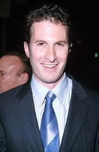
    Honestly, I think most of the problem lies in this very example ““ shows are being yanked before they have a chance to find their audience. Look at a show like Seinfeld, which did not catch on right away ““ and look at the success it had! What’s happening in tv is similar to what’s happened in the music industry ““ labels look for instant success, then yank artists who can’t make that happen right away. So you have fans that aren’t really fans, they just liked the band with the song that was played over and over on the radio. Then they move on to the next hyped band”¦ The same is happening in television.

    I truly hope audiences will tire of reality television and cheesy brainless programming ““ and I hope, in the meantime, the networks give us shows that are more cerebral ““ and leave them on the air long enough for audiences to catch on.

    ##

  • Trailer Park: Eventually It Wins Over Everyone

    By Christopher Stipp

    Archives? Right Here…

    Before we get started, kids: Interested in winning an original, signed poster for THE FOUNTAIN by Darren Aronofsky? Tune in soon with details about how you can rock an original piece of authentic movie schwag right on your wall absolutely free of charge. Dozens will enter…only a few will win.

    The first question I really wanted to ask Darren was whether or not he was afraid to die. I didn’t but I wanted to.

    After you sit and open yourself up to what THE FOUNTAIN has to offer your soul, and no, this is not hyperbole, there is a sense that you’ve been shown something that hasn’t ever really been rendered or expressed in film before.

    Yes, those of us who have been steeped in films can point out a few cinematic touchstones where the idea of death and its emotional connection to our collective experience as humans has been adequately presented. The basic thing of it, though, is that I can’t point out one movie that has pushed me as a viewer to accept the one truth about being a living, breathing person on this planet: I will die.

    THE FOUNTAIN pushes even harder on this premise and puts forth the notion of being faced with a loved one’s death while being terrified of accepting death’s inevitability yourself. This movie posits some heavy ideas but it never once feels, and this is key, like this was a movie based on someone’s high falutin obsession to make an inaccessible piece of art; rather, this is about as straight-forward as you could ever be when it comes to making a film that feels like it was written with real heart and passion. Love just drips from every pore and frame of this film that it makes you feel that Darren, Hugh, Rachel and everyone involved in this production believed this was a movie that needed to be made.

    To say that the film succeeds in easily becoming one of the most distinguished pictures to come out this year would be giving the word “understatement” not enough weight. This movie shows you what Hugh Jackman is really made of, what Rachel Weisz can really do with her abilities as an actress and that the world needs more filmmakers like Darren. The man could have, no doubt, turned out flicks that could’ve paid for a few houses in the Hollywood Hills and lived like a pimp if he would’ve just capitulated to studio pressure to just give up. To be honest, I don’t know if I would’ve had it in me to just stay true to thine self by ruminating on ways to make this movie happen but he did.

    I know I could write about how thrilling it was to sit across from one of the premier, again, not hyperbole, directors of the past decade but all you really need to know is that when people asked me what it was like to talk to him my only response was that it was like reading a novel and then being able to sit with the author the next day to ask whatever you like regarding whatever you wanted.

    If you want to know how great it was to work with Hugh or how awesomely sucky it was that Brad Pitt wasn’t in it or what we can expect on the DVD or any other questions regarding the technical aspects of this movie’s production, go somewhere else. Honestly, the movie rattled my emotional core and even though I wish we had more time than we did, I’m hoping this wasn’t the last time we would ever talk, I was all about trying to make a connection with this film’s story and to find out whether Americans, in general, have a hard time accepting that we’re all going to die.

    If you haven’t already figured it out I am hoping this short conversation piques your interest in seeing this movie next Wednesday. Darren not only hopes you tell a friend or two or three to see it but this is one film that, if you do suggest it and the individual(s) don’t dig it, I am thinking it’s grounds for you to dispatch a legal beating on their person with a loaf of stale sourdough. Seriously.

    Much thanks to everyone involved with Darren’s publicity team who helped make this 15 minutes possible.

    DARREN ARONOFSKY: You work for Kevin?

    CHRISTOPHER STIPP: Kinda. It’s for his website, actually. QuickStopEntertainment.com.

    ARONOFSKY: He has people all over the place?

    STIPP: Also, kinda. We’re like independent contractors who live all over the country and write on a multitude of things.

    ARONOFSKY: Nice.

    STIPP: I’ve been writing now for almost three years”¦

    ARONOFSKY: Wasn’t it called View Askew or something like that?

    STIPP: Poop Shoot. Movie Poop Shoot.

    ARONOFSKY: Movie Poop Shoot. Right. Now it’s called Quick Stop Entertainment?

    STIPP: Yup. Thankfully it was changed, just coming from my end of things, because it was really difficult”¦in fact, one story involves you.

    I called, around November of last year, when you were making the rounds on CHUD, JoBlo, Ain’t It Cool, to try and be able and talk to you but after putting in the request and when they asked me what site I worked for, me saying “Movie Poop Shoot”, they essentially just laughed and said, “I don’t think so.” That was it until now.

    And, speaking of which, I saw the movie last night…

    ARONOFSKY: That was a fun screening.

    STIPP: It was but I thought it was interesting that a movie like this, with the kind of heady subject matter, that you would target college kids.

    ARONOFSKY: Well, I’ve always done college tours with my films, PI and REQUIEM, this the third time I’ve done one; I don’t know if Kevin does them but he’s done more movies than me so he’s probably bored of it.

    I always get a good reaction at the colleges. To be honest”¦I didn’t know how it work either but it seems to really be working with the young crowds which is kind of cool and I think that’s because they’re more adventurous in their cinema.

    STIPP: Very dense movie.

    ARONOFSKY: Yeah.

    STIPP: It’s a word I also saw popping up in the early reviews, I cried a little but by the end”¦It affected me on a level I didn’t think a film could. I know the germ of this came about with your own parents’ situation with cancer and so I’m wondering if this movie has helped you wrap your arms around the notion of death?

    [Darren laughs]

    ARONOFSKY: Not quite. I think it’s always a struggle and I think the film was kind”¦a beginning of an exploration by me to start thinking about these things or at least think about it in a more formal way.

    STIPP: And has the storytelling aspect, when you went back and edited, thinking about your own life events in the past six years, changed how you wanted to tell this story?

    ARONOFSKY: Yeah. Ultimately, the problem with film and why I’ve always liked the concept of being a musician, even though I am tone deaf, a musician when they’re creating an album, when they’re creating a bunch of songs, you can really write songs that are connected to an immediate moment in your life. Films, though, take so long that they really represent what you were thinking years ago. This film has been progressing and growing for all these years so it does represent a lot of my life for the last four or five years but I imagine all the new things that have sprouted up in my life will probably effect me on my next film.

    STIPP: And, to touch on the concept of music, the score was really effective.

    ARONOFSKY: Thank you and it was Clint Mansell again, who I worked with on PI and REQUIEM, and we brought the Kronos back because we needed some strings and they are just the best. Then we also got this rock band called Mogwai, out of Scotland, to add sort of a psychedllic rock element to it.

    The score, I think, comes out a day before the movie.

    STIPP: A lot of the great filmmakers like to keep things consistent with regard who they work with on their projects, again and again and again, like the Kronos Quartet, is that how you see your future”¦

    ARONOFSKY: I love them. They’re just great to work with. They’re really great people, they’re totally experimental, they’re totally willing to take chances and go out on a limb and try new things. They just have an incredible spirit.

    And, on top of that, they are the most ridiculous musicians you’ve ever seen as far as skill. You’re like listening to some rhythm and you’re like, “Is that a 1/16th?” and they’re, “No, it’s a 1/32.”

    [Laughs]

    “Huh?”

    STIPP: I heard Rachel, to prepare, went and visited with people who were about to die and I’m wondering, on a personal level, has that experience still lingered with her?

    ARONOFSKY: I think so. I can’t see how something like that can’t change you and I think every film changes us and everyone. I mean, they’re very intense experiences. Rachel, especially, had to go and see some heavy-duty stuff.

    I know Hugh talks about in some of his interviews”¦I took him to see brain surgery. We went in and saw an actual brain surgery on an actual person. And Hugh, I think, had a conversation with the woman beforehand. During the surgery the doctors were saying that she was going to die and this was just a last hope to extend her life a little bit.

    You’re sitting there”¦staring at someone’s brain as they’re pulling out pieces. It’s a very intense thing.

    Some people see that all the time. These surgeons are sitting there doing a job, like anyone else would be doing, but they do it every day.

    STIPP: Do you think”¦myself I have two daughters, and it wasn’t until I had them when I started to feel pings of my own mortality. I’m scared to do a lot of things and I think I have a problem with death. As you were working on this did you find that, as a society, we have a problem with death? With talking about it, accepting it?

    ARONOFSKY: I think we’ve completely hidden it”¦Ignore it and face it with complete hubris even though it’s going to win. Eventually it wins over everyone.

    We just completely deny it.

    That was the interesting thing”¦When me and Rachel and Hugh would go to these hospices we would meet these caretakers and doctors and they would all say something astounding which was a lot of these young people when they got closer to death”¦something amazing started to happen to them; something similar [to what happens] to Izzie in the sense that they started to see something infinite in the finite reality in front of them but they had no vocabulary to talk about it. They had no way of explaining of what was going on because there’s just no education, and there’s no spiritual support structure in the west to help us with it.

    So, as they’re going down this path the ironic thing is that the families, who are healthy, are so indoctrinated into western medicine and science are like, “You’ve got to fight. You’ve got to keep fighting. You’ve got to fight.”

    Even when, at a certain point, there is no more of a fight. It’s over.

    And that’s the line that’s really hard; it’s when it’s ok to let go because, ultimately, it IS ok to let go because eventually we’re all going to die. But a lot of these people, a lot of these families, become really really tough and what happens, the tragedy of it all, that the person who’s dying actually dies in a much more lonely place because they can’t at all communicate with their families. And THAT, to me was the tragedy. That informed the whole plot of the film.

    In THE FOUNTAIN you have Izzie who is actually approaching some type of understanding and trying to reach her husband who is just doing the typical, normal response of like, “No, I’m going to solve this problem. I’m going to fix it and you’ve got to keep fighting.”

    So, I think in the west right now we’re completely cut off from having any type of tool or any way of understanding that what makes us human and what makes us alive is that we will die and mortality is actually a part of our humanity”¦and that dying can actually be a part of our spiritual path.

    [Darren smiles]

    How about that? Stick that in your pipe and smoke it.

    STIPP: Who do you think has stated it best? In the past six years did you come across anything that has really connected with you?

    ARONOFSKY: There was some, I can’t remember what, so many cultures have dealt with it in so many different ways, but one of my favorite was”¦and I don’t think it was Norse, I can’t remember, it was some type of northern European culture that was a warrior culture. You were judged by your dying words and how clever they were; and so, on the battlefield, you would construct, basically, a lyric that, if it was unbelievably poetic, it judged what your immortality would be. There was a whole culture based on that which I thought was great.

    Ari, the other guy I wrote the story with, and I read tons of that stuff.

    STIPP: I guess the last question I have is that you have a lot in your life, going forward, another life to look after as well, and are you now aware of what kind of legacy you want to leave behind you?

    ARONOFSKY: Yeah. Part of that is keep trying to make good work. Keep from having to compromise because there is always pressure to compromise. But I think you just have to take it step by step”¦I’m not one of those long-term planners that can think of what I’d like in fifty years for my life to have been.

    I think I’d just try to think about what I want to do next and then just get it done.

  • Toy Box: Stuff To Do…

    toybox.jpg

    This week there’s no review, so if that’s all your interested in me for, you can hit my own site. If you’re here for my witty writing and snazzy dialog, you’ve clearly clicked on the wrong link. But if you’d like a few suggestions – toy related – of things to do when you’re not doing much else, then read on.

    I get a lot of links from folks to check out, so many in fact that I’m quite a bit behind in the checkin’. But there’s some online and print (yes, it’s not dead) goodies out there that I thought I’d share. Let’s start with the obvious…

    Toy Related News Sites:

    Looking for the latest info on a wide range of action figures, statues or collectibles? Then do yourself a favor and give these guys a gander.

    Figures.com – one of the oldest general news sites out there, and one that covers a huge range of collectibles through the Action-Online network of sites. They’re coverage of large events – like Toy Fair or SDCC – tends to be solid as well.

    Raving Toy Maniac – THE grandaddy of news websites, which set the bar for all others back in the hey day. They’re focus isn’t as much on news these days, but they have a very active message board community.

    Toy News International – I’ll be honest, I don’t use TNI on a daily basis. But they tend to get scoops and early photos in advance of other sites, and do a great job reporting the news.

    Those are the three I used most often for general news, but there’s lots of sites that cater to the more specific fetis…uh, tastes of the collector:

    RebelScum – if you’re looking for a Star Wars site, then look no further. Rebelscum has it all, and it’s the only Star Wars specific site I regularly check. They also have a very dedicated and active community over on the message boards, and they have THE visual guide to action figures and other collectibles based on the Star Wars license.

    Sideshow Freaks – If you love anything from Sideshow – sixth scale figures, mini-busts, Premium Format, statues, etc. – then this is the website for you. It’s predominately a series of message boards, but the info and news is excellent. You’ll also get to mingle with folks from the company that stop by, and you’ll get to take part in some excellent discussions within this active community.

    One Sixth Scale Warriors – another group that’s merely a series of message boards, but what an excellent group of boards if you’re a sixth scale collector. While most of the conversation does tend to be about military figures, there’s plenty of talk on other lines as well. Another part of the Action Online group, they’re also a tremendously valuable resource for the sixth scale customizer.

    Simpsons Collector Sector – founded back in the days of the Playmates World of Springfield line, this website and message boards are still the place for all the latest info on Simpsons merchandise of all kinds. Be sure to check out the boards to mingle with a terrific group of collectors!

    Fwoosh – okay, it’s an odd name, but if you’re into superhero collectibles, it’s definitely one you should know. Covering DC and Marvel largely, the boards are extremely popular and very active, often getting photos and scoops on all your favorite caped crusader toys very early.

    Action Figure Insider – a relatively new site, but one with tremendous pedigree. Founded by Julius Marx and Jason Geyer, both having been involed with the toy website world for years, AFI has some great columns, an excellent community in their forums, and terrific inside contacts with folks at Mattel, DC Direct and Toybiz. While they focus on superhero toys, you’ll also find conversations on other lines as well.

    Azog’s Collection – if higher end items are more your cup of tea, whether they are Sideshow, Bowen, Gentle Giant or another manufacturer, then check out Azog’s. Azog keeps the news regularly updated, and you can commiserate with your fellow collectors over on the boards.

    BTVSFigs – if you’re thing is Buffy (or Angel, or Spike), then check out the BTVSFigs message boards. Here you’ll find a very active group of folks who love collecting all things Buffyverse.

    Voldemort’s Vault – VV is a very young, very new set of message boards, relatively speaking, but they have a great start on covering all the Harry Potter collectibles, including those from Gentle Giant.

    Gentle Giant Collector’s – and speaking of Gentle Giant, here’s another new website and set of forums dedicated to collecting all things GG, from the mini-busts to the statues to the bust ups. They have some terrific visual guides to the releases so far.

    Amusing Diversions:

    Okay, so much for the websites. What about other amusing diversions, you ask? Well, here’s a few suggestions to make that rainy Saturday afternoon pass a little faster.

    I recently received a copy of a couple self published books that I think are well worth recommending. The first is My Artwork and Designs at Hasbro, 1983 – 1989. This book is written by Robert Marcej, who worked at Hasbro as a graphic artist during the 80’s. He did package and control art for many of your favorite nostalgic lines, like G.I. Joe, Transformers and Inhumanoids. He was also the man completely responsible for Army Ants, remember those cute little buggers? You will once you see his art. This book is pretty short at just 48 pages long, but it contains some great artwork for the fans of old Hasbro toy lines.

    Robert has also started a comic book loosely based on his life as an artist at both Hasbro and Hallmark call “Action Figure – from the journals of Richard Marzelak”. I’ve read the first issue, and while the artwork isn’t my comic book preference (it reminds me a lot of the old Cracked or Mad style for ‘real’ people), I did find myself really getting into the life of the main character. I’m betting there’s a lot of potential to be mined out of a life inside the industry, in the hands of a solid writer, and I’m looking forward to issue number 2.

    You can find both these books, along with some of his other self published work, at Baboon Books.

    If you’re a toy collector, action figure fan, or just anybody with a nostalgia for the last 30 years, then you must be reading Shortpacked. This tremendously funny cartoon strip, written and drawn by David Willis, is an often sharply satirical look at the world of comic books, action figures and the movies and television shows they’re tied to. Every geek who ever bought a comic book has tried his or her hand at writing a comic strip, but none have ever managed to do it with as much style and ability as David Willis. Start out by checking some of my favorites – fave 1, fave 2, fave 3, fave 4…damn, there’s a whole lot more!

    Finally, this last recommendation has absolutely nothing to do with toys, but if you’re not reading it, you definitely should be. Scott Adams, creator of Dilbert, is one of the brightest and funniest guys around, and he does a regular blog at The Dilbert Blog. All other blogs should bow down at the majesty of humor that is this blog. Don’t believe me? Give it a read. I guarantee you’ll laugh regularly, and on more than one occasion be offended. But challenging your mind is a good thing, right?

  • Comics in Context #154: Master Class

    comicsincontext4.jpg

    On my first visit to the half of the “Masters of American Comics” exhibition that is at the Jewish Museum in Manhattan, I was accompanied by Ken Wong, the president of the Museum of Comic and Cartoon Art. At one point while we were there we encountered a lecturer giving a group a guided tour of the exhibit. Listening in, it soon became evident to Ken and myself that this woman was in over her head: she may have been knowledgeable about the usual sorts of drawing and painting that one finds in a museum, but not about the sequential art of comics. As they entered the section devoted to Robert Crumb’s work, she told her group. “I haven’t read up on Crumb.” Well, why not? Isn’t that the proper preparation for lecturing about him?

    But more importantly, she was describing the artwork on display as single images, missing the point that the essence of comics is visual storytelling through a succession of images. (Of course, Ken and I were animatedly discussing the works on display, and afterwards Ken told me that he noticed that some of the other visitors to the exhibition were listening to us! Well, after all, we know what we’re talking about with regard to comics.)

    “Masters of American Comics” undertakes the formidable task of persuading the world of art museum professionals and visitors that comics should be taken seriously as art. This exhibition therefore is meant to teach people a new way to see, to open their eyes to understanding and moire deeply appreciating an artform which they may well have previously underestimated. But the show offers little guidance to visitors, who run the risk of missing the point just as that tour guide did.

    There is no audio guide tour for “Masters” at either the Jewish Museum or at the Newark Museum, where the first half of the exhibit is currently housed. At each museum there is a lengthy introductory wall text to the show as a whole, and wall texts that introduce each artist. Labels for the individual works restrict themselves to listing the artist, the means by which the work was created (pencil, or pen and ink, and the like), the source (where the work was originally printed), and the name of the lender. The labels do not identify the characters portrayed, not do they explain the storyline, of which the individual page or strip is an excerpt. More importantly, the labels do not direct the viewer’s attention to any particular aspect of the works; hence, the labels do not inform the viewer why the curators chose to include these particular examples of the artists’ work. And sometimes, as we shall see, the labels are wrong about what they do say.

    Picking up where I left off last time in my travel through the Newark Museum’s half of “Masters,” proceeding chronologically through the history of the comic strip, I now come to the first of the Masters whom I have seen in person, the late Milton Caniff (1907-1988), creator of Terry and the Pirates and Steve Canyon. His introductory wall text correctly declares Caniff to be “one of the greatest storytellers ever to work in the comics medium.”

    The wall text continues, “Caniff’s characters, in contrast to the predictable behavior of most adventure heroes, had multifaceted personalities. . . .” (This line comes from page 84 of co-curator John Carlin’s text for the Masters of American Comics catalogue, published by Yale University Press.) I think it was comics writer Don McGregor who once observed that Stan Lee did for superhero comic books what Caniff had done three decades earlier for the adventure comic strip. Each man wreaked a revolution through endowing the cardboard character types of adventure melodrama with multidimensional characterization.

    But who are Caniff’s characters? Caniff did Terry and the Pirates from 1934 to 1946, and Steve Canyon‘s prime was in the late 1940s and 1950s. How many visitors to “Masters” who are under the age of sixty will know what the premise of Terry and the Pirates is, or will even know who Caniff’s most famous creation, the Dragon Lady, who appears in this show, is? Surely museum visitors could better appreciate the Terry and Canyon strips on display if they were given some background information about the series and their characters. There is a reason for the title of my column: comics should be placed in context. But the wall text provides no help in this regard, and Carlin’s text in the catalogue does little better.

    On the other hand, journalist Pete Hamill’s essay about Caniff in the catalogue not only clearly explains who Canyon and Terry‘s main characters are, but also vividly conjures up the atmosphere of Terry at its height, with mystery, exoticism, danger, and romance. Hamill points to Caniff’s own comparison of his comic strips to the picaresque novels of past centuries: a series of adventures in which supporting characters appear, disappear, and then return, just as people we know may do in our own lives. (Cervantes’ Don Quixote and Henry Fielding’s Tom Jones are classic examples.) I especially like Hamill’s observation that Caniff’s “women were his finest creations, each distinct, all with sophisticated emotional lives, all exuding erotic possibilities” (p. 232). This is a matter that Carlin himself does not even address.

    One of the Terry Sunday strips in the show (November 27, 1940, on pages 82 and 83 in the book), depicts Terry and another character, Dude Hennick, just after they have buried the latter’s girlfriend. This is an impressive work even if one does not know anything about the characters except what this particular Sunday reveals. Later in the book (p. 114) Carlin asserts that “Caniff’s art is compromised by his sentimental themes.” This is unfair. Similarly to the Dick Tracy funeral sequence I described last week, Caniff uses subtlety, indirection, and understatement to evade the traps of superficial, sentimental excess and to simultaneously convey deeper, dramatic emotion. Caniff distances the reader from potential bathos by repeatedly portraying Terry and Dude in long shot, and once even from far overhead. Caniff also repeatedly casts them into deep shadow. This particular Sunday strip is a prime example of what Hamill calls the “dense, impressionistic brushstrokes” (p. 232) to create what Carlin terms the use of “chiaroscuro” (p. 78), meaning the contrast between light and deep shadow. (Though this style, which Caniff’s friend Noel Sickles devised and Caniff perfected, is often called impressionistic, I prefer Carlin’s term, since Impressionism in painting signifies a bright color palette, and not the ominous black areas of Caniff’s artwork.) Even when Dude and Terry are depicted in closeup, Dude shows a stone-faced stoicism, while the younger Terry only subtly betrays his sorrow in his eyes and mouth. Significantly, Dude is in long shot when he looks at the grave for the last time, his emotions unreadable from the panel’s foreground.

    In the catalogue Hamill explains that when Dude’s girlfriend, Raven Sherman, was “suddenly, brutally killed,” “her death was unprecedented in comic strips and set off an outbreak of grief among millions of readers.” To continue the analogy with Marvel, Raven’s death was comparable in dramatic impact to the death of Gwen Stacy in Amazing Spider-Man in 1973. Each woman’s death marked a revolution in adventure melodrama in its particular comics format. Readers expected that the romantic heroine, however much she was endangered, would always be rescued; the deaths of Raven in an adventure comic strip and of Gwen in a superhero comic book dashed those expectations. These stories put readers on notice that happy endings were no longer mandatory. They thus signaled a new level of realism and even demonstrated that adventure comics melodrama could achieve the level of tragedy. But someone previously unfamiliar with Caniff’s Terry would learn none of this from the “Masters” show.

    Carlin called his section of his catalogue text about Caniff, “Milton Caniff–Master of Suspense,” giving the cartoonist the same title associated with Alfred Hitchcock. Indeed, in both a wall text in the show and in the catalogue (pgs. 84-85), Carlin writes that “Similar to filmmaker Alfred Hitchcock, Caniff took an already established medium and broadened its palette in a manner that significantly changed the way subsequent artists have worked. They both introduced depth of field, atmospheric lighting, and novel perspectives or camera angles to suggest dramatic points of view.” The second sentence overstates the case for Hitchcock: it’s true about Hitchcock’s camera angles, but he borrowed his “atmospheric lighting” from the German Expressionist films of the 1920s and 1930s, and the true cinematic innovators regarding depth of field were Orson Welles and Gregg Toland in Citizen Kane (1941). But Carlin’s basic point is correct: as he wrote earlier in the book (p. 78), Caniff “developed the vocabulary of realistic suspense to its classic form.”

    Carlin also asserts that, like Hitchcock’s films in their influence on the French New Wave directors of the late 1950s and 1960s, Caniff’s work had a “delayed impact” on what Carlin calls “new wave” comics artists of the 1960s. Carlin claims that “Caniff inspired Harvey Kurtzman and Jack Kirby to create the comic books produced by EC and Marvel, which highlighted the new wave of comics art” (p. 85). This is misleading in numerous ways.

    First, Carlin is linking Kurtzman and Kirby to the 1960s. But Kirby started in comics in the late 1930s, and co-created Captain America in 1941, when Caniff’s Terry was in its heyday, and Kurtzman did his innovative EC work in the 1950s, when Steve Canyon was still surging along. I agree that Kurtzman’s war comics and Kirby’s adventure comics show the influence of Caniff’s visual storytelling. Indeed, two daily Canyon strips in the show (August 21 and September 9, 1947, Masters p. 237) feature dynamically staged fight scenes that put me in mind of Kirby action scenes. But was Kurtzman consciously motivated to write his anti-war EC stories in response to Caniff’s gung-ho war sagas? How could Caniff’s work possibly bring about Kurtzman’s creation of MAD? Just how did the comparatively realistic Terry and Canyon inspire Kirby to create Marvel superhero comics? And didn’t Stan Lee have something to do with creating the Marvel superhero comics of the 1960s? In fact, didn’t Lee hire Kirby to collaborate with him on these books?

    Another example in the show of the need for context is Caniff’s great Sunday Terry strip for December 29, 1946 (Masters p. 85), which The New York Times ran in its online “slideshow” accompanying art critic Michael Kimmelman’s rave review of “Masters”. Here Terry, the boy hero of the 1930s who has grown up into a military pilot, bids farewell to a woman named Jane, who is leaving for Australia. Except for its first panel, the last two tiers of the strip are free from dialogue. Jane walks away from Terry through the snows of winter (the season of endings), stops, rushes towards him, they embrace and kiss, and then, overwhelmed by emotion, she leaves once more. Caniff’s simple but powerful staging provides a superb lesson in visual storytelling that any viewer, whatever the extent of his or her background in comics, can easily comprehend. The sequence also demonstrates Caniff’s masterful dramatization of emotion. When Jane runs towards Terry, it is in an overhead long shot, distancing the viewer from the characters’ feelings. This makes the impact of the panel showing their passionate embrace, in medium close-up, more powerful. Then Caniff pulls back to a long shot: we can see that Jane has her hand to her face in a gesture of anguish, but we are too far away to see her facial expression. Thus Caniff dramatically evokes emotion, but lets it subside before he runs the risk of falling into sentimental excess. Terry is even further away in the long shot, so his emotions are unreadable. Though literally speaking the reader’s viewpoint is in front of Jane, and Terry is behind her, Caniff has figuratively placed us in Terry’s psychological position: she is leaving both Terry and the reader behind. Jane’s plane takes off, and Terry trudges off through the snow towards the sunset (or sunrise?), in a variation on a standard final shot for ending a film (notably in Chaplin’s work), as he passes a poster for a New Year’s Eve party reading “Ring Out the Old, Ring In the New.” But the mood cast by the farewell scene and by the shadows in the final panel is one of melancholy.

    This Sunday strip is powerful just on the level of its literal meaning. But wouldn’t it deepen the museum viewer’s appreciation if he or she were informed by the label that this is also Caniff’s final Terry strip? Terry would be continued by other hands while Caniff went on to create Steve Canyon, a strip he would own. Hence this final Terry is as close as Caniff came to doing metafiction in this realistic strip: the emotion of Terry and Jane’s farewell also represents that of Caniff parting from the Terry strip.

    Had the label for this 1946 Sunday strip stated that it was Caniff’s last Terry, perhaps the curators would not have mislabeled two 1947 Canyon dailies in the show as Terry strips. In one of them, Canyon is even called by name! (All Terry and Canyon strips are properly identified in the book.)

    Museum visitors are on their own in studying Caniff’s more complex visual storytelling methods in a car chase sequence from the Terry dailies from November 25-30, 1940 (p. 80). But Carlin does a superb job of analyzing the sequence, panel by panel, in the catalogue. I found it rewarding to see what Caniff himself would probably have considered techniques of his craft now being described as the visual strategies of museum-worthy art.

    My approach to this sequence is to analyze it in cinematic terms, studying Caniff’s “camera angles,” composition, and “editing” as he shifts from one “shot” to the next. It has been claimed that the “decompressed” storytelling in contemporary comic books is an attempt to make them cinematic. But what is more truly cinematic: the interminable talking heads sequences of current comic books, or Caniff’s mastery of dynamic action, shifts of visual perspective, and his equivalent of rapid editing?

    Carlin describes Caniff’s “cinematic” methods, but he also points out design elements in the sequence. Carlin can go too far: he asserts that “The entire sequence is held together obliquely by a thread that runs through it in the form of the serpentine line” (p. 79). But he locates only four examples of this serpentine line in three strips out of the entire six. Moreover, how could the original readers perceive a continuing design element like this running through the sequence when they saw each strip printed a day apart from the next? The technique of a recurring design element makes more sense within the confines of a single installment. For example, in the November 28 strip Carlin points out a white stripe which appears along the bottom of each panel, and finally turns into a road in the final panel. Carlin contends that “The abstract diagonals of car forms, roads, rivers and streams give the strip a strong sense of design that created the suspenseful impact of the story’ (p. 79). I am not persuaded that such design elements created the suspense, rather than the aforementioned more cinematic methods, but they certainly contribute to the beauty of the sequence, and I’m grateful that Carlin points them out. By showing me how to see in as new way, the Masters book is doing its work.

    Hamill states in his essay that Caniff’s work was “widely imitated by two generations of cartoonists” (p. 229), in other words, from the 1930s into the 1960s. Yet despite the fact that Caniff, as Carlin says, established the visual vocabulary for action-adventure comics, how aware of Caniff’s work have subsequent artists doing adventure comic books been? I rarely see comic book artists of the last thirty-five years listing Caniff as an influence. My impression is that the work of Alex Toth and Frank Robbins, artists who were unmistakably influenced by Caniff, are more appreciated by comics professionals than by the comics readership at large. (When Bruce Timm mentioned Toth as an influence on stage at this year’s San Diego Con, there was not one clap of recognition from the audience.) If post-1960s comic book artists are influenced by Caniff, it is usually indirectly, through his influence on Kirby, and even Kirby’s influence, once ubiquitous in superhero comics, has drastically diminished in recent years under the growing domination of “decompressed” storytelling and manga.

    The saga of the American comic strip comes to a close at the Newark Museum with Charles M. Schulz (1922-2000), the creator of Peanuts. Of all the classic comic strips at the Newark Museum, many of which were quite famous in their heyday, Peanuts is the only one that maintains that level of popularity in the 21st century, thanks to continuing reprints in newspapers, reruns of the classic TV specials, and licensing ranging from greeting cards to Met Life commercials. (I expect that even Popeye is less well known to today’s kids than he was to Baby Boomers; like Looney Tunes, his animated cartoons have been exiled to appearing on Boomerang.)

    Schulz’s introductory wall text at the Newark Museum proclaims him to be “the most influential cartoonist of the post-war era.” This is an overstatement, but if the Museum had limited the accolade to the world of American newspaper comic strips, it would unquestionably be true. (In the world of postwar American comic books, Jack Kirby would likely be “the most influential cartoonist.” And somehow I doubt that Schulz was “the most influential cartoonist” for manga; wouldn’t that honor go to Osamu Tezuka?)

    In the Masters book Carlin asserts that “By the late 1940s the size and printing quality of newspaper comics diminished dramatically. . . “ (p. 86). This may be somewhat misleading: I can recall that in my early childhood Prince Valiant still took up a full page of a Sunday broadsheet newspaper. But it appears that from the beginning, Schulz labored under sharp restrictions on the size of Peanuts, and usually each daily consisted of four small panels. Carlin states that Schulz utilized the limitation to his advantage, becoming a “master of minimalism.” In his superb essay in the catalogue, Patrick O’Donnell, creator of the comic strip Mutts and a friend of Schulz, perceptively describes each four-panel Peanuts strip as a “graphic haiku” (p. 244).

    An example of Peanuts in the show (Sunday, October 13, 1968), the catalogue (p. 245) and the online slideshow may even be Schulz’s joke about people who dislike a minimalist approach to art, including his comics. Linus is drawing a simple picture of a row of trees, but his sister Lucy declares, “That’s not art.” She insists on his adding more and more–a lake, a waterfall, a deer, and a multicolored sunset, making it sound like a vast Hudson River School canvas of the mid-19th century–and then shouts, “That’s art!” with such force that it literally turns Linus the Artist upside down.

    In the book Carlin states that Schulz’s “visual minimalism was perfectly in keeping with the style of its times–shoebox skyscrapers, color-field painting, black-and-white TV, early rock “˜n’ roll, and frozen dinners” (p. 88). This seems to me a one-sided view of the 1950s and 1960s, when Peanuts originated and rose to its creative peak. These were also the time of Cinemascope movie epics and unprecedented postwar prosperity for the middle class, permitting them to buy big houses and cars in the suburbs: how does this relate to minimalism? In animation the 1950s were the heyday of the UPA Studio, which pioneered limited animation and preferred strong, stylized, often minimal visual design to attempts at detailed naturalism. In both regards UPA was reacting against the Disney studio. Wouldn’t it make more sense to compare Schulz’s minimalism (in both visual design and characters’ “movement”) to UPA’s? In his essay O’Donnell points out the influence that Segar and Herriman had on Schulz. Is it more likely that Schulz was part of a generational rebellion against the illustrative realism of comic strips by Hal Foster and Alex Raymond (who aren’t in the “Masters” show) and was attempting to recapture the “cartooniness” and simplicity of Krazy Kat and Popeye?

    Carlin explains that “the minimalism that defines Peanuts forces its readers to focus on subtle nuances rather than broad actions or sharp transitions. . . . Everything is kept in the same minor key so that the simplest turn of a line can transform a character’s expression. . . “ (p. 88). O’Donnell compares Schulz’s work to Japanese poetry; through the use of the term “minor key,” Carlin likens it to music. Carlin goes on to observe that “by 1960 Schulz went even further by routinely drawing strips that repeated the same image in every panel, with subtle variations. . . .By maintaining the image from frame to frame, Schulz shifts our focus from action to the subtle inner psychology of his characters” (p. 88). (I wish that Carlin did not sometimes substitute the word “frame” for the correct term of “panel.”)

    A Sunday strip from August 14, 1960, illustrates Carlin’s points. It presents Lucy, Charlie Brown, and Linus lying atop a small hill, looking upward at the clouds. (It’s a classic triangular composition.) As Linus describes how some clouds “look to me like the map of the British Honduras,” Charlie Brown raises his head with a deadpan expression, with two dots representing his eyes, that nonetheless subtly indicates his surprise and perhaps puzzlement at what Linus said. (This also may represent a subtle breaking of the fourth wall, since Charlie Brown is effectively looking out at the viewer, perhaps inviting our sympathy for his reaction, as Oliver Hardy used to do after Stan Laurel instigated yet another fine mess.) Charlie Brown puts his head back down in the succeeding panel, But in the next panel, when Linus claims he sees clouds resembling the stoning of St. Stephen and the Apostle Paul, Charlie Brown raises his head again, and this time Schulz drew curved lines next to his eyes, indicating that his surprise and bewilderment have sharply increased. But as Carlin said, this is “inner psychology”: Charlie Brown does not manifest these emotions in action or in dialogue. He turns his head when Lucy asks him what he sees in the clouds. Then, in the last panel, as if returning to the dominant key, Charlie Brown again places his head down, as he calmly delivers the punch line: “Well, I was going to say I saw a ducky and a horsie, but I changed my mind.”

    This Sunday strip makes an interesting pairing with the previous Sunday strip I described, in which Lucy rejects the simplicity of Linus’s original drawing. But in the second Sunday I don’t get the sense that Schulz is ridiculing Linus’s imaginative interpretation of what he sees in the clouds. Rather, Schulz seems to me to be acknowledging that there can be more to something than a surface interpretation might indicate. Here Linus is again portrayed as an imaginative artist, who sees more and further than the everyman Charlie Brown.

    Carlin states that Schulz’s repetition of the same image, with slight variations, “shifts our focus from action” to the characters; “inner psychology.” But one could see how, in less talented hands than Schulz’s, this stratagem could shift the readers’ attention from the visual aspect of the strip to the dialogue, and hence a strip could become a visually inert sequence of talking heads. It seems to me that in this Sunday strip about clouds, Schulz skillfully choreographs the “slight variations” in the image so that the reader focuses on them–on Charlie Brown’s changing head movements and subtly changing facial expression, and the psychological reactions they express–equally as much as on the dialogue. Looking around the room with Peanuts art at the Newark Museum, I was struck by how much Schulz actually has his characters move from panel to panel, in contrast with the conventional wisdom that he basically repeats the same image over and over.

    I take issue with the book’s contention that Peanuts always remains in the same “minor key.” Look again at the Sunday in which Lucy critiques Linus’s drawing, in which Schulz quietly builds to the next to last panel, in which Lucy shouts “That’s art!” and Linus suddenly flips head over heels, as if hit by the force of an explosion. Now there’s an abrupt shift into a major key, before Schulz returns in the final panel to calm, as Lucy quietly delivers the anticlimactic punch line: “Sometimes it takes a layman to set these people straight.” Now that I’m writing this, it also reminds me of Caniff’s minimalist treatment of Terry and Jane’s intense emotions in the panels on either side of the panel in which their passions “explode” in their tight embrace.

    Then there is a sequence in the Masters book from June 9-13, 1958 (p. 90), set during a baseball game, in which Charlie Brown ends up standing immobile, panel after panel, looking upward, waiting to catch a fly ball. Schulz moves to a close-up as Charlie Brown, with only a dot for an eye and no visible mouth, thinks to himself that if he catches the ball, his team will “win the championship, and I’ll be a hero!” Then in the next panel, he thinks, “If I miss it, I’ll be the goat!” and that curved line appears around his eye, indicating inner stress. In the following panel Charlie Brown tells himself, “I can hear it now. . . “˜Charlie, the goat, Brown!’” Here Schulz moves back to the medium close-up with which he began the daily, showing Violet and Lucy, the two women most likely to call Charlie Brown “the Goat,” and Schulz adds a line to Charlie Brown’s face that indicates a tightly clenched mouth, indicating his growing inner sense of impending disaster.

    After this long build-up, the explosion has to take place: the emotions must be released. Inevitably, Charlie Brown, in keeping with his role as the archetypal loser, drops the ball. Lucy immediately bursts into wailing, Schroeder and a visibly upset Patty shout their dismay (in large, bold letters), and in panel three the entire team, their mouths wide open, joins Lucy in a chorus of wailing. There’s nothing minimal about this. Even when Schulz returns to relative calm in the last panel, in which he typically had team manager Charlie Brown understate his reaction in dialogue (“It depresses a manager to see his team cry. . . .”), Schulz drew Charlie Brown looking far more emotional than he did previously in this four strip sequence.

    Speaking of E. C. Segar’s influence on Schulz in his essay, O’Donnell says that “Knowing that Popeye could meet Eugene the Jeep and Alice the Goon gave Schulz the freedom to make Snoopy a WWI flying ace” (p. 243). Looking at the Sunday, Feb. 13, 1966 strip in the catalogue (p. 241), in which World War I aerial ace Snoopy makes his way through the French countryside, I thought instead of two other Masters in the show: Winsor McCay and Frank King.

    Supposedly, on a literal level, Snoopy is merely fantasizing his adventures as a World War I pilot. But his imagined world is visualized as real: Schulz shows us one of the abandoned trenches, complete with barbed wire, and a sign to Pont-a-Mousson. At one point Schulz shows us Snoopy’s familiar doghouse, which Snoopy, in the midst of his fantasy, calls “a small French farm house.” But once Snoopy goes inside, it really does seem to be a French farm house, with a table, lighted candle, and even a window! In other words, like Nemo entering Slumberland, or Skeezix entering the world of his daydreams, Snoopy is depicted as entering a fantasy world. This obviously is the forerunner of Calvin’s fantasy worlds in Bill Watterson’s Calvin and Hobbes. And the final panel of this Peanuts Sunday shows Snoopy asleep in bed, as if to make the connection with Little Nemo clear.

    An even more explicit representative of the artist than Linus in Peanuts is Schroeder, Schulz’s boy virtuoso pianist. Schroeder might even be Schulz’s metaphor, conscious or unconscious, for the cartoonist as artist: Schroeder plays a child’s toy piano, but somehow he can get it to produce Beethoven’s masterworks.

    Two strips that pair Schroeder and Snoopy, one from April 27, 1990 in the Newark Museum, and another from September 14, 1986 in the book (p. 93), show Schulz venturing into metacomics territory. In the 1990 strip Schroeder plays his piano, and, as usual, Schulz represents the music by means of upper and lower musical staffs bearing notes. We see the staffs again at Snoopy’s doghouse, where bones replace the notes. Just what is going on here? Does Schulz mean to suggest that Snoopy is imagining his own musical staffs, but that Snoopy is interested not in music but in his own appetite? Hence, Snoopy’s “art” is all about food. Or have the musical staffs somehow become physical objects, on which Snoopy can hang bones as if they were ornaments on a Christmas tree?

    In the 1986 strip Snoopy is asleep atop Schroeder’s piano, as Schroeder plays his music, which again is represented by notes on musical staffs. Snoopy awakens and inadvertently places his head between the upper and lower staffs as he yawns. Snoopy then walks off, taking the staffs with him. Schroeder grabs the upper staff, and the lines connecting it to the lower staff stretch like rubber bands. Then Schroeder lets go, and the upper staff snaps back, knocking Snoopy down as the notes fly into the air. Snoopy hangs the notes (some of which are now bent) back on the staffs, which are now quite crooked, places it above the piano, and falls asleep once more, as Schroeder looks at it with a minimalist expression. perhaps denoting a placid sort of wonderment.

    In this case the staffs and the notes seem not only to have become solid objects, but have also seemingly lost their original purpose of denoting music. (What would the severely dented notes and staff sound like? Yet Schroeder has stopped playing the piano, so presumably these “signs” have ceased denoting musical sounds.) Schroeder and Snoopy inhabit a world in which one of the visual signs of comics language–musical notes and staffs–are as “real” as they are. Presumably, then, at least in strip installments like these, Snoopy ands Schroeder know they themselves exist in a comic strip. This is a gag that could only be done in the comics medium. It’s as if the word balloons over their heads had physical reality for the comic strip characters, as, actually, sometimes happened in Walt Kelly’s Pogo. (Once Kelly’s turtle, Churchy La Femme, even went around shooting the balloons.)

    With Peanuts the Newark Museum’s portion of “Masters” and the show’s history of comic strips come to an end. (Will Eisner’s Sunday Spirit sections not only started before the 1950 debut of Peanuts, but are really more like comic books than newspaper strips.) The implication is that Schulz was the last true “Master of American Comics” who worked in newspaper comic strips. “Masters” co-curator Brian Walker is aware of this implication and expressed his concern in an interview: “I think one of the biggest differences I have from the Spiegelman/Carlin canon is that I don’t really believe that newspaper comics died at some point or that they were completely eclipsed by what is going on now, beginning with underground comics. I still think there are cartoonists doing incredibly creative work in newspapers these days.”

    But has there been anyone who started in newspaper comics after Schulz who matched him and many of the other Masters as an innovator in visual storytelling and design? I don’t know that there has been. Still, is it right to give museumgoers the impression that comic strips stopped being a creatively vital artform after the creation of Peanuts?

    So, as you shall see next week, the Masters show moves on to the Jewish Museum, the history of American comic books, and even more questionable assumptions about the evolution of the comics medium.

    ADVERTISEMENTS FOR MYSELF

    Becker and Mayer has recently published Marvel Classic Heroes, a book written by myself, recounting the history of Captain America, the Hulk, Spider-Man, and Wolverine, which comes in a box including statuettes of the aforementioned heroes. Looks to me like the sort of thing that would make a good Christmas present!

    My lecture series “1986: The Year That Changed Comics,” finally reaches the high point of that fateful year on Monday, November 13. That’s when I tackle the first six issues of Alan Moore and Dave Gibbons’ Watchmen, starting at 6:30 PM at New York City’s Museum of Comic and Cartoon Art.

    Copyright 2006 Peter Sanderson

  • Game On! 11-11-2006

    gameon.jpg

    Well, it’s that time of year once again. Time for the game companies to trot out their biggest and brightest titles for the holiday spending benders. This year is no different from any other, with some top quality A list games hitting store shelves. This week, we’re looking at the hottest of the hot, just in time for you to throw down that holiday cash. These are the games that the hardcore have been waiting for, and for many, it’s about time. And it’s the most wonderful time of the year”¦

    DOUBLE YOUR PLEASURE, DOUBLE YOUR FUN”¦

    scda.jpgFirst up is the Xbox 360 version of the newest Tom Clancy title SPLINTER CELL: DOUBLE AGENT. Here, Sam Fisher is just about at the end of his rope; the heir to his title as “sneakiest spy around” has just fouled up in a mission and bit it, and Sam’s daughter has just died in a car crash. With nothing left to lose, Sam takes on some seriously dangerous escapades as he moonlights as a thug in prison and attempts to join the John Brown’s Army, a terrorist faction, all the while still keeping tabs with his associates at the NSA. As you progress through that game’s missions, you’ll have to keep and eye one which company holds you with the most trust. Lose it from either and it’s game over.
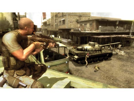
    This plays out with some very interesting mission types. From escaping from prison to daylight missions where sneaking (for once) just isn’t an easy option, Sam really doesn’t have his work cut out for him. Capping off many of these missions are directed actions, where the decisions you make during crucial cinematics will play out into how the NSA or JBA view you as a trusted member. Shooting an innocent, making a quick decision while parachuting”¦it’s all there and it all counts.

    The AI in this newest installment of the series seems a bit on the edgy side. While in previous efforts I’ve been able to sneak by nearly everyone with a minimal amount of trouble, here, even the slightest hair out of place and the baddies come a runnin’. Still, you’ve got a variety of new tricks up your sleeve, such as a small EMP devise attached to your pistol (to save on bullets for shooting out lights) and Sam now can swim too, pulling foes underwater for a murky wet death. Yeah, that sounds weird, but it’s cool to watch.

    scda2.jpg

    And while each decision plays on which particular faction you’re trying to impress, you can generally keep in the sweet spot between good and bad based on your actions. Doing too many neck snappings and you’ll lose face with the NSA, so just play it nice for a bit”¦until the JSA gets suspicious and you’ll have to work the other angles. Depending on how much you play one side or the other affects the games three endings. This opens up a great deal of replayability, and should keep fans happy.

    The multiplayer options, however, are a bit of a split deal. The two-player co-op is not as great as previous offerings, and doesn’t offer nearly as many cool gadgets or options for simultaneous play. The versus game, however, has been balanced a great deal from previous games, making it so that even newbies can have a fighting chance against folks familiar with the series, or even the newest title’s Spy Vs Mercenaries modes.

    From what I understand, the regular Xbox version of the game is drastically different from the Xbox 360 version. Still, the 360 version is no slouch. While it isn’t my favorite in the series, it doesn’t suffer from “been there done that” as many sequels tend to do. It may be thin on story, but the multiple playing options and direct action sequences are a new kick to the familiar license.

    One Gamer’s Opinion:
    righton.jpg

    FANTAS(Y)TIC

    ffxii.jpgSo, after all these years, I finally get to play a FINAL FANTASY game. And sure, some fans may argue that XII may not be the one to start with, but it’s the newest, and seems to be the most hyped and most awaited, so here we go.

    Taking a cue (so I’m told) from the worlds and battles of the online XI, this newest title starts out slow, but reveals an intricate slew of creative characters and plot developments, usually akin to series television. Just when you think you know who the main character is, 8 hours in to the game, it switches off to another. Hell, this game takes a good three hours just to get REALLY started, and while that may turn most RPG fans away, it’s something that all FF fans know to stick through. So I plodded on, and I’m thankful that I did.

    Throughout the game’s enveloping storyline, you’ll learn of assassination plots, invasions, intrigue and more ups, downs and twists than a single season of 24. It begins with a young Prince perishing in battle on the eve of his wedding. The King of Dalmasca, wishing for peace against the militaristic Archadians, has agreed to sign a treaty allowing Archadia entrance and stay in Dalmasca so long as the war ends. Just as he’s about to sign, however, The King is double-crossed and assassinated and his daughter, the princess, kills herself as a result. Now, years later, Archadia occupies Dalmasca, after an apparent conquering. The cities inhabitants don’t take so kindly to this, including a young thief/shopworker named Vaan. The actions he sets in motion throughout the game will trigger events that make the gamer feel as though you’re merely one cog working the wheels of an entirely bigger story.

    The game’s story is so expert presented, thanks to its expertly crafted CG cutscenes and impeccable voicework. Every character you meet along the way you’ll think you begin to understand, only to have a new and unusual change to then as the story progresses. It’s engaging, it’s fun, and it’s hard to stop. Thankfully, the game’s time moves along quite well thanks to its innovative battle system.

    ffxii2.jpg

    While most reviewers have described it as a real-time fighting style, that’s not entirely true. What FFXII employs is more of a hybrid between real-time and turn-based battles, which allow the player to freely roam around the character and the environment, moving the camera in any way possible to get just about any angle on the combat. Through timed attacks, you r character can plot out their modes of aggression or retaliation. With the introduction of “Gambits”, you can even script how battles can take place by allowing for just about any variable. For example, you can have one character heal another automatically once their health reaches a certain level, then immediately attack the foe, or even have a series of magick and attack combinations. There are literally endless equations of possibilities for how your characters can act (and react) in battle.

    What’s more, equipment, skills and magicks can be bought at any time. What motivates how you use them is a license system. As you battle, you gain license points which you spend, ironically enough, on license which allow you to use what you’ve gained. You can have the license, or you can have the item, but you must have BOTH to equip and use them. It sounds more complex that it really is (and the screen where the licenses are is quite daunting to look at) but it’s all fairly simple. Buy one license, and other possible ones appear, and you can plan out how you spend your points based on what opens up.

    I don’t feel I’m doing a good job of describing the game, but I also don’t think that anyone truly can. The game is just a fantastic example of intricate storytelling, epic scope and scale, and innovative and intuitive battle and combat styles. The game looks great, sounds great, plays great, and, guess what, IS great. It’ll take up your time, it’ll take a while to get going, and just when you think you know where it’s leading, it takes you the other way, and every second is fantastic.

    One Gamer’s Opinion:
    kickass.jpg

    LET SLIP THE COGS OF WAR

    gow.jpgWhen the Xbox 360 was announced, one title had gamers salivating in a most Pavlovian way, and they have continued to do so up until this title’s release. Thankfully, all that drool hasn’t been wasted, as this is a game truly deserving of a tubs worth of saliva. GEARS OF WAR has lived up to the hype, cut it up with a chainsaw, and stomped its skull into the curb, and walked away laughing at the non-believers.
    First, let’s get the simple stuff out of the way: the game is jaw-droppingly gorgeous. Everything you’ve seen should have prepared you for this, but actually playing the game you’ll be taken aback by the stunning architecture, the realistic facial models and the amazing look and tone of the atmosphere. Between the frenetic action of the gameplay, you’ll catch yourself taking moments just to spin the camera around and observe your surrounding before jumping back into the fray and coating the landscape with a fresh touch of crimson.

    As far as how the game plays, that’s where the hype truly lives. As has been stated by many, this is no run and gun” adventure a la HALO. This is “stop and pop”, a game where you actively seek cover and most of the time end up firing blindly from safety, all the while working with your team to flank the enemy. It’s almost RAINBOW SIX meets HALO, but with a deeper sense of using the surroundings as much as possible to save your ass. Doing so is simple enough, just run up to cover and tap A and you’ll slam your broad back into whichever you come against; beat up car, downed pillar, etc. From there you use the A button to SWAT roll to another place of cover, dive to more shielding, jump over small cover and more, all on your way to advancing on the enemy and taking them down.

    gow2.jpg

    The enemy is no slouch either. The Locust Horde has sprung up from the center of the planet Sera and laid waste to the entire world. As a COG (Coalition of Ordered Governments) Solider it’s up to you to send them back. These foes are wily, crazy, scary and smart. THEY will actively seek cover too. THEY will flank you, and THEY will do just about everything you do. And they are larger in mass and numbers, so you’ll feel a bit overwhelmed in almost every situation. This is why it’s important to bring a friend. GOW offers quite possibly the best two player co-op game around, be it on split screen, system link or Xbox Live, this game can’t be beat as far as team ups go. You’ll be constantly chatting away with your teammate as you flank the enemy, help each other out of low health situations, and come up against horror after subterranean horror. And in some cases you may split up and see each other across various paths, but you’ll always be working together against the same goal. Hell, if you’re playing the single player mission and you see a friend sign on, you can invite them to your game and they’ll appear automatically as your squadmate already in the game without any need to restart.

    The weapons in GOW are plentiful and diverse, and while not many are exceptional, there are a few with some interesting features. Your main weapon has a killer bayonet”¦a chainsaw. Sneaking up behind the enemy and letting it rip into them is gory, horrific and satisfying. Likewise, the Hammer of Dawn is exacting in its killing style, but a difficult use. It puts a beacon on your targets and strikes down from the heavens with a searing beam of power”¦all you need is a clear shot and an open sky, and you can even direct the beam across multiple enemies as they flee for cover.

    Versus games are variations of Deathmatch, but are never ending amounts of fun. And while the maximum number of players is 8 (four on four team setups) you won’t mind as different factions wage war against each other. There’s nothing more frightening than setting up a headshot with a sniper rifle, only to hear the rip of a chainsaw and turn around to have it buzzing into and your head slopping to the ground in a sickening thud.

    The game is tough, and each difficulty only gets tougher. Hardcore is really HARDcore, and the enemy will be unrelenting in it’s desire to see you in a body bag. Insane is even worse, and only the strongest will survive this setting, so going in with a friend is strongly advised for that one. The game has truly lived up to and beyond all expectations, and while some areas aren’t wholly perfect (the overuse of the A button for many features will have you flipping around the stages and running into unnecessary shit as you get used to the controls) you’ll have a blast anyway. And frankly, it’s about time.

    One Gamer’s Opinion:
    kickass.jpg

    QUICKSHOT OF THE WEEK

    fear.jpgI reviewed F.E.A.R. when it was released for the PC a year ago, and as it has now hit the Xbox 360, my opinion still stands: this is a frightening, well-paced game that just about any FPS fan should play. The plot (such as it is) of a Hannibal Lechter wannabe crossed with the supernatural and your “heightened senses” allowing for slow motion and super charged kung fu work exceptionally well here as before, though the repetitive backgrounds, though detailed, may bring some shooter nuts down a bit. Still, the 360 version boasts a new mode in “Instant Action” where players are dumped into a setting with a huge onslaught of enemies and must fight their way to the end. Scores are built on how many enemies killed and how quickly, how many health packs are used and stocked and more, and scores are uploaded to Xbox Live leaderboards, While most will argue about innovation in the title, one can’t deny it’s visceral appeal, and just about any fan of survival horror and first person shooters should give this jump-fest a shot. Its scares may be different than GOW’s, but are none the less worthwhile.
    fear2.jpg

    One Gamer’s Opinion:
    kickass.jpg

    And this brings us to the end of yet another week. Before I go, though, I just want to let you all know about a kick ass show out in New York. Now, this is not something I’d normally talk about in my column, but damnit, I love Evil Dead, and I can’t resist this:

    edtm.gif

    Also, in some online gaming news, Gametap will feature an exclusive version of MYST: URU in December. MYST ONLINE: URU LIVE is being prepped and ready for the holiday, and for $9.99 a month you can play it and around 700 other gaming classics, all streaming right from your computer. Also, for Xbox Live gamers who dug the single player demo of LOST PLANET from Capcom, they just announced that the multiplayer demo will be availble right around Thanksgiving. A tasty treat indeed.

    Next week, I have a literal crapton of handheld titles to review for the holidays, including the newest GRAND THEFT AUTO, DEATH JR 2, the new TONY HAWK handheld game, CAPCOM CLASSICS RELOADED, POWERSTONE COLLECTION, SCARFACE on PSP and more. “˜Til then, friends”¦

    THE GAME ON! RATING SYSTEM


    gameonratingscomplete.jpg

    Kick-Ass, Right On, Okay, Eh, and Stinker (or Craptacular)

  • Melonpool Quickcast #20: Bloopers!

    melonpool2.gif

    -By Steve Troop

    Based on Steve Troop’s classic webcomic of the same name, the Melonpool Quickcast features puppet versions of Troop’s alien cast, who are desperately trying to make heads or tails out of Earth culture.

    20

    It’s amazing that the Melonpool Quickcasts ever get done, what with all the flubbed lines, broken puppets, missed cues and uncooperative props… good thing video tapes are cheap!

    Don’t forget to comment on this and other Melonpool Quickcasts over at the official Melonpool Quickcast Forum!

    Melonpool Quickcast #20: Bloopers!:

    • Large (560 x 420 – QuickTime – 23.1 MB)
    • Small (320 x 240 – QuickTime – 10 MB)
    ##
  • Trailer Park: A Tale of Two Movies or: What a Textbook Definition of Disparate Is.

    By Christopher Stipp

    Archives? Right Here…

    “Hey,” Joe said, an unusual call coming from my wife’s cousin who lives and studies here in Arizona, “There were some people handing out passes for a movie tonight. Have you ever heard of THE FOUNTAIN?”

    Usually, when there are Sneak Previews that are promoted and pimped in the local paper, these free pass features are free for a reason; the movie obviously needs some word-of-mouth for it to come close to being profitable or it’s a crap film that needs someone, anyone, to go see it. It was odd, really odd, to hear Joe tell me that THE FOUNTAIN was about to be screened for a collegiate audience. This wasn’t a flick for the frat boys, I thought, and everything I’ve understood about this film, reading the graphic novel months ago, it just didn’t add up as to why Darren Aronofsky would debut a film of this caliber in the middle of the desert.

    It’s not like I don’t have a little state pride, I do, kinda, sorta, not really, but when I saw RAISING ARIZONA as a child that’s what I thought Arizona was like: desolate, sparce and teeming with dudes who wear panty hose on their heads and stick up Circle Ks. I’ll have you know that I wasn’t too far off when I came here over a decade ago. The point here is that, yes, this city is like Las Vegas in that this town shouldn’t be here. It’s a dust bowl and nothing ever happens here that’s of note to anyone outside of this enclosed metropolis that’s damn near claustrophobic inducing with the mountains that are threatening to squeeze everyone like a STAR WARS dumpster set on “Crush.”

    “It also says that,” Joe continued, “That there’s going to be a Q&A with the director following the movie.”

    I don’t know if you’re a fan or not of Darren’s but when you hear this kind of information from someone the first impulse should be to tell the messenger to maim and/or run a blade through anyone who stands in the way of getting those passes.

    I asked Joe to get one for me.

    The events that follow between hanging up the phone and meeting Darren poolside at a local hotel for an-honest-to-goodness 10 exact minutes will be recounted later but this introduction today is aimed at doing only one thing: To help get the word out about a movie that not only deserves Oscar attention next year but to let you know that Darren honestly needs help in making this film resonate through the throngs of moviegoers that pay to see movies.

    I don’t want to write a review for this movie because I really think that my interview will kind of touch here and there about what I felt after seeing the efforts of six years worth of dedication to a singular story but, suffice to say, I have to say that I already know how you should approach this film. I figured it out after leaving the theater.

    You’ve got to allow yourself to be open.

    This movie’s specific gravity is going to weigh you down. It needs you to be available, emotionally and spiritually, but even if you’re not it’s going to affect you in some way. I learned by watching this film that there is a reaction everyone has after seeing it. Darren mentions that there is a lot that’s left open to interpretation but there is a story here. There is nothing that can’t be explained after you see it. I was worried, initially, that there is three, different, stories happening at once but to quell those who have seen the wicked trailer I can tell you that there is only one story you need to know before going into the film: a wife is on the verge of death and she wants to try and put into words what her husband cannot emote and will not express. This film is more about Hugh and the wretchedness that is caused by fighting inevitability; what happens, as well, when the tympany is too loud in your head to just be quiet, sit still and find peace.

    That’s all the film is but you can see how that might be a little hard to squeeze in the trailer.

    This film is the best there is for 2006 and, dare I say it, the real benchmark for every film to follow with regard to what it means to lose a loved one. The movie is sad and it breaks your heart in two, it made me cry just a little, but, by the end, you are allowed to finally breathe in the comfort knowing our protagonist has found what he was searching for.

    The movie shakes you, again, if you let it, and challenges basic notions of the heart and what it means to die in 21st century America where we believe that death is challengable, defeatable. There is so much present that in the film that it would be larcenous to point out a few moments that really show how Darren’s style has evolved since REQUIEM FOR A DREAM, it’s a misnomer if you see any review that says Darren’s style has “matured” instead of recognizing that these movies are just different from one another in every sense, but those elements that you come to expect from him are still present. The music is woven and wrapped around every moment perfectly, the performances are just solid and the way you are brought into a world you’ve never been to before but by the end you understand it completely is sheer craftsmanship. Hugh Jackman and Rachel Weisz give performances that feel completely devoid of any hubris and are nothing short of emotional believability.
    Make no mistake, it’s a fool’s errand to think you can live forever but Darren has made a masterpiece out of a thought that tries to show you, really, what kind of an existence that would be for one person who can’t let go.

    I’ve got the exceptionally short interview here for you next week but also know that I have another suprise up the sleeve inside this column and, hopefully, for some lucky readers of this site but like everything else worth waiting for you’ll have to come back next week and check it out.

    THE FOUNTAIN opens in a week and a half on Wednesday, November 22nd.

    And what would this column be worth if I didn’t mention BORAT? After trying to spread the good word of Borat Sagdiyev I am pleased, quite pleased, that Sacha Baron Cohen has shown the might of this movie’s power by absolutely destroying the competition with raking in nearly 30 million dollars. Not only that but something to keep in mind when looking at the raw totals is to also consider how many screens BORAT was playing on: 837. The 2nd place film? 3,458. Over 4 times fewer screens yet the film showed what I hoped would happen when it was released unto the world. No one could be more happier than Sacha who managed to score a huge payday for this outing and, I have to confess, I am happy too that I managed to interview Borat before the film’s opening; you can read all about that one-of-a-kind experience here. I could write on and on about this movie being able to live up to the hype, unlike many other filmic turds that have landed in the proverbial box office punch bowl but I just feel a certain amount of satisfaction of knowing that my comedic radar is still just as sharp as ever and that I didn’t run my mouth in supporting a film that completely sucked for nothing.

    JONESTOWN: THE LIFE AND DEATH OF PEOPLES TEMPLE (2006)

    Director: Stanley Nelson
    Cast:
    No one
    Release: October 20, 2006 (Limited)
    Synopsis:
    On November 18, 1978, over 900 members of Peoples Temple died in the largest mass suicide/murder in history. What drew so many people across racial and class lines to the People’s Temple? How could a diverse group of 900 people be convinced to drink the poisoned Flavor Aid that caused their deaths?

    View Trailer:
    * Large (QuickTime)

    Prognosis: Positive. I’m not one to draw much inspiration from song lyrics.

    One tune, though, “Dogma” from KMFDM, has lingered with me for a long, long time. It goes, “The only reason you’re still alive is because someone has decided to let you live.”

    The thing that I learned after watching the deplorable things our government exacted on the residents of the Branch Davidians in a movie called WACO: THE RULES OF ENGAGEMENT is that the government not only are the storytellers when it comes to explaining to the writers of history their own version what’s happened but that there isn’t a concerted effort to teach this kind of social studies inside the public educational system. I have never been exposed to a true explanation of what happened in Jamestown but it’s this kind of documentary filmmaking, exposing these tales to a little air and public scrutiny, that gets me all sorts of excited to finally feel I have a handle on all those “drink the Kool-Aid” jokes we’ve all heard in one context or another.

    And this trailer begins, spooky as all fuck, with the sounds of distant church bells and a black scene with all the background information we need: “On November 18th, 1978 in Jonestown, Guyana, 909 members of the Peoples Temple died in what has been called the largest mass suicide in modern history.”

    You’ve got my undivided attention.

    We see slow-motion file footage of the people who ostensibly made up the rank and file of this “cult,” the voice-over of someone who we don’t see explaining that no one joins a cult, that they are people who are joining a movement and are trying to be with other individuals who they enjoy being around, and it’s disconcerting. You realize that all these vibrant people are going to be dead quite soon.

    Next up is a brief look into what these people were subscribing to when they all decided Jim Jones was on the level: they felt he was someone who could bring positive change. It doesn’t feel religious as it does social. Society was rocking and rolling in a tumultuous cement mixer of polar issues and people looked to Jim for stability. Too bad that when we first see Jim you can immediately see those crazy eyes of his; I mean, they look bat shit crazy.

    It breaks your heart when you listen to one of the interview subjects talk about what these people were escaping in modern America, racism being one, but when you see a pack of kids just happy to be kids in this hippie playground you can’t turn away from what’s coming.

    This is when you see a photo of Jim Jones with his fingers on a stack of clear plastic cups.

    The narration of our interview subject, on the verge of tears as he tells of the pain that still swirls around his heart, telling us that those who were followers of Jim were just “fucking slaughtered,” the beep being the one thing that’s added to his twice echoed sentiment, all you can do is stare at the photos of the dozens of dead people on the ground. Entire families just face first in the dirt. Dead.

    Gripping stuff and this trailer just begs to be seen for no other reason than to try and see what it was that moved these people into complete obedience and acceptance of their collective fates.

    BOBBY (2006)

    Director: Emilio Estevez
    Cast: Harry Belafonte, Joy Bryant, Nick Cannon, Emilio Estevez, Laurence Fishburne
    Release: November 17, 2006
    Synopsis: Revisits the night Robert F. Kennedy was gunned down at the Ambassador Hotel in 1968. With an incredible ensemble cast portraying fictionalized characters from a cross-section of America, the film follows 22 individuals who are all at the hotel for different purposes but share the common thread of anticipating Kennedy’s arrival at the primary election night party.

    View Trailer:
    * Large (QuickTime)

    Prognosis: Positive-ish. Now, memory escapes me on this one.

    I think it was either Greg Speetzen or Doug Saam who I saw MEN AT WORK with when it was at the dollar theater in Barrington, IL. What I can remember, though, was that this movie was really a lot better than it has been credit for being. I still love to watch it for its golf clapping, for Keith David’s insane performance and, without spilling a single drop of irony when I say this, the man-on-man action on the children’s carousel was way hot.

    I believe Emilio has learned a lot in the 16 years since his last major feature, discounting THE WAR AT HOME, and his experience really shines through in this trailer for a movie that I hadn’t really followed until now.

    We start this trailer stoically with a really nice suite of music playing beneath a slow introduction of what is going on when we meet Sir Anthony Hopkins, explaining what it was like to be a doorman at the Ambassador hotel. It’s odd that this trailer doesn’t show its hand about the crux of what we’re all tuning in for, the assassination of Robert F. Kennedy, but we gingerly jump like checker pieces around a whole lot of players in this movie.

    “June 4, 1968″

    Seeing Emilio in that latter-day porno moustache, engaged in a game of bocce ball, makes me wonder about who he’s portraying, some kind of wag, some kind of stuffy playboy, but I forget about Mr. St. James when I see that Estevez splices in file footage of Bobby Kennedy into the mix of it all. It’s a bold, FORREST GUMP-ian move, but it’s so brief that it doesn’t feel disingenuous.

    I hate to essentially say that this movie starts to delve into PULP FICTION territory with all the players in this thing, 22 people in total, and beside Hopkins, Estevez, Belafonte, Rodriguez, Slater and others spilling into the scenes it’s hard to get a firm grip on how this story is going to be told. 22 people is a LOT of storylines to keep in the air like a juggler’s balls, the film could live or die based on how well each person is allowed to be developed without giving short shrift to the film’s overall impact, but when I see Sharon Stone I briefly wonder if this could be a “re-imagining” of sorts with Sharon being the recipient of some bullets. It’s all for naught, however, as the tension slowly creeps its way into this thing.

    The issues of Vietnam, civil rights, racial inequality and the sense that the world was at the precipice of something huge all get swirled nicely into the overall vibe but what’s really noteworthy here, and something that I can’t help but comment on, is the actual use of Bobby Kennedy’s speech as a way to define all the chaos of the moment that we’re watching.

    Maybe that’s the point. Maybe having all these storylines and all these different motivations is the way Emilio is tying to illustrate what this assassination meant in a larger context; that it maybe wasn’t all about Bobby, perhaps. It was about the people living within the reality of what he represented.

    FACTOTUM (2006)

    Director: Bent Hamer
    Cast:
    Matt Dillon, Lili Taylor, Marisa Tomei, Fisher Stevens, Didier Flamand
    Release: August 18, 2006 (Limited)
    Synopsis: Henry Chinaski (Dillon) considers himself a writer, and on occasion writes. Mostly he quests for the booze and women that sidetrack and seduce, rather than inspire greatness. When he falls for Jan (Taylor), the soulful connection fails to save either from their self-destructive ways, and the relationship totters between earnest connection and loathing.

    View Trailer:
    * Large (QuickTime)

    Prognosis: Sure. MY BODYGUARD.

    You watch a film like that and it encapsulates everything there is to know about Matt Dillon: he’s greasy, charismatic, threatening and possesses the kind of emotional tractor beam that prevents your gaze from pulling away. I’ve seen this flick more times across so many different periods in my life yet it still holds up thanks in large part to Dillon’s timelessness as a bully that we all have known at one time in our youth. Sure, the dingy city life that’s depicted in the movie has since been replaced with squeaky clean gentrification and a concerted effort to make suburban life, with all these white kids shooting up their high schools, seem a little bit more risqué than inner city existence but Matt Dillon keeps going on.

    This movie looks like one of those parts that, while not as thrilling as him getting his ass kicked by Adam Baldwin, makes you cheer for a dude who has persevered as long as he has in an industry that has shorter shelf-life for their talent than a bowl of fruit salad.

    To be honest I didn’t know what to expect from this movie but while I don’t think the trailer aspires to be anything greater than the sum of its parts I have to give praise here because this advertisement really feels like a small film all unto itself. The opening sequence is completely absurd. An apartment building is on fire, Matt steps into the hallway to find out what all the commotion is, gets barked at that it’s a blaze by a fireman and then proceeds to close the door and slips back in bed. How can you not like a guy like that as a protagonist? I’m not one to really suffer long sequences in a trailer but this works.

    Quickly, we rip through the images of Dillon’s drinking problem. He drinks. A lot. We establish that this is all coming to us via the scribblings of Charles Bukowski, a man who had his own chemical issues as well, and then whip through a series of moments where it is implied that he is incapable of holding gainful employment and, surprise surprise, has a gambling problem.

    Normally these things just add up to hackneyed storytelling but as I watch Matt I am transfixed by his innate ability to at once seem right at place sitting still at a bar, flushing his life away, and completely believable as someone who feels the motion in his fingers to write but just suffers from synaptic retardation; he just can’t get it together.

    The accompanying quotes from the Post succinctly punctuate what we see on screen as Dillon just drifts back and forth on the screen with those who he is interacting with as it doesn’t seem like he’s acting, he appears to be occupying a person.

    While this film looks like it has already come and gone the trailer is still a great example of what the sublime can be for those who want to be engaging, persuasive but not completely pushy.

    FOR YOUR CONSIDERATION (2006)


    Director: Christopher Guest
    Cast:
    Ricky Gervais, Catherine O’Hara, Parker Posey, Harry Shearer, Eugene Levy, Bob Balaban, Jennifer Coolidge, Michael McKean, Fred Willard
    Release: November 17, 2006 (Limited)
    Synopsis: Christopher Guest turns the camera on Hollywood for his next film, “For Your Consideration.” The film focuses on the making of an independent movie and its cast who become victims of the dreaded awards buzz.

    View Trailer:
    * Large (QuickTime)

    Prognosis: The Film Just HAS To Be Better, Right? I’ll reveal a little sliver of my psychoses that not many of you know.

    Ahem, well, whenever I see Fred Willard in anything, be it television or film, I cannot get past that moment in my life when I first came upon this wickedly sharp master of the sly. It was in a little movie called SALEM’S LOT and he was getting his swerve on with the wife of a crazy bumpkin who suspected the woman was stepping out on him and nearly blew Fred’s head clean off before showing his hand, revealing the shotgun he had stuffed in Fred’s mouth was not loaded. It wasn’t the tension of that scene, how perfectly it was captured, no. It was that floozy and Fred’s matching silk tennis short ensemble that I think a) freaked me out a bit and b) made me question why a dude would let himself dress up in silky underwear like that. Since that moment in the 80’s when I saw that film I have never been able to see Fred without first seeing him in those silky ball huggers. Thank Lord Jebus that Fred has shown he is much better at comedy than he was with getting smoked by a 10 foot tall vampire and this film, FOR YOUR CONSIDERATION, looks like comes correct in ways that A MIGHTY WIND slightly fell short of being able to accomplish.

    “And you know what they say about blind prostitutes”¦You really have to hand it to them.”

    Catherine O’Hara shows her ability to assimilate any character she’s asked to inhabit as we’re introduced to her in all of her dumpy glory in this rather subdued opening for a movie that eschews flash and pomp with regard to how they’re selling this film; they completely depend on the actors to make the moments and, ah yes, Mr. silky short Willard knocks what looks like his first pitch straight into left field and over the fence. He’s just perfect as a dolt who doesn’t have a mean bone in his body and not a synapse that hasn’t been fried by a bad sense of humor.

    I, unfortunately, can’t say the same about Eugene Levy who really does need to atone for his miserable turns in films, checks that he obviously needed in a bad way, since his precise wit sliced straight through his character’s malaise as a cuckolded husband in BEST IN SHOW. The joke we’re pitched from him is flat but the smiles pick up as Harry Shearer more than makes up for the lost moment in his portrayal as a wiener who is looking to make a serious comeback.

    And, oh my, how far has Parker Posey come since her turn as ho-hum actress before landing in BEST IN SHOW, giving what I believe was a stand-out performance, and just coming correct as we see her overacting here in a film where she reveals to her mother that she’s a lesbian.

    I am also buoyed here by Ricky Gervais, a man who deserves a turn to participate in this absurdness, who quite matter-of-factly suggests to a pack of filmmakers that they should tone down the level of “Jewish-ness” in their movie so “everyone can enjoy it.” He is so smooth when he delivers these lines that you damn well believe he means it with a straight face and without a drip of insincerity.

    I can’t say that I am all that giggly when O’Hara tells John Michael Higgins about there being a rumor on the Internet which says she might be an Oscar contender and John responds blankly about what the Internet is. Personally, and I hate to be old school on this, but I have to say that I liked the moment in JAY AND SILENT BOB STRIKE BACK more when Ben Affleck has to explain what the Internet is to Jay. It’s an easy joke here and I’m not sure it really hit me the right way.

    “In every actor there lives a tiger, a pig, an ass and a nightingale. You never know which one is going to show up.”

    I like the ending to a degree in this trailer but I have to say that it’s really the riffing that’s inherent in the scenes themselves that will determine whether Guest has done it again. If there is enough Willard, Gervais and Higgins in this movie as the trailer suggests there might be then I think he has. While I think I set my expectations for this trailer awfully high, and to some degree I have to admit that it does disappoint a bit, what is funny is enough to get me out of the house to buy a ticket.

  • Toy Box: Gremlins – The Originals!

    toybox.jpg

    As a kid, one of my favorite authors was Roald Dahl. Oh yes, he did that little book called Charlie and the Chocolate Factory, and as a fan of the book and movie (uh, the good one with Gene Wilder, thank you very much), you might think that was it. But no, the book that really turned me on to Mr. Dahl was James and the Giant Peach. But long before either of those books, or Matilda or The Witches, or any other piece of fiction penned by Roald Dahl, there were Gremlins.

    His first children’s story was written in 1943, specifically for Walt Disney. It told the story of Gremlins, the little bastards that got into military aircraft and snafued it all up. That’s actually the origin of the term ‘gremlins’, first seen in British Air Force writings in the early 1940’s. Dahl took that idea and whipped up a tale of little creatures that wreak havoc, which was turned into animated characters by Warner Brothers several years later, and even ended up in a Bugs Bunny cartoon.

    Dark Horse is reprinting the original book (just released last month), and are also releasing several different items in conjunction. Today I’m checking out one of three different PVC sets, called “Jamface”.

    Gremlins – not so fuzzy!

    Dark Horse is producing three boxed sets of PVC figures. The one I’m reviewing is refered to as “Jamface”, while the other two are “Gus” and “Rufus“. There’s also a larger vinyl set of Gus and Fifinella (which was the name used by Dahl for any female gremlin. Males were called ‘widgets’). On top of all that, Dark Horse will be using the characters in new stories as well!

    toybox_110706_1.jpg

    Packaging – ***1/2
    It’s a nice sized box, with bold colors reminiscent of the era and the book. It shows off the figures pretty well, and it’s completely collector friendly – pop out those PVC’s and pop them back in later if you’d like. No twisties. Thank God!

    The box will also store easily for the MIBBers, but won’t take up much shelf space if you want to display it that way.

    toybox_110706_2.jpg

    Sculpting – ***1/2
    Gentle Giant was involved in the sculpts on these, and they did a very nice job. Each Gremlin looks very much like his comic counterpart, and they are posed in mischievious ways. In this set, one is using a hand drill, one is using a pick axe, and the third is scarring a surface with a nail. Just the kind of behavior you’d like your own children to emulate around the house.

    toybox_110706_4.jpg

    The bases all show sculpted signs of their work. The drill is leaving shards in it’s wake, scattered on the base, the pick ax is aimed at a roughly scratched “X” on the base, and the nail has gouged a fairly deep line. The proportions on the little buggers and their tools is good, and while they aren’t quite small enough to really be in scale with the DC Direct Bugs Bunny figures, they’ll look okay together.

    If I have one complaint, it’s that the mold lines are a little too obvious in some spots. Of course, they might appear quite obvious in the photos, but keep in mind that the scale here is fairly small (under 4″ and that’s standing on the base), so in person they aren’t quite that easy to see.

    toybox_110706_5.jpg

    Paint – ***1/2
    These are PVC’s, and as such you might not expect perfect paint. But you might be surprised by the quality here, with very little bleed, and good cuts between colors. And speaking of colors, there’s plenty of bright ones, but even these feel very much like the 40’s.

    toybox_110706_7.jpg

    Don’t get me wrong, there’s a little slop here and there. Some of the brighter colors aren’t quite as consistent as they could be, and the eyes have a smudge here and there. But in general, these are well above average for PVC’s. They’ve also added a nice touch using different finishes for differen areas, something you don’t see much in this format. For example, the markings on the back of the gloves and the edges of their masks are done in a glossy black, providing a nice contrast against the more matte colors on the suits. This is something you see more often in high end collectible, but it’s fairly rare at this price point.

    toybox_110706_6.jpg

    Articulation – Bupkis
    Nope, these are PVC’s, not figures. This category won’t go against them in the overall, but I wanted to be sure I pointed it out, to avoid confusion.

    Accessories – Bupkis
    See above. As you should expect, there’s no accessories, and none of the tools are removable, and they don’t come off their bases. Again, this won’t effect my overall score, but I wanted to be clear.

    toybox_110706_3.jpg

    Fun Factor – ***
    Contrary to popular belief, kids can have fun with unarticulated figures. I know I sure did, and I’ve seen my own kids do it as well. Those little imaginations are pretty active. Still, without joints these aren’t as much fun as they could be, and unless you’re 7 year old is into ancient cartoon characters that were created before you were, it’s unlikely they’ll have any idea who they are. Of course, cute designs are cute designs, no matter what decade, and kids will be attracted to the style and color.

    toybox_110706_8.jpg

    Value – **
    These are a little more expensive than the usual PVC, even by today’s standards. It’s gotten common to pay $4 for a basic PVC figure in this scale (about 4″), but here you’re paying around $5 each. Pick these up for around $12 – $13, and you can add another half star to this category.

    Overall – ***1/2
    The paint and sculpt on these are top notch, and for me this time around, those categories have the greatest weight. While they are a touch more expensive than I’d like, I also have to take into consideration that these are pretty much going to be it for Gremlins merchandise, so it’s unlikely that beggars can be choosers. Fans of Dahl’s work are likely to be quite pleased that these are hitting along with the reprint, and I for one will be watching for the 7″ vinyl figures as well.

    Where to Buy –
    Your local comic shop should be getting these in soon – this is a bit of an early review, but you should see them within the next couple weeks. Ask your fine LCS employee, and I’m sure he (or she) will be happy to let you know if they have them on order.

    Related Links –
    There are some interesting conspiracy theories out there about Dahl and his role between the U.S. and Britain during the end of the war. Check out some info here. And, if you have the need to kill someone, you can always use the technique in his classic short story, Lamb to the Slaughter.

    And if you prefer your Gremlins more modern, check out the review of the NECA action figures based on the film.

  • Comics in Context #153: Top Drawers

    comicsincontext4.jpg

    That redoubtable comics news blogger, the Beat, regularly refers to “the comics-loving New York Times,” and that description is largely apt. Last year The New York Times Sunday Magazine inaugurated its new section “The Funny Pages,” including a weekly comic strip by a prominent alternative cartoonist, each of whom does a story that runs for several months: the first contributor was Chris Ware, who was followed by Jaime Hernandez, and currently by Seth. Though it would have seemed highly improbable even two years ago, Times readers are now accustomed to regularly seeing writer George Gene Gustines’ news reports on the superhero genre, in comics and other media.

    cic2006-11-03.jpgBut then on October 30, 2006, the Times ran an article by television reporter Bill Carter with the headline “It Doesn’t Take a “˜Comic Book Nerd’ to Create a Superheroes Hit.”

    I write my own titles for this column, but I have learned that generally in the world of magazines and newspapers, editors rather than writers devise the titles for articles. So perhaps, you might think, Carter and his subject, Tim Kring, the creator of the new NBC series Heroes, did not thus disparage the audience for comics. But you would be wrong. “”˜I was not a comic book nerd,’ Mr. Kring said,” according to Carter’s article. It’s just amazing that it has not occurred to Mr. Kring that it is not good public relations to disparage much of your core audience.

    I suspect that I see a trend emerging. As the mainstream becomes more interested in comics and graphic novels, some of these newcomers to the medium will feel obligated to distance themselves from those of us who have known and appreciated comics as an artform all along. The newcomers will position themselves to appear as discerning observers with good taste; we will still be stereotyped as nerds and geeks.

    Mr. Carter seems not to think highly of the comics audience, either. He writes that “With an audience of 14.3 million on Oct. 23, more than the comic-obsessed are watching now.” Would these be the television-obsessed, then? Or does Carter only consider aficionados of art forms he thinks are outside the mainstream to be obsessives?

    Carter also asserts that “The world Mr. Kring comes from seems almost antithetical to the comic traditions. He was a religious-studies major who somehow turned that interest into a master’s degree in filmmaking.” So Kring has a background in mythology and in visual storytelling. That seems to me to be a proper foundation for writing superhero stories.

    Of course there remain that large contingent of comics buffs who glory in being stereotyped as nerds and geeks. For example, on November 1, 2006, the venerable TV soap opera Guiding Light, with cooperation from Marvel, ran an episode in which one of the characters gained super-powers and became a costumed heroine called, of course, the Guiding Light. Marvel did a tie-in comics story, written by Jim McCann, who told the Times’ Gustines (October 31, 2006) about “writing the sound effects for Wolverine’s unleashing his claws and Spider-Man’s shooting his webs. He said, “˜I geeked out typing SNIKT and THWIP.’” This isn’t the most felicitously phrased statement to be immortalized in cyberspace, either.

    The Guiding Light episode and the success of Heroes both demonstrate that a taste for the superhero fiction that originated in comics is not confined to some supposed subculture of social misfits. Carter quotes Kevin Reilly, the president of NBC Entertainment, as stating that in Heroes, “We have the only real hit of the fall, and it’s growing.” In the same article Kring says about comics that “the truth is that nowadays that world is so pervasive, especially when you have kids, that you go to movies in the summertime and that’s what you see.” This is becoming part of the mainstream in American entertainment.

    How far does this cultural shift extend? The last time that I visited the Metropolitan Museum of Art, I stumbled across a new temporary exhibition titled “Series and Sequence: Modern Photographs from the Collection.” Each display in this exhibit consisted of a series of photographs that were taken by the same photographer and that were meant to be shown in a specific sequence. As the introductory wall text stated, these were “groupings that highlight serial progression and narrative sequence and thus go against the traditional authority and autonomy of the single image.” These “groupings” may not have been cartoon art. Only one of these series, a set of photos by Chris Burden, recording his encounter with a woman, actually told a story. Each photo in another series was accompanied by a sheet of paper with a typed description. Hence, this sequence combined words and pictures. But all of the series in this exhibition were indeed “sequential art,” to use Will Eisner’s term for describing comics.

    I quite like the Metropolitan’s assertion that in these examples of sequential art “go against the traditional authority and autonomy of the single image,” by which the Museum presumably means the conventional paintings, drawings and photographs exhibited in museums. That is an intriguing approach to looking at comics.

    Upstairs the Metropolitan’s galleries for drawings, the Museum was temporarily exhibiting illustrations from children’s books of the late 19th and early 20th centuries by artists including Maxfield Parrish, Howard Pyle, Arthur Rackham, and an artist whose work I hadn’t known, Peter Newell, the illustrator of a 1902 edition of Alice’s Adventures in Wonderland. Perhaps this was a response to the Dahesh Museum’s show of classic American illustration earlier this year (see “Comics in Context” #132). It may also be further evidence that the best of popular culture, given sufficient passage of time, becomes incorporated into the canon of high art.

    The works by Newell, Pyle and Rackham were efforts at conveying a story through pictures. Looking over these displays, I found myself reflecting that the first great Master of American Comics, Winsor McCay was a contemporary of Newell and Pyle. Why shouldn’t McCay be exhibited at the Met, too? (Actually, I recall seeing a McCay collection in the Met’s book shop over a decade and a half ago.)

    On this same visit to the Metropolitan, I looked through another new temporary exhibit, “Coaxing the Spirits to Dance: Art of the Papuan Gulf.”
    One label stated regarding Papuan ritual dances that “During these performances, spirits entered the masks and possessed the dancers, allowing them to do remarkable things.” This is why I like museum exhibits of tribal masks and costumes. They serve as reminders that the masks and costumes of superheroes are modern counterparts to the masks and costumes of ancient tribal religions.

    Sequential art. Illustrations for children’s books. Masks. Thirteen years ago the Met did a retrospective of drawings by Honore Daumier, the 19th century French illustrator and caricaturist. Three years ago the Met did a retrospective about Philip Guston, whose later paintings were quite cartoonlike, noted in its wall texts that Guston was influenced by George Herriman’s Krazy Kat, but failed to show any examples of Herriman’s work (see “Comics in Context” #20). I wonder how long it will take the Metropolitan to put together the puzzle pieces and do an exhibition about comics.

    The bad old days are not so long ago. Take the case of Roy Lichtenstein, the late Pop artist who is best known for creating variations on comics panels. Back in “Comics in Context” #4, I recalled the Solomon R. Guggenheim’s 1993 Lichtenstein retrospective, whose introductory wall text commended him for appropriating images from sources that, it claimed, had no artistic value, including comics, and converting them into art.

    Thanks to Colleen Doran’s blog (for Oct. 18, 2006) and an article in The Boston Globe, I learned about art teacher David Barsalou’s “Deconstructing Roy Lichtenstein” website. (It’s here, but I warn you, if you’re on dial-up, it’ll take a long, long time to load.) Barsalou has been tracking down the comic book and comic strip panels that Lichtenstein used for source material, and posts them next to reproductions of Lichtenstein’s work on his website. The results are eye-opening.

    The Globe quotes Jack Cowart, the executive director of the Lichtenstein Foundation, as saying, “Barsalou is boring to us.” Here is yet another example of a person who does not comprehend how to talk to the news media. He comes off sounding like a stuffed shirt caricature of an academic who finds people outside his elite circle tedious. But Cowart does deign to respond: “Barsalou’s thesis notwithstanding, the panels were changed in scale, color, treatment, and in their implications. There is no exact copy.” That’s true, but to look at the Lichtensteins side by side with the original source material is to realize that Lichtenstein unmistakably copied the essential figure drawing and all or much of the composition of these works from the original comics. Much of the artistic vitality and power of Lichtenstein’s pictures comes directly from their sources in comics (including work by such important figures as Carl Barks, Joe Kubert and Russ Heath; I’ve even spotted a Lichtenstein that seems adapted from Jack Kirby). The Globe article points out that in the music world this would be called “sampling,” which, an intellectual property attorney quoted in the piece says, “is considered stealing.” I would add that in the comics world it’s called “swiping.” Cowart protests that “Nobody seemed to raise this issue way back when.” Ah, but now mainstream culture has started taking the comics medium seriously, and Lichtenstein is being found out. (Indeed, to my taste, certain Lichtensteins on Barsalou’s website are inferior to the original comics sources as artwork.)

    Cowart also declares that “We are all in favor of having the drawers and writers receive as much credit as humanly possible.” The “drawers”? What, are they furniture or underwear? Can’t Cowart bring himself to call the people who drew and inked the original comics “artists”? And if the Lichtenstein Foundation is so concerned with crediting the “drawers” of the source material, why didn’t they already do what Barsalou is doing now?

    Right now, the Whitney Museum of American Art is holding an exhibition called “Picasso and American Art,” demonstrating how Picasso’s work influenced many major American artists of the 20th century. There are Lichtenstein works in this show, hanging alongside the Picassos that inspired them. Hence viewers can see for themselves exactly what Lichtenstein took from Picasso and how he changed it to suit his own purposes. So here’s an idea for a retrospective: “Lichtenstein and American Comics.” Why not hang Lichtenstein paintings alongside reproductions of the comics he used as sources? The Museum of Modern Art’s “High and Low” show in the early 1990s paired some examples of Lichtensteins with comics, but I’m proposing using this compare-and-contrast scenario for an all-Lichtenstein show. Such an exhibition would ideally set viewers thinking about the artistic merits of the original comics as well.

    Even as museums and galleries grow more interested in comics as the new century progresses, I wonder how much 21st century comics artwork will be available for eventual exhibition? In an October 22 entry on her blog, Colleen Doran reflects on how lettering, coloring, and even, increasingly, inking is done on computers now, and how publishers increasingly prefer artwork to be delivered via discs. “Since so many artists aren’t even really doing inks anymore – they are sketching their work and tweaking it in Photoshop – I wonder about the values of comic art,” she writes. “I’ve heard some collectors say they have trouble finding hand lettered art directly on the page, and classic comic art with lettering and inking, is becoming very attractive.” This echoes the warnings sounded on the “Brush Masters” panel I moderated at one of the Big Apple Conventions last year (see “Comics in Context” #132).

    You can see original comics art. complete with inking and lettering, at the “Masters of American Comics” show that I have been covering for the last two weeks. Another of the virtues of this exhibition is that it never condescends to the comics medium, to the individual artists whose work is displayed, or to comics aficionados. (The sole exception is an essay by a contributing writer to the Masters of American Comics catalogue, as you shall see.)

    The show is currently divided between the Jewish Museum in Manhattan and the Newark Museum in New Jersey. When I left off last week I was still making my way through the Newark Museum’s galleries, where work by classic comic strip artists is displayed.

    The next Master in the show is Frank King (1883-1969), the creator of Gasoline Alley, which has been going through a critical rediscovery and reappraisal. In books about comics that I read decades ago, Gasoline Alley seemed most notable for defying the convention that comics characters never aged, or did so extremely slowly: King’s strip presented a community whose members aged in real time.

    One claim that the “Masters” show makes for Gasoline Alley in a wall text is well over the top: “Gasoline Alley is the Our Town of the comics pages, and the family history that has unfolded in its panels for more than 80 years reads like the Great American Novel.” Most of the Gasoline Alley I’ve read was done after King’s death, and I only know King’s own work from individual Sundays and daily strips, not from entire story arcs. Nevertheless, I find the idea that King’s Gasoline Alley reads “like the Great American Novel” hard to swallow. Is it really on a level with the novels of, say, Nathaniel Hawthorne, Herman Melville, Mark Twain, Henry James, F. Scott Fitzgerald, Ernest Hemingway, or William Faulkner? Certainly none of the individual strips in the exhibit’s King section show any trace of that level of literary quality. Even the comparison to Thornton Wilder’s Our Town goes only so far, since the last act of Wilder’s drama, set in a graveyard among the spirits of the deceased, reveals the play’s deep and dark foundation of pessimism about the brevity of existence. From the examples on display, King’s Gasoline Alley seems genuinely sunny in comparison. (Similarly, Krazy Kat‘s desert setting reminds New York Times art critic Michael Kimmelman of Samuel Beckett in his October 13, 2006 “Masters” review, but Herriman’s work is free from Beckett’s underlying despair.)

    “Masters” co-curator John Carlin more persuasively contends in the wall text and the catalogue that King “was one of the last newspaper artists to follow his [Winsor McCay’s] lead” (Masters p. 61). This is demonstrated by King’s early strip Bobby Make-Believe, which was obviously inspired by Little Nemo. In a 1918 Sunday page in “Masters” Bobby imagines himself ascending through the clouds, becoming gigantic and walking on the moon and Saturn’s rings, and even riding the tail of a comet, before returning to reality (p. 210).

    I notice two major differences between this particular Sunday strip and Nemo. Nemo falls asleep and has dreams which are beyond his conscious control. In contrast, Bobby is daydreaming: he is consciously imagining what he sees. Nemo is repeatedly awed by the wonders he witnesses in Slumberland, and often terrified by them, causing him to awaken. In this installment, at least, Bobby, who seems to have a short attention span, is quickly bored by the marvels he conjures up for himself, as if he were a creative artist who did not value his own talents.

    Although on weekdays Gasoline Alley dealt with homey realities of everyday life, “King’s Sunday pages,” Carlin states, are “filled with unexpected fantasy and visual inventiveness” (p. 61).

    Some of the show’s Gasoline Alley Sundays follow the Nemo/Bobby pattern. In the Sunday, August 19, 1934 strip (p. 62) Skeezix, then a boy, observes the reflection of the sky in a lake, and then imagines himself entering this “upside-down world” and flying/swimming about among the clouds and birds flying upside down. In the Sunday, June 28, 1931 page (p. 219), Skeezix actually does dive into the lake, whereupon he imagines seeing fish as big as he is: has he shrunk or have the fish grown gigantic?

    I am less impressed than the curators by two pages in which Skeezix’s adoptive “uncle,” Walt, takes him for “our annual walk among the autumn colors” (Sunday, November 4, 1928 and Sunday, October 20, 1929, pgs. 216-217). The colors on these two newspaper pages on display have faded with time, but studying the reproductions in the catalogue, I doubt that even when the pages were new, I would have found these pale yellows and dull oranges for autumn leaves appealing; I’ve seen far more vivid coloring done in comics even within the limitations of four-color printing.

    More interesting to me is the return of the show’s “metafiction” theme. In the 1928 strip Skeezix, here not yet a teenager, talks about his hobby of painting, and Walt uses the example of the autumn leaves to teach Skeezix about color. “Nature is the best teacher of color,” he tells Skeezix; “See there–she uses the contrast of orange and blue for a startling picture.” But of course Walt and Skeezix are actually part of a picture themselves, drawn by King, and presumably colored by him as well. King is explaining his ideas about color and line to the reader through Walt’s lecture to Skeezix. In one panel, King even breaks the illusion of reality. Walt and Skeezix seem to be standing in a void, looking at islands floating in an orange sky. Look more carefully and you may detect that King intends that the islands are rising from a lake, and the sky (with a setting sun, as the final panel makes clear) and its reflection in the water both have an orange hue. But King did not draw a line dividing the water from the sky, so it looks as if Walt and Skeezix have entered some orange void, as if they were Doctor Strange traveling through one of Steve Ditko’s surreal dimensions.

    Throughout this 1928 strip Walt speaks of Nature as the creator of the effects of color around them, as if Nature were a sentient being. Perhaps in referring to Nature, Walt and King actually mean God. King is the artist who created the world of Gasoline Alley and the natural vistas in this sunday strip, and God is the artist who created the real world, which King here presents as the highest work of art. Speaking of Nature (or God), Skeezix says in the last panel, “She paints better than I can,” presumably speaking on behalf of King.

    In the 1929 Sunday, Walt looks about at the autumn colors and exclaims, with surprisingly stylized language for an everyday man, “Oh, that I were a poet and could put into words the thrill of these toasted avenues!” (Well, the word “toasted” doesn’t work.) He continues in the next panel, “I wish I was an artist so I could fix this fleeting splendor on a canvas!” But of course King is an artist and a writer (if not a poet) as well. But the point of this Sunday strip seems to be King’s confession, through Walt, of his inability–and perhaps that of any human–to fully capture the beauty of nature. Walt says, “If I could paint it, people would never believe it.”

    In a November 30, 1930 Sunday page (p. 66) the leaves have almost all fallen from the trees, and Walt and Skeezix wander through a dark, ominous landscape that suggests the darkening days of late fall. Carlin asserts that the heavy dark lines King uses for the trees and ground in this Sunday “mimic woodcuts” (p 64). But he doesn’t mention that Walt actually says so at the start of the strip: “Here we are, Skeezix, in the style of the old woodcut pictures.” In other words, Walt and Skeezix are aware that they are cartoon characters, drawn into a comic strip! To my mind, the deep blacks and stylized drawing style of this sequence reminds me of Expressionism. I am particularly struck by the dark, overhanging clouds in one panel, which King represents as masses of disconnected black dots, surrounded by a white halo of light, against a dark sky consisting of black horizontal lines.

    Two other Sunday strips in the show combine the Bobby Make-Believe daydream motif with this concept of Walt and Skeezix walking through a picture. In the May 10, 1931 Sunday (p. 60), Walt and Skeezix use a compass to draw circles, and King fills the backgrounds of the panels with complex patterns of concentric circles. Skeezix decides to “make an outdoor picture with a compass,” whereupon Walt and Skeezix walk into a version of the outside world with strong curved and circular shapes: round trees, a rainbow, undulating ground, enormous oval leaves, and finally a huge setting (or rising?) sun. The strip ends with Skeezix claiming, “I draw better circles than Nature does.” Skeezix can’t outdo Nature/God at color, but here King is pointing out that the perfect circle does not exist in nature, and hence is man’s creation.

    In the November 2, 1930 Sunday (p. 67), Walt and Skeezix are looking at a modern painting when Skeezix decides they should enter the world of the picture. And so they do, wandering amidst an expressionistically distorted landscape, and finally encountering a monkey with a Cubist face. Walt dislikes what he calls “modernism” from the start, and Skeezix ends up agreeing, but presumably King is actually paying homage to modern painting by doing the day’s strip in this style. In the final panel Skeezix says, “That was an awful dream, Uncle Walt! Or was it a dream?” So is this a strip in the style of Bobby Make-Believe, in which Walt and Skeezix imagine this expressionistic world? Is this distorted world a modernist version of one of Nemo’s nightmares? Or is this another example of Walt and Skeezix knowing they are in a comic strip and traveling into drawings done in a different style?

    What most seems to impress King’s latter-day admirers are the Sunday strips which consist of a single large background, like a beach, which King then divides up through a grid of panels. One or more characters might then wander from panel to panel across this otherwise static landscape. One example of this, a Sunday page from August 19, 1934, is not in the book, but is part of the online “slideshow” that accompanies Michael Kimmelman’s “Masters” review in The New York Times. Carlin observes in the book that “These pages are shown from an aerial perspective, similar to that found in many Japanese paintings and prints” (p. 64). So it seems that some American comics were influenced by Japanese art long before the current infatuation with manga. These King pages, with the panel grid superimposed over a single background, strike me as cinematic: it’s as if the “camera” pans from panel to panel, often following an “actor” as he makes his way through a setting.

    The next Master is Chester Gould (1900-1985), creator of Dick Tracy, whose
    title character Carlin calls “perhaps the best known and most iconographically potent comic character aside from Mickey Mouse” (p. 74). Even leaving aside the objection that Mickey began in animation, what about Superman? And do contemporary readers really know Tracy, whose strip’s glory days were over a half century ago, more than Charlie Brown?

    But Carlin is correct in focusing on Gould’s skill in visual iconography: Dick Tracy is the literally square-jawed detective, a visual symbol of relentless righteousness and avenging justice, who is pitted against evil that takes the form of what Carlin calls “the best collection of grotesque villains ever assembled” (p. 74). (That last quotation could use a little tweaking: it’s definitely the best collection of grotesque villains created for a newspaper comic strip. Carlin does not mention Dick Tracy‘s obvious influence on Batman, whose hero was also square-jawed in the 1940s and 1950s, and whose rogues’ gallery may have been partly inspired by Tracy’s.) I admire Robert Storr’s observation in his essay in the catalogue that “in a fallen world such as the one Gould posited, primal abominations constantly reasserted their hold in ever viler forms” (p. 226). It is as if evil in Tracy’s world is like the mythical Hydra, with many heads–Flattop, Pruneface, and the rest of these monsters in bizarre human forms. Storr refers to Gould’s “urban eschatology” (p. 226), implying that Tracy is an avenging angel doing battle with these demonic figures who threaten to transform the city he protects into hell on Earth.

    Carlin also correctly states that Gould’s “way with the contrast between black and white. . .closely paralleled film noir” (p. 74), whose heyday coincided with that of the Tracy strip. The look of American film noir was influenced by the German Expressionist films of the 1920s and 1930s, and in his review Michael Kimmelman quotes Art Spiegelman as calling Gould’s style “blueprint Expressionism.”

    Gould could create astonishing effects: in a July 17, 1943 daily (p. 223) he places the menacing figure of Mrs. Pruneface in silhouette, streaked by slanted white lines representing the driving rain of the literal storm that has broken out about her.

    The Times slideshow presents a Sunday page from August 4, 1957 (p. 71), which creates a mood of foreboding by casting a mountainside into deep shadow and a young woman with a gun into ominous silhouette. In the final panel Tracy is shot directly in the forehead (shown in enlarged version on pgs. 72-73). Gould walks the edge here: there is no blood or gore shown, but the bluntness and explicitness of the violence is still shocking. (And how Tracy survived this, I have no idea.)

    These examples suit the reputation of Gould’s Dick Tracy. But the example of Gould’s work in the show (but, alas, not in the book) that most impressed me was a daily strip from March 27, 1952 that was set at a funeral. The first panel shows a cemetery behind a fence. In the second panel Tracy, a woman and another man, who are partly concealed (perhaps Tracy’s wife Tess and detective partner Sam) stand together on the left, facing off-panel, while a large tree dominates the right side. The third panel has a black silhouette (a tombstone?) to the left (paralleling the tree in the previous panel), and a tombstone, clearly shown, to the right, with figures of mourners in the background. The concluding panel shows the back of someone’s head–Tracy’s adopted son Junior, I think–with a word balloon, “I’ll always love you.”

    This sequence makes such a sharp contrast with that panel of Tracy getting shot in the head. In that Sunday page Gould confronted us with the violence head on (so to speak). But in this funeral sequence Gould works through subtlety and indirection, focusing on objects–the tombstones, a tree, a fence–rather than on people. Whereas he could have shown us Junior Tracy’s face wracked by sorrow, perhaps even weeping, instead Gould shows us the back of his head. Instead of going in for the open show of emotion that we might expect, Gould avoids the traps of sentimentality and cliche, and mutes the emotional tone of the scene. In doing so, Gould instead captures the somber, even numb mood that so many mourners actually do experience at funerals, which, after all, take place after the initial shock of the loved one’s death. This is a brilliantly done sequence, and gave me new insight into Gould’s work, which is just what a museum retrospective for a familiar artist should accomplish.

    Considering that Art Spiegelman pulled out of the show, we are now seven Masters down with eight more to go. To be continued next week.

    ADVERTISEMENTS FOR MYSELF

    On Monday, November 6 at 7:00 PM, contributing writers Tom De Falco, Dan Wallace and I will be doing a signing of DK’s new Marvel Encyclopedia at Barnes & Noble’s store in the Chelsea section of Manhattan (675 Sixth Avenue at 22nd Street). The Beat informs me that the Encyclopedia is on BookScan’s graphic novels best seller list (and it’s not even a graphic novel). Come one, come all!

    You can find my report on the United Nations’ “Cartooning for Peace” seminar in the October 31, 2006 edition of Publishers Weekly‘s Comics Week.

    Copyright 2006 Peter Sanderson

  • Trailer Park: Vote on Tuesday, kids. It’s the right thing to do and the tasty way to do it.

    By Christopher Stipp

    Archives? Right Here…

    Note bene: I just wanted to start off with a bit of a tease for next week. 2 nights ago I saw THE FOUNTAIN here in Tempe, Arizona. I don’t know how or why but I was additionally allowed 10 minutes with Darren Aronofsky the next morning at his hotel for a 1:1 right before he flew away. I’ll save all my comments until then but, suffice to say, THE FOUNTAIN has the ability to define what it is to live and what it is like to lose while breaking your heart with every frame that slips and glides by your eyes.

    I’m keeping things real short this week because I really indulged in some storytelling last week as I replayed the events that led up to my appearance in this month’s Moving Pictures magazine. Did you all run out to get it? It’s got a picture of Lucy Liu on the cover so you can purchase it just for her if you want a real reason to get a magazine. I know there are a lot of people who could go either way with Lucy but color me a fan of hers just for that mouse-y pose she struck in CHARLIE’S ANGELS II for Sir John Cleese. Yummy.

    Also, I wanted to do two things before sending you people on your collective way this weekend:

    1. Go vote this Tuesday. A lot has been made of the apathy that so plagues this generation and I can’t say I don’t agree with how far down we are as a collective voting body on the list of people who actually give a fuck what happens to us as a nation but, please, for the love of all that’s holy, take some time on the way home from work, Lord knows many of us actually have jobs to tend to, and pull that lever. Or punch some chads or, as we do here in God’s country, Arizona, we’ve got to color in arrows. Yeah, we do, I’m not kidding. Democrat or Republican, show those buttheads who think that the Internet is made of tubes, courtesy of Ted Stevens (R-Alaska), and that Internet service providers deserve to charge you more for access based on a promise that tele-co’s would upgrade slow-ass copper wire with fiber optic lines, and have now since reneged on, that you don’t appreciate the liars that are in there now; you want liars in there of your own choosing.

    2. Big ups to my man Rich N. who solicited me for a donation recently. Called the St. Baldrick’s Foundation this organizaion gives money to CureSearch National Childhood Cancer Foundation and it is dedicated to raising funds for childhood cancer research. Coming from a family with a fireman I always enjoy helping other first-responders whenever possible and, being a mick myself, I have a soft spot for anything that comes close to being affiliated with St. Patrick’s Day. Rich emailed a few people looking for donations as one of the goals for this charity results in not only money going to a good cause but the person drumming up the support and dinero has to shave their head when it’s all done. So, it was with a hearty laugh that I whipped out my AmEx and tossed a few bucks his way if for the delight and amusement of getting a photo weeks later with the attachment labeled “Rich_Shaved.jpg.” I admit that attachment scared me a bit with a name like that but here Rich is, bald and lovin’ life. I don’t speak New York-ian very well but I can say that’s “week’id ha-d-core.”

    …SO GOES THE NATION (2006)

    Director: James D. Stern, Adam Del Deo
    Cast:
    Paul Begala, Mary Beth Cahill, Thomas (Tad) Devine, Terry McAuliffe, Matthew Dowd
    Release: October 4, 2006 (Limited)
    Synopsis:
    A documentary that examines America’s tumultuous electoral process through the eyes of diverse politicians, activists, and voters. The 2004 presidential election between George W. Bush and John Kerry provides the stage, showing how the voting public is manipulated by both parties’ leaders and their political marketing machines.

    View Trailer:
    * Large (QuickTime)

    Prognosis: Just vote, you assholes. I mean, a lot of you out there don’t care you’re being cornholed by your elected officials but show a little spine, would ya please? Kinda yeah, kinda nah.

    One of the most important things about having to sway people to see your movie is that when the intended audience are jamokes like me, who have zero clue about your feature, you’ve got to hook me within the first ten seconds or I start to wonder why I’m looking at boring trailers and I’m off to find free porn.

    This trailer has some unique angles to work around but it’s hard to get over how exquisite the computer graphics are in the opening sequences, the Katie Couric’s voiceover letting me know that Ohio is too close to call, as does Wolf Blitzer, as the contentious topics of debate for the 2004 election scroll over the screen. That hooked me. I can get what’s going on and I feel fairly engaged as a casual onlooker.

    But then I’m deflated like a hot balloon that’s been put in the freezer.

    “We’ve got truth on our side.”

    We get some digital video about how awesome it is that so many people came out and volunteered to come help the campaign of Kerry/Edwards. Of course, we all know how that went and I think we linger way too long on this lost cause that has been beaten like a dead whale in every sort of public forum. Yet, we’ve got the star of MY SCIENCE PROJECT, Fischer Stevens, crazy eyed Steve Buscemi, star of THE KARATE KID III, Hilary Swank, all to tell me what I already knew a couple years ago.

    Yes, Michael Moore, if the majority of Americans did show up at the polls George W. Bush WOULD have been punted like a pigskin from the White House but, as you know, we didn’t do what a lot of blowhards said would happen this time.

    “In the last 42 years, only two democrats have won the presidential election. Why?”

    We’re halfway through this thing and NOW you want to pique my interest? You see it’s a little late to be saying the one sentence that grabs me by my eyeballs. And, worse yet, we linger far too long with getting to the point which is this: the Kerry/Edwards campaign weren’t as nearly as organized as Bush/Cheney with regard to planning and execution.

    That’s it.

    The campaigns of these two dudes were so diametrically opposed that it was Bush’s angle at getting people to vote for him, while Kerry tried to sway those who would be swayed instead of being methodical not emotional in their attack, that ultimately led to Kerry’s demise as a contender; and we great talking heads to tell us again and again, in this trailer, to tell us this fact.

    So why do I need to see this movie in the theaters? And, to tell you the honest truth, there just isn’t one here. You’ve told me everything I need to ostensibly know about this movie and I am just as well to just wait until video in order for this flick to tell me why democrats lost an election to the republicans.

    SURF’S UP (2007)


    Director: Lisa Addario, Joe Syracuse
    Cast: CJeff Bridges, Shia LaBeouf, Zooey Deschanel, James Woods, Jane Krakowski, Jon Heder, Mario Cantone, Brian Benben, Michael McKeana
    Release: June 8, 2007
    Synopsis: This animated mockumentary, based on the revelation that surfing was actually invented by penguins, will take audiences behind the scenes of the exciting Penguin World Surfing Championship.

    View Trailer:
    * Large (QuickTime)

    Prognosis: Positive. I don’t care if this movie turns out to be a piece of SHARK TALE crap this is a solid trailer for a kids movie that I would want to see on my own.

    It’s hard to deny the fact, the pure essential truth, that when you pitch a kids movie studio opens its wallet to a point because they know they can nearly be guaranteed of a certain amount because of the dearth of flicks in the marketplace. This explains a lot of scum in the marketplace and why straight-to-DVD “sequel” Disney flicks like BAMBI and LION KING do so damn well. This would even explain why a TOY STORY 3, no matter how shitty if Disney made it without Pixar, would’ve yielded a certain percentage just because of its cache with its youthful fan base. This movie, though, gets kudos from me because the makers could’ve slapped a milquetoast trailer on this thing and released it unto the world.

    Instead, we get a thoughtful, creative trailer that some people put effort into with an eye towards really creating a voice. You can he-haw all you like but I appreciate having to stop for a moment and figure out what’s happening; this kind of risk is lost on a lot of people but penguins and surfing? What the fuck? Exactly.

    “As soon as there was the first wave”¦there was the first surfer.”

    The image of a penguin on a surfboard, etched like glyphs on a long deserted cave wall, papyrus and even a Japanese block print, first caught my cynical nature and I nearly dismissed what was happening. The voiceover is not ironic when it takes the lore of surfing and applies it to the animal kingdom, penguins, and if this wasn’t so absurd I would’ve dismissed that too.

    The voiceovers feel so genuine as “old footage” of penguin pioneers in surfing, the piano suite twinkling in the background doing a superb job of keeping the conceit perfectly believable, and I actually had a great laugh as one enterprising penguin in archival black and white crashes his hybrid surfboard into a reef, the pieces scattering everywhere with the penguin’s fate in serious question.

    “He lived so hard because he wasn’t afraid to live”¦he wasn’t afraid to die”

    Big Z, the ostensible focus of this voiceover’s, this particular penguin’s, life seems to be the alpha surfer who we follow for a bit in this pseudo-docu trailer and I dare you to scoff at the clip where Z takes on a few story tall wave; it’s hard to tell where the animation starts and where photo-realism ends. It’s a wonderful blend to behold. We see how the young penguin who we’re going to be following was influenced and it’s as good of a backstory that most movies ever give us.

    And then, blickety-bam, rock n’ roll is infused to this trailer, Red Hot Chili Peppers-like, and we see this little penguin just riding a wave in the same kind of cinematic blend that just shows how you don’t need to splash freakish amounts of color, a la SHARK TALE, MADAGASCAR, etc., to catch the attention of people who would otherwise pay to see your movie.

    Finally, a reason to look forward to seeing a movie with the kids.

    HOME OF THE BRAVE (2006)

    Director: Irwin Winkler
    Cast:
    Samuel Jackson, Jessica Biel, Curtis “50 Cent” Jackson, Brian Presleyr
    Release: December 15, 2006
    Synopsis: The story of four American soldiers nearing the end of their tours of duty in Iraq. Shortly after learning their unit will soon return home, they are sent on one final humanitarian mission to bring medical supplies to a remote Iraqi village. The unit is ambushed and takes heavy losses. The surviving troops suffer both physical and psychological injuries.

    View Trailer:
    * Large (QuickTime)

    Prognosis: You had me at hello and then you cheated on me. For those who may or may not know, I am a fan of Frontline on PBS.

    I am not one to dwell, like some, on The History Channel where I can see Allied forces tear apart Nazis or pick apart issues that drove us as a nation into the Vietnam War. Just doesn’t hold my interest. Now, put these issues into a context that informs the here and now, something that I can get a handle on, and you’ve got my undivided attention. That said, I am innately interested, by default, for movies that want to render fictional moments against the backdrop of recent history. WORLD TRADE CENTER? Maudlin. UNITED 93? Moving. The key here is being unique with everything that goes into a production. The former wanted to Ron Howard things and the latter wanted to be honest. This movie, though, seems like it wants to be a little BLACK HAWK DOWN with a dash of COURAGE UNDER FIRE. Not a bad combo but the trailer is really solid.

    I like, I really like, that we open with the establishment of location “70 miles south of Baghdad” and a haunting score that succinctly sets the tone for the kind of ominous portent of what’s to come. I enjoy the moment so much that I damn well ignore Fiddy Cenn’s presence. True, we might as well be hit with an obvious brick in the nuts when Jessica Biel and Co. start talking about going home, everyone else making plans about what they’re going to do when they get there but that’s forgivable when the second obvious brick finishes off my testes when a dude riding in a convoy essentially says he’s got a bad feeling about this; I’m just hopeful there is going to be a wicked firefight and that Fiddley Sent catches an RPG to the chest.

    And just like that we get a bottleneck that is reminiscent of CLEAR AND PRESENT DANGER, although, to be fair, CLEAR was a little more dramatic than what seems to happen here. I mean, really, one rocket and it’s over? One? And to top it, Fliddy makes it through.

    We don’t dwell, thankfully, on the fight, it’s not extended, and I’m impressed because this movie could have easily been sold on the conflict but we really get right into the thrust of the film’s center: the aftermath of war and what it does to people on the inside. And then, I’m dropped emotionally like a $2 hooker when we get Dave Matthews’ “The Space Between.”

    Huh?

    The music doesn’t really jive with the posttraumatic stress disorder angle that could’ve easily been more crafted rather than the pop effluence that is the undeniable stylings of Mr. Matthews being pumped like a spewing artery through my speakers. I can see where there is some promise of how these people all react to being in the line of fire and having to live with the things they went through in Iraq, violent behavior and despondency being great examples, but I feel that a lot of slo-mo hugging and disingenuous smiling that ends this trailer just smacks of Ron Howard-ness that doomed WORLD TRADE CENTER to mediocrity.

    If Flippy Cien-t commits suicide, a very real product of this war that Frontline explored in honest detail, I might be inclined to actually pay to see this.

    300 (2007)

    Director: Zack Snyder
    Cast:
    Gerard Butler, Lena Headey, David Wenham, Vincent Regan, Rodrigo Santoro
    Release: March 9, 2007
    Synopsis: Based on the epic graphic novel by Frank Miller, 300 is a ferocious retelling of the ancient Battle of Thermopylae in which King Leonidas (Gerard Butler) and 300 Spartans fought to the death against Xerxes and his massive Persian army. Facing insurmountable odds, their valor and sacrifice inspire all of Greece to unite.

    View Trailer:
    * Large (QuickTime)

    Prognosis: This’ll put hair on your chest…And balls. What an absolute coup.

    You think to yourself that while you rocked the party hard with your re-imagining of DAWN OF THE DEAD you need to curry even more favor with the hopelessly virginal dweebs who don’t really know what to make of a work that, while sharply written, needs to attract a big chunk of audience and create a big buzz. Solution?

    You bring a teaser trailer to Comic-Con that absolutely explodes with bombastic noise and testosterone, death, war, screaming, yelling and bare boobs that swish and sway in slow-motion. And then proceed to show it a few times within the time allotted to you.

    Score.

    Now, while the hooters are gone, did you really think they’d let them be unfurled unto the world in all their womanly glory, this trailer gnashes on silt and dirt while calling it sustenance; and, while it’s at it, it would like to start a fight with your mom.

    There isn’t much in the way of a voiceover to couch what you’re seeing in the opening images, soldiers slowly falling off a sharp precipice, a kid squaring off a wolf that looks like it could be a hellspawn demon dog of Gozer from GHOSTBUSTERS and a randy looking monarch of some kind on his stately throne, but that’s alright. I’m being roped in and this is the way to do it.

    “This”¦is”¦Sparta!”

    I’m a Gerard Butler fan. Eff his work on DRACULA 2000, that wretched junk heap of a film, his talent really bled through the screen in DEAR FRANKIE. Here, as well, his charisma as a leading man demands your respect with the stoic bravado that mires so many other movies that have dudes reciting monologues that seem spoken just for the sake of speaking them in that manly intonation, your eyes rolling backward in its disingenuousness. No, here, his threats, his weapon at the ready, and that kick which just knocks down that fool in a well that Borat would well reserve for some Jews just lights a fire in me. It’s effective.

    “Then we will fight in the shade.”

    What’s more is the Nine Inch Nails suite that accompanies the other unrelated sequences here; it really captures the spirit of the movie in a way, I would posit, that trumps a lot of other “cast of thousands” productions. Things feel dirty, messy. The way they should be.

    You can’t expect to try and wrangle the ladies in with this trailer and it’s really bold, and refreshing, to see a campaign just slice out that 50% of the potential audience and just represent the movie’s hard edge without regard to any superfluous romance or foo-foo hook to be everything to everyone.

    Splendid.