Judging Albums By Their Covers

This week sees the release of the new Take That album Progress. Now, while I know nothing of the album other than the current single I am already impressed by the cover. The album sees the return of former member Robbie Williams to the group. This cover, featuring the band members parodying the scale of evolution, is poignant, clever and looks great.

This had me thinking about other album covers that I can just stare at all day. This may be hard to do on an iTunes screen but I still buy CDs so I can appreciate them. Here’s a list of some of my favourites.
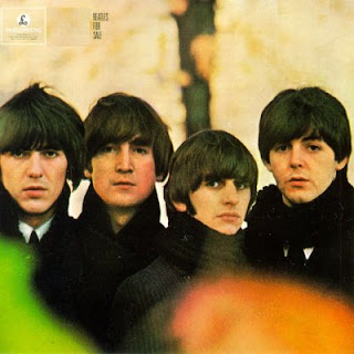
The Beatles have had plenty of iconic album covers and while For Sale is a lot simpler in comparison to Revolver or Sgt Pepper’s I think its an awesome image in the true definition of the word. And as Paul McCartney has pointed out before, George’s turnip hair is a thing of beauty.

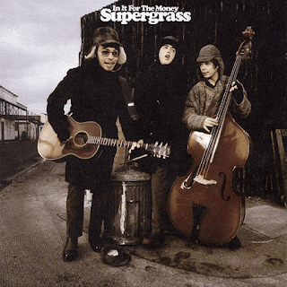
Supergrass were an essential 90s band. They kept going through the 00s but for me it was the 90s that they hit their musical heights. This album cover is a wonderful tongue-in-cheek nod after the success of their debut I Should CoCo. Also, it doesn’t hurt that there are some stonking great tunes on it too.
I have a storied history of love/hate with this band. Snow Patrol now are nothing more than elevator music but there was a time that they were a great indie band. This album is one of those times. And while the title is a bit of a ramble and indicative of a young band, the Icarus style photo is timeless.
This came out when I was relatively young (8 years old to be precise) and my older brother, who I shared a room with, had bought the album. I remember staring at it for hours, being fascinated by the design. The title Blood Sugar Sex Magik contributed to peak my interest, no doubt. It stayed with me and I grew up to buy it myself.
Pearl Jam’s No Code isn’t my favourite of their albums musically. It’s not bad but it’s definitely not my favourite. However, if we’re talking album covers that you could stare at all day, this is definitely one. This motif continues to the back and in-sleeve. It is fascinating and I spot something different every time I browse it.
I could go on all day with this and the above are certainly not a well considered Top 5 but they’re the first ones that jumped to mind. I may revisit this theme someday but for now I’ll leave it with this.
If you have any favourites yourself, please comment and include them below!
– Aaron Poole is the last savior of Sunday mornings. He is also more acurately an editor for FRED and rarely leaves the house. If you like what you read here, or more likely want to leave him some hate message, check out his blog http://aaronfever.blogspot.com
Comments: None
Leave a Reply |


